Thursday 30 September 2010

LoveLane Cupcakes

Today I was looking at interesting cake designs. I stumbled across LoveLane Cupcakes. A wonderful place to order beautiful cupcakes. One piece that particularly caught my eye were the flower cupcake bouquets, they look so real. 
Here are some images:


The Stuff No-One Told Me


Yesterday I came across a delightful blog called The Stuff No-One Told Me. The blog belongs to Alex Noriega a cartoonist from Barcelona. The blog has wonderful cartoons that depict things we all secretly know but never say. One of my favorites is " People who try harder to look tough, usually are the ones who need more affection". I think the idea of the blog is fantastic, are very entertaining and funny and also get you thinking about the message. Anyone who likes illustration, cartoons, jokes should really take a look. Alex also has a shop that sells the cartoons on mugs and greeting cards which can be found here


Wednesday 29 September 2010

Minimalist Print Ads - Saying More with Less

The advertising world is packed with creative ideas and imaginative advertisement messages. The job of an advertiser is to persuade the target audience into buying a certain product or service. There is a big difference between a TV ad and producing a print ad.

Print ads are hardest to execute because of the lack of space and freedom. Within a limited domain, you need to effectively place your message to the target audience. Hence, minimalist and conceptual print ads are helpful in serving the cause perfectly. In a print ad, less use of graphic design can yield more substance to the copy. This is where the services of a talented graphic designer come in handy.

Mc Donalds - Wi Fries
McDonald’s fries are shaped into Wi-Fi sign to show love for free Wi-Fi.

MTV Networks: Black Ribbon Michael Jackson

Wonderful minimalist ad by MTV, showing a ribbon shaped into Michael Jackson’s legs.

Kit Kat: Bench

The bench is made of Kit Kat, signifying that you ‘Have a Break with a Kit Kat’.

Lego: Tank

This minimalist ad communicates that LEGO toys can create real objects.


Wite-Out spec:

The funny resignation letter amendment shows that this correction fluid is ‘For Big Mistakes’.


Tuesday 28 September 2010

Rain Rain Go Away, Come Again Another Day - Completed

A few days ago I was talking about doing an illustration about children playing in the rain. I have just finished it and here it is:

Indigo Launches Mother Tongue: Call for Submissions


Mother Tongue is an innovative online exhibition that seeks to capture the power of language - verbal and visual, formal and informal. As a fundamental form of expression.

A language can be visual - made up of complex ideas of truth deeply rooted in symbols, custom and imagery. Intended to stimulate creative dialogue, Mother Tongue offers designers a forum to respond to the position that indigenous language iconography, process and design knowledge can and should play an integral role in contemporary design.

This cross-cultural platform will honour languages at risk and encourage collaborative projects that deepen our understanding of people's culture in our visual world of this 21 century.
Mother Tongue is an open, multi-disciplinary, online exhibition. It is open to designers of all disciplines, students of design, poets and writers.
Deadline for submissions is December 1, 2010.


My Entry:
I have decided to enter.  My piece will be about young people in this country using "text speech" all the time and how does this affect their spelling, grammar and ability to string a sentence together. Also I want to see if I can incorporate how this would affect the next generation of children's language. If the child's parents cant use language appropriately, how can the child learn from them?


I will post an update in a few days.

Monday 27 September 2010

Dinara Mirtalipova

Yesterday I was looking through blogs and came across Dinara Mirtalipova's blog. I instantly fell in love with her whimsical illustrations and intricately detailed patterns. Her blog is definitely worth viewing.

Here is some of her work:


Sunday 26 September 2010

History of Psychology - Blog Design

Today I have been working on a new banner/logo design for the History of Psychology blog. I am very pleased with the look of the banner which has been hand drawn in pencil. I think it really fits into the nature of the blog.

Here is the design:

Tetley Tea Folk are back!!


Nine years after they were unceremoniously dumped from Tetley's TV adverts, the much-loved Tetley Tea Folk made their return to our screens last night. In the ad, which made its debut during Coronation Street, a spilled drop of 'steaming Tetley tea' awakes and releases Gaffer, Sydney and the rest of the gang from their slumbering prison.
"We're back!" exclaims cheery boss Gaffer. The Tea Folk were retired in 2001 when Tetley was bought by the Indian tea producer Tata, and will now surely be seeking a tea-thirsty revenge.
"I've never been so excited when watching an advert," said one YouTube commenter. "They should never have been scrapped anyway. That's better, That's Tetley."
Find out more at the Tetley Tea Folk website, watch the old Tetley adverts on YouTube and follow the Tea Folk on Facebook and Twitter.

Saturday 25 September 2010

Rain Rain Go Away, Come Again Another Day

I have been back in Wales for about 3 and half weeks now. I am slowly beginning to get used to the frequent rainy weather. I want to make an illustration on the theme of rain and children to go with the other drawings of children that I have illustrated recently. The idea at the moment is to illustrate a child playing in puddles with the phrase "Rain Rain Go Away, Come Again Another Day". I am going to start this tomorrow and will post images a.s.a.p. 

Worlds Most Cramped Airline Seat to Launch Next Week


As a frequent flyer I was astonished when I came across the new "Skyrider" chair. It is a saddle-style airplane seat which allows airlines to squash more passengers into cabins. The poor passenger will have to perch on a "seat" that has more in common with a horse-saddle than a comfy chair.
The new seats are due to be launched next week at the Aircraft Interiors Expo Americas conference in Long Beach, by manufacturer Aviointeriors. They’re intended to introduce a new cabin-class, below economy. It should probably be called cattle-class.
As you can see, part of the passenger’s weight is taken on their legs, and the legs are tucked under the seat in front. Just how close are the seats? Aviointeriors says that the seat-pitch is just 23-inches. Seat-pitch is the distance between the same point on two seats, and the smallest seat-pitch on economy-class flights is around 31-inches. Even low-cost carrier Southwest has a pitch of 32-33 inches on its planes.
No airlines have yet committed to using the SkyRider, but it can’t be long before companies like Europe’s Ryanair, notorious for wanting to charge passengers to use the toilet, puts these things into their planes. But would this be so bad?
I would say overall YES it is bad. If the passenger is 100% fit and can stand sitting like that bearing their weight on their legs for more than an hour.....then the seat is fine. How many people fit into this category? Sitting  in this position restricts passengers with back problems, knees, hips, the elderly, children, tall people, larger people and what about the disabled??? How would someone with no use of their legs sit in this awful chair?
It is sad how far a company will go to save money. Okay yes the tickets with such companies are cheap but to put in a chair that can barely be sat on is ridiculous.

Friday 24 September 2010

Reading Illustration

Here is an Illustration I did today


You can also view it on my Facebook group and Big Cartel Store

Paper Cut

It is mum's 50th birthday in November and I want to make her something special as well as the standard shop bought present. I have been wanting to try out paper cutting for a long time and now that I have the time and occasion I thought I would try it.

The design of what I am going to do is below. I have inverted the colours to make it easier for myself when cutting. I will be cutting out the black areas.

Thursday 23 September 2010

NEON Character Design - Compeition

Today I was looking through design competitions and came across the NEON Character Design compeition. Neon are asking for character designs that fit into their template. The template is a downloadable PDF on the site. The prizes are £100, marketing exposure and the chance for your design to be printed on a series of Teetonic t-shirts. The designer also gets a commission from each t-shirt that is sold.
Winning designs would be used on NEON printed materials. All winning entries will be displayed on the NEON online gallery. 


Here is my entry:


Wednesday 22 September 2010

Timeline Expansion Project - Page Spreads

I have been working on my page spreads for my timeline book. Here is what I have done so far (I am leaving the contents page till last)


Andy Warhol from the Sonnabed Collection


I have been looking for new art/design books to sink my teeth into. I have not read in a while because of the manic last few months, from finishing my third year of my degree and graduating. Whilst looking through Amazon I came across the book Andy Warhol from the Sonnabed Collection.
The book features leana Sonnabend's impressive collection of seminal work directly from the Warhol studio at the time of its making. Ieana Sonnabed was a renowned gallerist and collector and an early and fervent supporter of Warhol. Sonnabed held three important exhibitions of his work at her Paris gallery, including the series Death and Disasters (1964), Flowers (1965), and Thirteen Most Wanted Men (1967). This beautifully illustrated book includes essays by Picasso biographer John Richardson and leading Warhol scholar Brenda Richardson, who was a close friend of Sonnabend’s. Her essay is an insightful portrait of the highly regarded dealer and her relationship with Warhol. The book is illuminated by previously unpublished private letters and includes stand-alone facsimile reproductions of the exhibition catalogues, originally published by Galerie Ileana Sonnabend.

The book is cleverly housed in a box fashioned to look like a Kellogg's cereal box. The book is a bit pricy but it may appear on my Christmas list. The cheapest I have been able to find it for is about £30 here. 

Tuesday 21 September 2010

Wallpaper Rose


Wallpaper Rose is a wonderful blog/jewelry store. It is run by fellow University of Wales Newport graduate Louise Gibbs. She makes beautiful vintage inspired jewelry that will suit anyone. I myself have purchased some items and have always been pleased.

Here are some images of items that are on sale:


Rob Ryan Exhibition - The Stars Shine Brightly Too

One of my favorite artists Rob Ryan will be exhibiting at The Air Gallery from Monday the 1st Nov 2010 to Saturday the 20th Nov 2010. The exhibition will showcase new papercuts and screenprints by the internationally renowned artist. Displaying the traditional Rob Ryan beauty that is loved and admired. These new works capture the distinctive qualities of the evocative hand-crafted papercut, drawing the viewer into Ryan's world of romance.


The exhibition is definitely worth a visit and it is FREE. Ryan's work is truly inspirational all his paper cuts are cut by hand from one single piece of paper.


Exhibition details:
Who - Rob Ryan - The Stars Shine Brightly Too
Where - The Air Gallery, 32 Dover Street, London, W15 4NE
When - 1st November - 20th November 2010 
How Much - FREE.


Monday 20 September 2010

Roger Black's Ready Made Media Project

Publication designer Roger Black has released a new venture Ready-Media. Ready Media is a collection of pre-existing templates for print and web publications.The service offers already designed magazines in a various styles including city/regional, trade, travel, etc., as well as newspaper and web designs. Clients can choose a variety of fonts online and even see how they'll look in the layouts. The new venture's website states:

"never before has world-class media design been so   available,so accessible, so affordable."


The question is does it cheapen the work of the designer/publisher? Personally I can see why designers are frustrated. Designers such as myself have spent years learning the ins and outs of design. However my argument is, hasn't this been happening for a long time?
With the introduction of Photoshop and InDesign to the public resulted in people designing for themselves. So surely this has been a long time coming. There are already self publishing websites for books which has allowed for numerous authors to launch their careers so surely something like Ready-Made was going to happen eventually. 
Personally I do not have a problem with it. I believe that everyone should be allowed to have a voice and if they wish to self publish a magazine or anything else they should be allowed to. I do not believe that this type of technology cheapens the job of a designer, because I like to think that although anyone can design not everyone can design well.


Big Cartel Store and Facebook Group

As you may have noticed I have been joining various groups. Here are some that I have joined


Big Cartel

All of these websites are great. I have been updating my website ALOT and I really wanted my "shop" to have the same house style as my website. Also I want to hopefully make a bigger profit.
This is what Big Cartel provide. I have opted for the gold membership which is free, but there are more advanced memberships that allow in depth HTML/CSS customization. So I have now linked the store nicely to my website (website will be updated soon).
Here is my Store: Lisa Holland Design 

Facebook

I have been a member of Facebook since starting university and have decided that the networking that can be done through it is fantastic.
So I have also made my own facebook group which is also named Lisa Holland Design.  

Sunday 19 September 2010

Stone and Spear - Simon Cook

Simon Cook is a fellow 2010 graduate from Nottingham Trent University. He is a well accomplished Illustrator who has been featured in this years Creative Review 2010 Graduate Special. 


Even though Simon has only just graduated he has already set up his own business named Stone and Spear. His Illustrative style is bold and colourful, he combines vintage photography with strong geometric vector shapes which achieves a wonderful playful feel to his work. 


Here is some of Simon Cooks work:


Pink Hitler posters provoke fury

There has been public outrage in Italy this week as a result of this 18 foot high poster.
The controversial posters feature Hitler in a shocking pink uniform, with his swastika armband replaced with one bearing a bright red heart. Underneath is the slogan "Change Style – Don't Follow Your Leader". 
The posters advertise a line of clothing for young people and adorn street corners and bus stops in Palermo, Sicily's biggest city.
I personally can understand the controversy but I do have to admit that this campaign is very clever and thought provoking. The advertising agency which came up with the idea said critics of the campaign were over-reacting. The Hitler poster was a tongue-in-cheek way of encouraging young people not to follow the crowd in their fashion choices.
"We have ridiculed Hitler in a way that invites young people to create their own style and not to be influenced by their peers," said the agency's Daniele Manno.
Impressionable locals will now have to brace themselves for a fresh affront – the company plans to bring out a new poster campaign in the next few weeks featuring Mao Tse Tung.

Zazzle Store

Today I was on hunt for a new mouse mat. I wanted an unusual one and came across Zazzle.com. I then noticed that you can design your own items. So I decided to join Zazzle and start up my own store. Here is the link to my store.


Here is the mouse Mat that I have designed for myself and have put up for sale:

Saturday 18 September 2010

Alison Tod

Alison Tod is one of the UK's top milliners. Her hats are innovative and bold and are for sale in top stores such as Harrods. She has hats on permanent display in the Victoria and Albert Museum, and the National Museums and Galleries of Wales in Cardiff. She has also won numerous awards for her designs including Welsh Designer of the Year for two years in a row. 


Today Alison Tod is hosting a Mad Hatters Tea Party at the Abergavenny Food Festival. She will be showing this edible hat, that is modeled by fellow Newport University graduate Claire Tremlett. 


Claire's own collection is featured on Jocelyn Allen's website (another Newport graduate)

London Design Festival 2010


Today is the start of the London Design Festival. The London Design Festival is a nine-day celebration of design in the world’s creative capital. 


The Festival is a platform for the widest spectrum of design disciplines. The festival features over 200 events, the majority of which are FREE!! 


Sadly I cannot attend but if I had I would have liked to have attended:


Thursday 16 September 2010

Raymond Hawkey

Sadly Raymond Hawkey an extremely influential and innovative graphic designer died recently aged 80. He was design director at the Daily Express in the late 1950s and early 60s, and later at the Observer until the mid-70s. He changed the look of newspapers with his introduction of banner headlines, using a simple photographic line style and sans serif fonts. 
It is fair to say that he also changed the course of the visual culture in Britain.


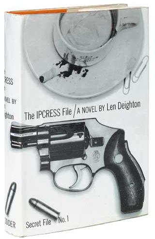
In 1962  Hawkey was asked by the writer Len Deighton, to design the cover for The Ipcress File. The book's publishers, Hodder & Stoughton, were appalled when they saw Hawkey's Ipcress design – a photograph of a revolver, bullets, a cracked teacup and a stubbed-out cigarette. They refused to pay him more than 15 of his 50-guinea fee for his "disgusting" illustration. The cover would later be regarded as one of the key moments in design history.

The book became a huge success, and Hawkey went on to create some of Deighton's most memorable covers, including Horse Under Water, Funeral in Berlin and Close-Up. He later designed covers for Kingsley Amis, Frederick Forsyth and others.
His cover for the 1963 Pan paperback edition of Ian Fleming's Thunderball – with bullet holes cut into the Brian Duffy photograph of a girl's back – anticipated a phenomenon in which movies became a key element in the marketing and success of the Bond books. Not only did Hawkey decide that "James Bond" should be emblazoned across the top of every cover but also made the type twice the size of the title and Fleming's name. It remained that way for almost four decades.
Because Hawkey was naturally shy, he was often considered difficult. "Ray had a way of diverting questions about himself, often turning the conversation back on to you," says Edward Milward-Oliver, a friend. "In fact, he was the best company amid small groups of friends."He was wonderfully generous, especially with his time, to young people who sought his advice, whether it was on design or writing.
A fastidious and private man, he had a dread of dying in hospital; and after a long illness he died in his own bed – with his beloved wife, Mary, reading his favourite poem to him.
• Raymond John Hawkey, graphic designer, born 2 February 1930; died 22 August 2010


Timeline Expansion Project - Book Dust Jacket

I have finally started the timeline expansion project. I downloaded the relevant templates from Blurb and got started. I am using the Standard Landscape size which is 10" X13"inches.

Here is my Dust Jacket Design: