Friday 29 April 2011

Royal Wedding Cakes

The big day had two cakes one chosen by Prince William and one chosen by the bride Catherine Middleton. Prince William's choice was made by the biscuit company McVities and Catherine's was made by Fiona Cairns

Prince William's Choice:

Guests at the royal reception indulged in a multi-tiered chocolate biscuit cake at the request of Prince William, who is said to have developed a soft spot for the treat. The newlyweds commissioned biscuit maker McVities to craft the chocolate creation after the Duke of Cambridge enjoyed eating the sweet treat as a child.
Guests were given a taste of nostalgia as the confectionery delight was offered as an alternative to the official wedding cake by Fiona Cairns.
Detailed with white chocolate water lilies, milk chocolate leaves and a mixture of white and milk chocolate feathers, the cake looked fit for the grand occasion. The flowers, which had white Malteser-shaped centres, were placed at the corner of each square and several were arranged aesthetically on top.
A smooth, crisp chocolate exterior encased the unbaked delight which was made from dark chocolate for added flavour, crushed rich tea biscuits and some undisclosed secret ingredients. McVities crafted the cake at one of its UK plants from a recipe received from Buckingham Palace kitchen chefs.
The company, now part of the United Biscuits Group, has made many of the wedding and christening cakes for members of the Royal Family since the marriage of George V to Queen Mary in 1893.
Catherine Middleton's Choice:

a traditional multitiered fruitcake with cream and white piping designed by prestigious British baker Fiona Cairns. Beginning in February, Cairns worked closely with the couple in secret on the concoction.

"Catherine wanted a traditional wedding cake with a modern twist," Cairns said.  To that end, Cairns and her team used "scroll work, lattice work, intricate piping techniques, sugar flowers" to decorate the treat.
"We've used Catherine's list of the 'language of flowers," Cairns added. "The 'language of flowers' is something that was used in Victorian times to express, in a coded way, emotions that couldn't easily or openly be expressed in words but [could be] conveyed in flowers. So all the flowers have meanings."
For example, the bridal rose symbolizes happiness, ivy leaves marriage, and "Sweet William" flowers, which represent gallantry.
Like any engaged couple, William and Kate tested several different flavors.
"We sent over samples of different fruitcake types and they picked their favorites and commented," she said.
Adds an insider, Catherine loved the design. "When Catherine saw the first sketches, she clapped. She is so excited. It's something she has always dreamed of."


Evening Gown: Kate Stays With Same Designer


Kate Middleton followed up her highly-anticipated wedding dress with an evening outfit created by the same designer. Her decision to stick to a very similar shape to THE wedding dress shows she knows what suits her.


Kate's second Burton outfit for the evening celebrations was a strapless white satin gazar evening gown with a circle skirt and diamante embroidered detail round the waist.
She was also wearing a white angora bolero cardigan, St James's Palace said.


Kate Middleton's bridal gown was 'experience of a lifetime, says designer Sarah Burton from Alexander McQueen

Well finally today we saw Catherine Middelton's wedding dress and I was blown away by the vintage inspired elegant gown designed by Sarah Burton of Alexander McQueen. 


The designer of Kate Middleton's wedding dress said it was the "experience of a lifetime" to be tasked with creating the exquisite gown.

Sarah Burton, of Alexander McQueen, described the bride as looking "absolutely stunning".

She said she was incredibly honoured to be asked to design the historic dress, adding: "I have enjoyed every moment of it."
The bridal dress is an ivory gown with lace applique floral detail, with the skirt resembling "an opening flower" and intricate lace detailed train.
Burton said: "It has been the experience of a lifetime to work with Catherine Middleton to create her wedding dress, and I have enjoyed every moment of it". "It was such an incredible honour to be asked, and I am so proud of what we and the Alexander McQueen team have created.

"I am delighted that the dress represents the best of British craftsmanship. Alexander McQueen's designs are all about bringing contrasts together to create startling and beautiful clothes and I hope that by marrying traditional fabrics and lacework, with a modern structure and design, we have created a beautiful dress for Catherine on her wedding day."

Burton added: "Catherine looked absolutely stunning today, and the team at Alexander McQueen are very proud of what we have created."

Kate also wore her brunette locks in cascading curls and a ivory silk tulle veil, which was trimmed with hand-embroidered flowers. The bride held her veil with a Cartier 'halo' tiara, lent to Kate by the Queen. She was also seen wearing diamond drop earrings by Robinson Pelham, a gift from her parents.


Pippa Middleton, the maid-of-honour, also wore a stunning full length ivory gown by McQueen while the bridesmaids wore creations by Nikki Macfarlane.


Prince William the newly appointed  Duke of Cambridge arrived ahead of his bride in a red Colonel of the Irish Guards uniform created by Savile Row tailors Gieves & Hawkes, which was accented with a blue sash.


Well I definitely enjoyed the day and loved the garden inspired decorations

including eight, 20 foot high trees - to recreate a lavish English country garden inside Westminster Abbey.


Under the guidance of her ‘floral artistic director’, Shane Connolly, half a dozen English Field Maples were installed in the historic church to create a ‘Living Avenue’ under which guests will walked to their seats.

Each of the trees were placed in a planter personally designed by Mr Connolly and handcrafted by artisans on the Prince of Wales’s Highgrove estate.

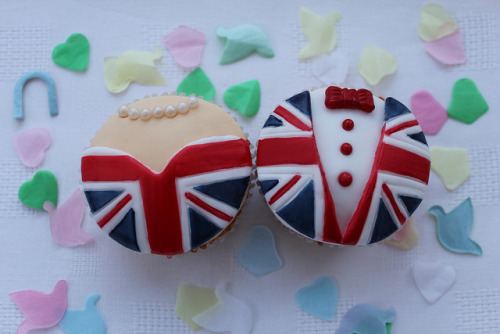
Here are some cakes complete with handmade flags that I made that we enjoyed while watching the Royal Wedding:


Thursday 28 April 2011

Royal Wedding Illustrations for Sketchbook Magazine

Last week I was commissioned by the wonderful people at Sketchbook Magazine to illustrate what the royal wedding means to me. I decided that it is a day of celebration whether you are a royalist or not and the day is either a day filled of patriotic fun or time to spend with family. I have illustrated it from Kate Middelton's and the public's perspective. Hope you like it and any comments are more than welcome!


Wednesday 20 April 2011

Preparations for the Royal Wedding Weekend

The news for the last couple of months has been filled with excitement for the royal wedding. The big day is almost here and my boyfriend, boyfriend's family and I thought it would be nice to celebrate the big day with some good old english patriotism.

Cakes:
I will be making Union Jack inspired cakes so thought I would have a look around to see what others have been making. I love both the images below and would like to do something similar if my coordination allows me to!

Bunting
We are also planning on getting some bunting here is a  lovely example that I found from the The Contemporary Home Blog


Other Items
A few other fun filled items from Party Packs.Co.Uk


BBC Video about the making of Royal Wedding China by Royal Crown Derby Cool!


This is a link to a great video on the BBC website about the making of Royal Wedding china by Royal Crown Derby. If you have never seen china made, this is a good way to see some of the process. 


Link - BBC Video Making Royal Wedding China

Friday 15 April 2011

Iconic Women - Madonna

This morning I posted an updated (unfinished) image of this illustration. Well after a few hours work here is the final piece!

I chose the quote "Sometimes you have to be a bitch to get things done" because Madonna is fighter and fights for position in the pop industry hence the boxing ring scenario, so I thought the quote went well with the tough image I am trying to portray in the illustration. Let me know what you think!

Iconic Women - Madonna Update

Hello readers about a week ago I think I showed you the beginnings of my illustration of Madonna for my Iconic Women Project. Here is how it stands at the moment.


I am very happy with how it is going it almost has a graphic novel feel about it! I almost finished I just need to add the typography and finish the background and ropes. Let me know what you think so far and I will update the finished illustration soon!

Sunday 10 April 2011

Iconic Women - Madonna Working Progress

Hello I am currently extremely busy hence the lack of updates with my Iconic Women Project. I am currently sifting through a 4000 word essay and will be handing in a 3000 word essay next week! But I thought I would show my lovely readers my working progress through the Madonna Illustration. So here is what I have done so far:

So as you can see this is a very rough start to the illustration! I need to clean up the lines and add more line detail and then colour and shading. I chose this stance for Madonna because she a fighter and fights for her position in the pop industry by always re-inventing herself. I am still looking for a quote to go with the illustration....so any suggestions would be very welcome!

Saturday 9 April 2011

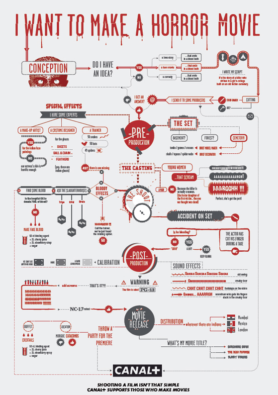
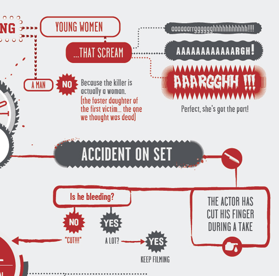
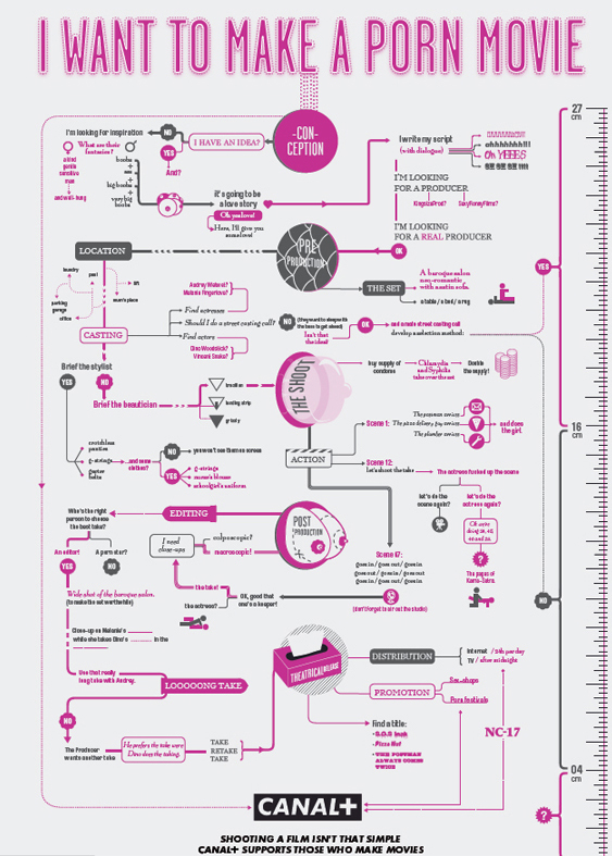
Canal+ shows how to get ahead in the movies

French TV channel Canal+ has a released a witty series of ads, devised by BETC Euro RSCG in Paris, that emphasise its commitment to helping filmmakers...The ads use beautifully designed flowcharts (inspired by New York magazine, perhaps?) to highlight the many twists and turns that can occur when making a movie, and some of the solutions. Each one tackles a different genre, including action, horror and porn, and feature many amusing outcomes. Shown below are three of the full ads, alongside details of each.


Credits:
Agency: BETC Euro RSCG
Global creative director: Stéphane Xiberras
Creative director: Olivier Apers
Creatives: Gregory Ferembach, David Troquier
Illustrator: Les Graphiquants


Friday 8 April 2011

Tate Modern's appeal to release Ai Weiwei

Recenlty it has been all over the news that the acclaimed chinese artist Ai WeiWei has had his human rights breached by being detained at Beijing Airport and his studio has been raided. Here is what the guardian had to say:

"China's best-known artist Ai Weiwei has been detained at Beijing airport this morning and police have surrounded his studio in the capital.
The 53-year-old, who designed the Olympic Bird's Nest stadium, has been an outspoken critic of the government. Although he has previously experienced harassment by officials, he appeared to be relatively protected by the status of his late father, a renowned poet, and his high international profile; last year, he created the Sunflower Seedsinstallation for Tate Modern.
His detention comes amid a wider crackdown on activists and dissidents, which human rights campaigners describe as the worst in over a decade. At least 23 people have been detained, mostly in relation to incitement to subversion or creating a disturbance. Three more have been formally arrested and more than a dozen are missing, including high profile human rights lawyers.
Ai was due to fly to Hong Kong for business this morning, but was detained at immigration on his way out of Beijing. An officer told an assistant who was travelling with him that the artist had "other business" and could not board the plane. Between 15 and 20 uniformed and plain clothes police surrounded his studio in Caochangdi, in the north of the capital, and more were believed to be searching it. Power to the neighbourhood was cut off.


Twitter users reported that Ai's friend Wen Tao had been detained by police in Caochangdi. Shortly beforehand, replying to a friend enquiring whether he was all right, he had tweeted: "So far, so good". Wen's mobile was not available. Beijing police said they did not know anything about either man. Asked about Ai, an airport police spokesman said: "I do not have the obligation to tell you the information. You may have got your information wrong; even if it is right, you have to go through certain procedures to make inquiries, not just make a phone call."
Earlier this week it emerged that Ai was setting up a studio in Berlin because of his increasing work in Europe.But he told the Guardian that it would take at least two years to build the space and he would probably divide his time between Europe and China.
He said the situation in Beijing was "difficult" and added: "It is hard to know what will happen in a few years.
"I will never leave China behind unless I am forced to….Hopefully that is not going to happen."

Tate Modern has posted this message of support for the Chinese artist Ai Weiwei, who was detained on Sunday at Beijing Airport, on its façade. The arts organisation is also encouraging people to sign this petition calling for the artist's release.

Wednesday 6 April 2011

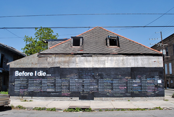
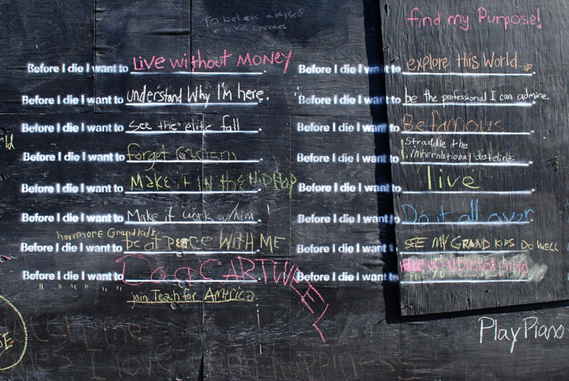
Candy Chang - Before I Die I Want To.....

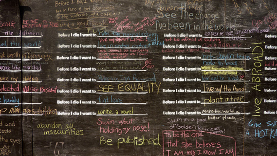
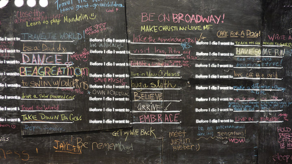
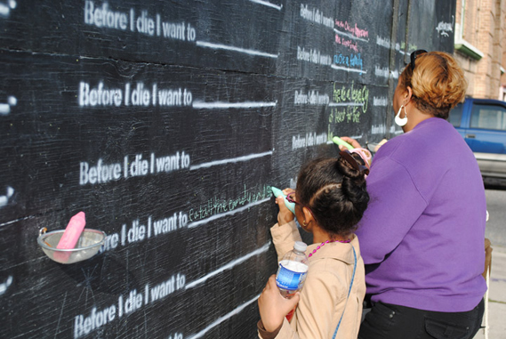
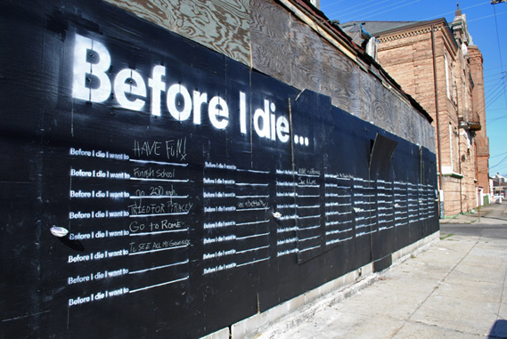
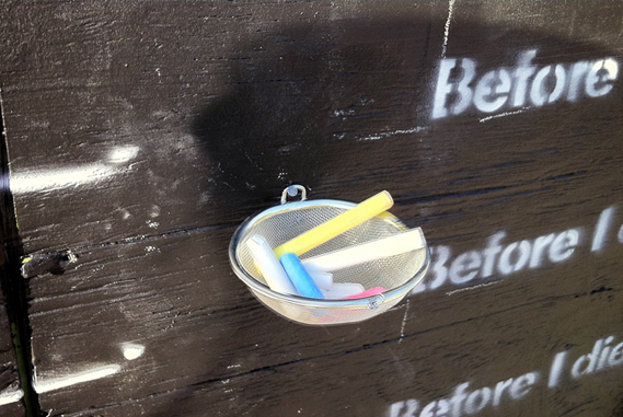
A little over a month ago, installation artist Candy Chang turned the side of an abandoned house in her New Orleans neighbourhood into a giant chalkboard where passersby could write up their personal aspirations...

Before I Die, "transforms neglected spaces into constructive ones where we can learn the hopes and aspirations of the people around us," Chang writes on her website.

As the founder of Civic Center, a design studio in the city that aims to "make thoughtful public spaces and communication tools for everyday issue of city life," Chang has been following the progress of the messages as they have accumulated on the chalkboard.

The latest pictures from the Before I Die project, the first two images shown here, are from just a few days ago.

The self-initiated piece (Chang sought permission from the property owner) is at 900 Marigny Street, on the corner of Marigny and Burgundy, in New Orleans. It was made using boarding and chalkboard paint – and plenty of chalk – in collaboration with the neighborhood association's blight committee, the Historic District Landmarks Commission, the Arts Council, and the City Planning Commission.


Tuesday 5 April 2011

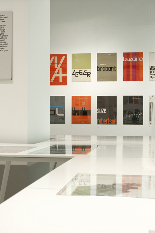
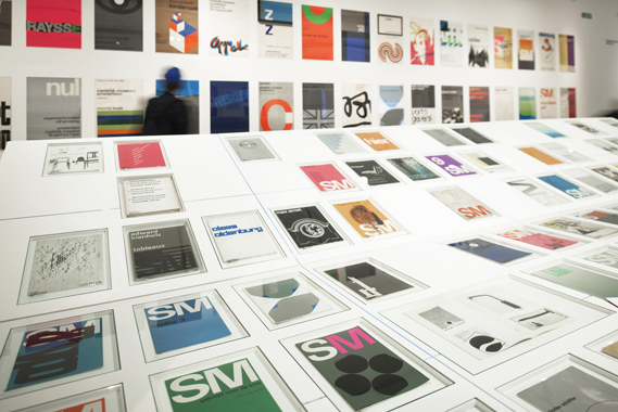
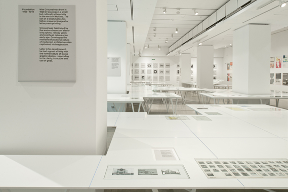
The Cult of Crouwel

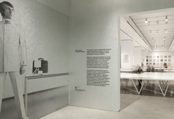
The Design Museum's excellent Wim Crouwel show is evidence of the reverence afforded to the Dutch designer in the UK, but why is he held in such high regard? And why now?

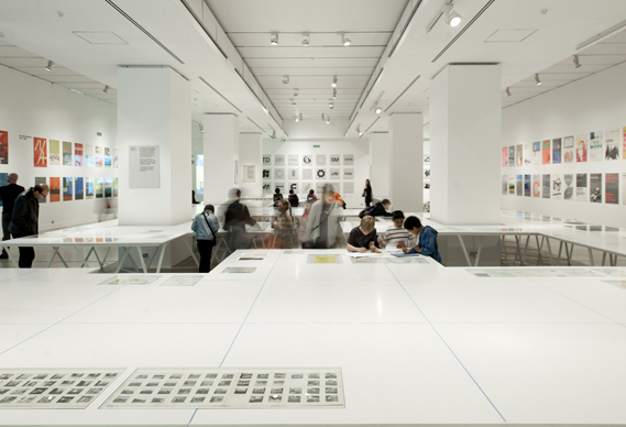
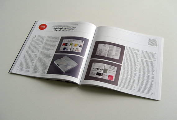
In terms of the sheer amount of work on show, Wim Crouwel A Graphic Odyssey is one of the biggest graphic design exhibitions seen in the UK. In the current issue of CR, Rick Poynor asks why Crouwel's influence in the UK is running so high:"What is it about Crouwel's work that has brought him so much to the fore of late?" Poynor asks in the piece. Subscribers to creative review can view the article here

"There is no question that Crouwel's work has great historical significance, above all in the Netherlands where he helped to define the visual landscape of his time," Poynor writes. "He is also the creator of some wonderful poster and catalogue designs that still look impressive. But he is not alone or even rare among designers in either of these achievements."

Poynor argues that the attraction of Crouwel's work for many today is purely stylistic: "The designers who applaud him now tend, like Crouwel himself, to put most emphasis on typography. They like visual rigour, precision, purity of form and dynamically balanced structure. They like systems and visual programmes that impose order and consistency ... 
The history of mid-century European modernism enthrals and inspires them, but more as an imaginary utopia of style than as an ideal of how a reformed visual realm based on modernism could embody a radically new polity."


Poynor goes on to argue that "the current wave of Crouwel adulation" ignores some problematic aspects of his work, specifically his ideal of graphic clarity and neutrality. "I was always saying that the designer should not be too visible," Crouwel had once told Poynor. "He should not stand between the receiver and the sender. But I realised afterwards that I was always there - but never in my ideas. There is a kind of contradiction."

"It makes no sense to fetishise Crouwel or other modernists whose work 50 years ago was a response to conditions of rapid economic development in European social democracies," Poynor argues in CR. "And it would be even more misguided to treat his archive as a ransackable storehouse of fashionable stylistic effects. These views of Crouwel, coming from non-Dutch devotees, misinterpret both his national context and his intentions. We should study his example, and study design's past, the better to understand where design is now."

Wim Crouwel A Graphic Odyssey is at the Design Museum, Shad Thames, London SE1 until July 3. Exhibition design by 6a Architects. Show images courtesy 6a Architects.
Rick Poynor also writes about Crouwel here on Design Observer