Tuesday 30 November 2010

Design By Bingo

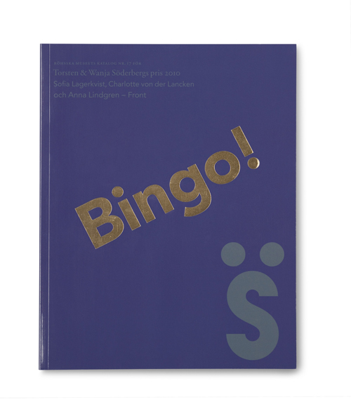
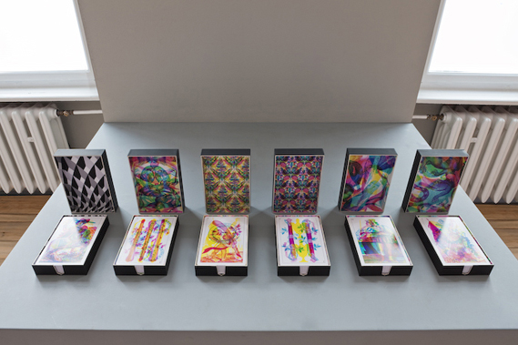
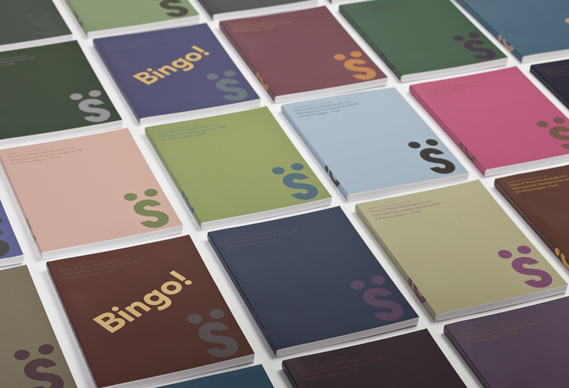
Can't decide on the right cover for that catalogue? Why not let fate lend a hand? How the local bingo hall became a vital part of the design process of Happy Forsman & Bodenfors' newest project.

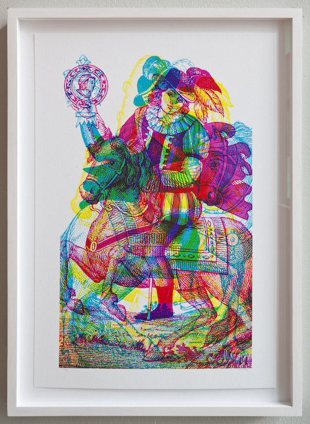
The Swedish design studio was asked to produce the catalogue for the 2010 Torsten and Wanja Söderberg Prize, the major Nordic design award. The winners were the Front design group who, explains HF&B art director Andreas Kittel, are renowned for allowing "external factors to direct the design process".

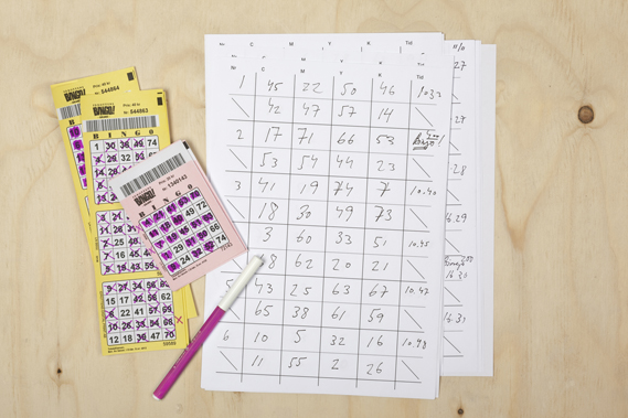
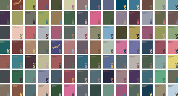
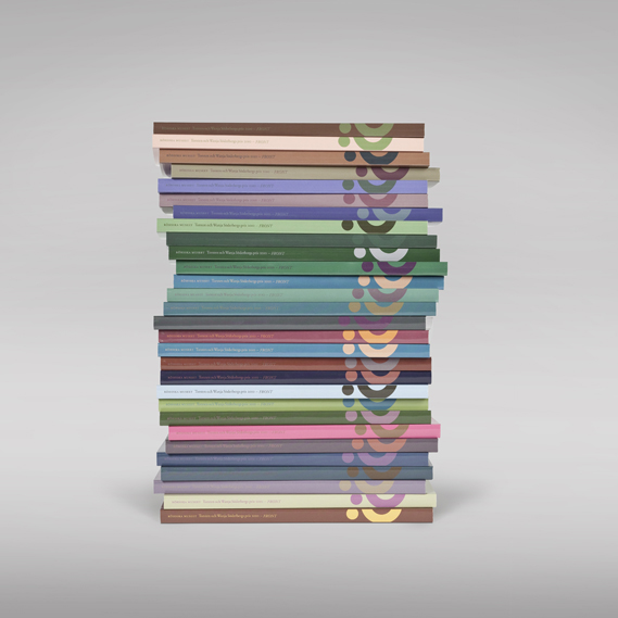
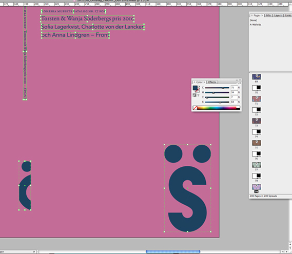
In this spirit, HF&B decided to allow their own 'external process' a say. "We simply went to the bingo hall next door to our office with a specially made form with four columns - for C, M, Y and K," Kittel explains. "While playing, we noted the order of the bingo caller's numbers: Four numbers determined the cover's background colour. The following four numbers settled the colour of the text. In total, we had to collect 800 numbers to create one hundred covers."

Each cover was made individually (in InDesign). HF&B entered the bingo numbers into the colour panel, turning them into colour values.

"The range of bingo numbers (1-75) is very well suited for the project," Kittel explains, "because it makes the maximum sum of a four number sequence 294 - the total ink coverage in a printing press should not exceed 300%."


Monday 29 November 2010

DesignStudio unveils new £2 coin design

DesignStudio in London has created a new design for the £2 coin, which celebrates the 400th anniversary of the King James Bible.

The coin features the quote 'In the beginning was the Word', from John 1.1, and the design aims to demonstrate the original process of the printing press. The text appears in a reversed, mirrored version that protrudes, representing the printing block, and in a recessed correct version, representing the printed word.


As part of the design process, DesignStudio visited the British Library in London, to see one of the original copies of the Bible. "This was our first glimpse of the actual print and quality of the original document," says Paul Stafford, DesignStudio founding partner. "After seeing the detailing of the text we knew we wanted to create a design that was a representation of the printing process."


Other designs proposed by DesignStudio included two separate coins that were a mirror image of each other, also reflecting the print process. A sketch of this idea is shown above.


The team also proposed a single coin version which focused on the language aspect of the King James Bible (sketch shown above). This idea reflected the Latin/English tranlation of the Bible commissoned by King James, and the way it helped develop English into a worldwide language. The design features the first line from Genesis – 'In the beginning God created the heaven and the earth' – in both Latin and English.


The finished version of the coin, shown top, will launch on December 1 in a base metal collector version. Additional collector versions will be struck in silver and gold next year, with general circulation of the coin taking place later in 2011.

Sunday 28 November 2010

My Feature on SketchBook Magazine's Blog

I have been very secretive about a recent project I was doing for SketchBook Magazine. I was asked to create a comic about Arsenal football club. I really enjoyed injecting some fantasy into the game. Here are the illustrations:


You can view the feature here

Central Station's Coronation Street show

To help celebrate the 50th anniversary of ITV's Coronation Street soap opera, Central Station (the Manchester art and design studio that created bold, colourful painted artwork for the likes of The Happy Mondays and Factory Records in the late 80s and early 90s) has created 25 portraits of well known 'Corrie' characters...
Central Station said:  "We are all massive Corrie fans, the long list of colourful characters that have lived on the street over the past 50 years, not only relate to us as people, but have come along at times that reflect the social and cultural dynamics of the world around us. It has been brilliant putting our stamp on the national treasure that is Corrie."

The paintings will show at the Richard Goodall Gallery in Manchester's Northern Quarter from December 2 - January 15.

Visit richardgoodallgallery.com for more details
Central Station are also manning a pop-up gallery/store in the Trafford Centre in Manchester at the moment. Find it at Unit 6, Regents Cresent – next to Debenhams.


Thursday 25 November 2010

Xbox Kinect puppet prototype

Interaction designers are starting to have fun with the Xbox Kinect: here, Emily Gobeille and Theo Watson of Design I/O show their prototype of an interactive puppet using the system
"The system is doing skeleton tracking on the arm and determining where the shoulder, elbow, and wrist is, using it to control the movement and posture of the giant funky bird," they explain.

See more of their work here

Carnovsky's RGB wallpaper

Today I came across the Italian studio Carnovsky's amazing RGB Wallpaper. The designs were created for the Milan shop of Janelli & Volpi, a noted Italian wallpaper brand. Each features overlapping illustrations, different elements of which are revealed depending on whether a blue, green or red light is shone upon them.

There is now a new exhibition of new RGB Wallpapers that is on display in Berlin. The exhibition also showcases prints and playing cards that have been printed in a similar fashion. 


Playing Cards


Print

The Wallpaper
Wallpaper under normal lighting
Wallpaper under red light
Wallpaper under green light
Wallpaper under blue light

Tuesday 23 November 2010

Creative Review's December Issue


A few days ago I did a post about the information graphics in the wonderful New York Magazine. Yesterday I was pleased to discover that they have also designed the cover for Decembers issue of Creative Review. It is a beautiful piece of information graphics that showcases the contents of the issue.


The Cover asks you what you want to read and offers various (not altogether serious) routes to finding the stories that are right for you.

Stamps that move

The world's "smallest and shortest film" appears on a new lenticular stamp that has been created for the dutch postal service TNT. KesselsKramer askes director Anton Corrbijn to shoot the one second film, which features actress Carice van Houten.

The Amsterdam and London based agency were commissioned to develop new innovations in stamps and the result is a small lenticular stamp that contains 30 frames of film. 350,000 have been printed from Dutch post offices. 

Lenticular Thunderbirds Stamps Are Go!

GBH in London are also about to launch a whole Thunderbirds inspired lenticular set for the Royal Mail. You can watch the stamps below:


And as part of the special edition pack who better than Brains himself to take fans through how the stamps were made.
"The stamps were created by GBH with a process that fused film-making, editing and post production techniques with graphic design," runs the write-up that also appears on GBH's blog.

"Sequences were meticulously trialled from the original master 35mm print at ITV, and the final frames were carefully selected, exported to HD quality, digitally re-mastered and then re-edited back into an all-new 36 frames sequence, for use in the complex micro-lenticular process."

The lenticular stamps are joined by a Royal Mail Special Stamp Issue of six landscape stamps featuring all of Gerry Anderson's Supermarionation TV shows from the 1960s: Supercar, Fireball XL5, Stingray, Captain Scarlet and Joe 90:
"The stamp format allows the full 35mm frame to be shown exactly as it was shot by Gerry Anderson for the first time, as it was cropped to 4:3 when originally aired on British TV," say GBH, who have been clearly been meticulous about the detailing here.
Indeed, the presentation pack for the stamps features a special pull-out four-page comic telling the story of the creation of the Thunderbirds through the illustrations of original TV21 comic artist, Gerry Embleton, with text by Stephen La Riviere. Part of the pack also looks at the design of the Captain Scarlet puppet:
The stamps, micro-lenticular mini-sheet and all collectible products are available for pre-order from Royal Mail now and will officially launch on January 11 2011.

Sunday 21 November 2010

The Facebook Book

This project has been inspired by the idea that events that occur on Facebook eventually get forgotten in the virtual world. So Siavosh Zabeti and agency DDB for Bouygues Télécom created this book as a history of Facebook statuses, photos and comments for one Facebook user. 


Here is the video for this project:

When Facebook becomes a book from Siavosh Zabeti on Vimeo.

New York magazine: data done right

I always feel jealous when I see a copy of New York magazine, jealous that my own country's capital city, London, doesn't have such an intelligent, funny and well-designed equivalent title to document its life and times.
There are lots of things that New York does well, but the thing it does best is its infographics. After Information is Beautiful's David McCandless had his infamous set-to with Neville Brody on Newsnight, the role of infographics has been increasingly questioned: many are beautiful but are they also meaningless? The infographics in New York are sometimes the former, but never the latter.
What sets New York's infographics apart (created by the design department under design director Chris Dixon) is that they combine journalistic rigour with design excellence in almost equal measure. A particular favourite is regular feature The Neighbourhood News. A map of New York is annotated with short news stories from different boroughs across the city, neatly encapsulating its diverse nature: an Upper West Side lady reports the theft of $1 million worth of jewellery from her apartment while, in outlying Soundview, police remove a three-foot-long snake from a man's bathroom.


Elsewhere, infographics are used to illustrate and explain features and news stories, adding rather than merely decorating. Sometimes a whole spread will be devoted to data, such as Who Got In (above from the 4/10/10 issue), a recent piece on the Manhattan social scene that simply listed the guests at all the biggest parties in one week. And they are frequently funny, especially The Approval Matrix "our deliberately oversimplified guide to who falls where on our taste hierarchies".


Saturday 20 November 2010

Le French Dresser

I recently came across this piece by Wary Meyers, a husband and wife design team, on Apartment Therapy.  "Le French Dresser" was created by adding scroll-saw cut wooden letters to a salvaged dresser, drawing upon inspiration from Lou Dorfsman's Gastrotypographicalassemblage.  This awesome DIY project is currently featured in Wary Meyers' book, "Tossed and Found ," along with several other simple masterpieces created from items that others might disregard as trash.

Thursday 18 November 2010

The Mayor gets air to promote a new iPhone app


No, of course it's not the real Mayor of London!
It's merely a man in a suit with a Boris-alike wig on that stars in this film – one of several created by new agency Meanwhile... to help promote MyTaptu - an iPhone app which launched last week that helpfully aggregates all your news feeds and social media streams into one, easy to navigate and peruse reader.
The idea is that My Taptu tidies all your non-work related online stuff into streams – and the idea of this campaign is to get the message over that if you like something you see online, you can "Taptu it" - that is, share it, store it or comment on it on any of your social networks in one fell swoop, using the MyTaptu on your iPhone.
Here's another of the campaign films:


To be honest I'm not too sure the films are successful in explaining what the heck MyTaptu is or what it's for. But I really enjoyed both these films  – and then ended up trying to solve the mystery of just what MyTaptu is all about. And now I have, it sounds quite useful.

More on MyTaptu at taptu.com

Credits:
ON YER BIKE
Agency: Meanwhile...
Creatives: Simon Huhtala, Gabbi Cahane, Tareq Kubaisi, Jay Fretwell
Production Co: Nice Shirt
Director: The Graley Brothers
DoP: August Jacobsson
Producer: Richard Martin
Editor: Dominic Leung - Trim
Post: Prime Focus
Sound: 750mph
HAMMER TIME (OLD LADY)
Agency: Meanwhile...
Creatives: Simon Huhtala, Gabbi Cahane, Tareq Kubaisi, Jay Fretwell
Production co: Nice Shirt
Director: Tareq Kubaisi
DoP: August Jacobsson
Producer: Richard Martin
Editor: Dominic Leung - Trim
Music: Faber Music
Post: Prime Focus
Sound: 750mph

Tom Carnase

Tom Carnase (1939 - ) has produced some of the most memorable product lettering and logographic designs of the last 50 years for a Who's Who of corporate clients, including Brooks Brothers, Calvin Klein, Saks Fifth Avenue, Consumer Reports, Fortune magazine and L'eggs. In addition, he has designed, or co-designed, over 100 typefaces, including the iconic ITC Avant Garde Gothic and WTC Bodoni, both of which influenced a generation of graphic designers.
Some of his most significant early work came out of the design agency Lubalin, Smith, Carnase, Inc. (1969 - 1979) including Avant Garde, a typeface inspired by publisher Ralph Ginzburg's new magazine of the same name. The design history of the type is complex, and was based on initial sketches by Herb Lubalin for the magazine's masthead design. Carnase, however, developed and drew many of the additional letterforms necessary for a full typeface, as well as additional weights and styles.
In 1980, Carnase co-founded the World Typeface Center, out of which came WTC Our Bodoni, a typeface collaboration with Massimo Vignelli. Other types produced by Carnase for WTC include Carnase Text, Favrille, WTC Goudy, and Our Futura. He later maintained an independent design studio in which he used his extraordinary lettering skills to create logos and corporate identity work that perfectly captured his clients' products. He has taught and lectured at University of Cincinnati, Pratt Institute, Parson's School of Design, Cleveland Institute of Art, and RIT. He now operates a studio out of Palm Springs, CA. -- DP
Hank, blog for Portfolio Center, April 9, 2008,http://www.portfoliocenter.com/blog/2008/04/09/291.
Linotype, Font and Type Database, http://www.linotype.com/362/tomcarnase.html(object name Font Designer - Tom Carnase; accessed September 28, 2009).
"The Art of Design," Carnase Inc. http://www.carnase.com.
Avant Garde Typeface
Candy
Revlon
Saks Fifth Avenue
Borracho