Monday 30 May 2011

Audi ad reveals Le Mans driver experience


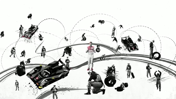
This beautiful new ad for Audi from BBH London stars Audi Le Mans team leader Allan McNish and gives a real insight into the physical endurance required to be a Le Mans driver...

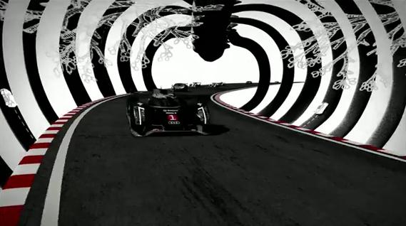
Directed by Chris Hemming at Passion Pictures, the ad is two-and-a-half minutes in length and incorporates a mixture of live action, hand-drawn sketches and stereoscopic techniques. The 2D version is shown above, but a 3D version will play out on Sky 3D during the Champions League final on Saturday and also in cinemas.
"Audi were keen to promote Le Mans, as it is an unsung success for them," says Kevin Stark, creative director at BBH. "They have won it nine out of eleven times in the last few years. I was lucky to see Le Mans winner Allan McNish at the Audi National Forum. He did a five-minute lecture on the famous endurance race, but from the driver's  perspective. I thought this might have potential to answer our brief. We wanted to bring a human aspect to Audi communications and Allan's off-beat and likeable style was a good fit."

"Next step was to get this into a manageable time length film," continues Stark. "And also see if we could further increase the exciting, sensory experience of driving the race. We approached animator Chris Hemming at Passion Pictures. Chris and his artist Tim Marrs did some great, expressive style sketches that enhanced what Allan was saying but without drowning his performance. Allan was filmed using 3D live action cameras, but Chris had the idea that we could make the hand-drawn sketch style 3D too, but also using stereoscopic techniques. The result is a fresh-looking piece of animation that works well in 2D but really comes alive in 3D."

Credits:
Ad agency: BBH London
ECD: Nick Gill
Senior creative directors: Nick Kidney, Kevin Stark
Production company: Passion Pictures
Director: Chris Hemming


Wednesday 25 May 2011

Coca-Cola at the Design Museum

To celebrate its 125th anniversary, Coca-Cola has just opened a new display on the history of its visual identity at the Design Museum in London...

The exhibition fills the Design Museum's glass tank and features some rarities from the Coke archives, commonly housed in a vault in the Coca-Cola headquarters in Atlanta. The display also shows that while differently shaped Coke bottles have come and gone, the brand's visual identity has survived largely unchanged in 125 years. 

The Coca-Cola logo itself was created by Frank Robinson in 1886 and was written out in Spencerian script because that was the favoured typeface of accounting folk at that time. Robinson was Coca-Cola inventor John S Pemberton's book-keeper.

One of the stand-out pieces in the tank (though designers will love the rare design manuals and identity guidelines on show) is the Raymond Loewy-designed fountain dispenser, shown above. First made in 1947, it resembles a sleek speedboat engine.


Occupying the rear of the Design Museum's tank is a display of several Coca-Cola bottles, charting the subtle changes in shape that have occurred since the straight-sided Hutchinson bottle launched in 1899.

When first designed, the now more familiar curvy frame of the Coke bottle was actually a reference the shape of the cocoa bean (though the bean has nothing to do with the drink) and the form has moved in and out of fashion ever since.

Take a virtual tour the Coca-Cola archives at theverybestofcocacola.com and get across to Shad Thames in London for a close-up look at the objects on display.

The Coca-Cola exhibition is on at the Design Museum until July 3.


In the foreground, above: a sheet of Coca-Cola logos applied in different perspectives.


This dispenser is one of the oldest objects in the Coca-Cola archive, from 1886. It dispensed syprup that was then mixed with carbonated water.


Tuesday 24 May 2011

Denmark bans sale of yeasty Marmite spread


Denmark has already threatened to reimpose national border checks to control immigration, now it has moved to expel the savoury spread Marmite.

Danish officials say the product breaks food safety laws because of its added vitamins and minerals. The Danish authorities must give their permission for products with such additives to be sold.

Over the past few years several well known items including breakfast cereals have been banned.Already a shop in Copenhagen has been ordered to remove jars of Marmite from its shelves, says the BBC's Europe correspondent, Chris Morris, in Brussels. He says outraged expats in the country are already threatening a campaign of civil disobedience and there are suggestions that the Danish ban could break European law.

Monday 23 May 2011

TOTAL sleeve by Peter Saville and ParrisWakefield

Peter Saville and and Howard Wakefield of design studio ParrisWakefield have collaborated on the artwork of a new compilation of music by Joy Division and New Order called TOTAL, due for release on June 6 from Rhino...

Endeavouring to capture the essence of both Joy Division and New Order, Saville and Wakefield agreed that the Helvetica Heavy Italic used on the cover of New Order'sTechnique album, perfectly conveyed the band's graphic look, and also that, typographically speaking, Joy Division was predominantly uppercase. So for the cover of this new compilation, the pair decided to merge the two and set the word TOTAL in italicised upper case Helvetica Heavy.

Originally the word TOTAL, as below, was set to appear as large as possible so it fitted on the front cover. However the band decided there was too much white space.

The 'O' was the sexiest letter," says Wakefield, "with the overlapping letter-forms alluding to the sleeve of New Order's Technique album and also to the band's 1989 single, Run 2. Funnily enough 'O' is also the only letter to appear in New Order, Joy Division and TOTAL." Wakefield decided to zoom in the 'O' and let the other letters wrap around the fold out CD insert. The letters also appear to wrap around from the back cover and the jewel case spine too:


Sunday 22 May 2011

New D&AD Trophies

New to this year's D&AD Awards will be two physical awards for both In Book and Nominated work: slices of a coveted Yellow Pencil...

The new trophies have been designed by Turner Duckworth and will sit alongside the Yellow, Black and recently unveiled White Pencils. "The slices of pencil are relative in relation to the size and material of the Yellow Pencil award," explains TD's Bruce Duckworth. "They are also exactly the same shape and proportion of the D&AD hexagonal logo. Of course they are made of wood, to be quirky like the Pencil itself."D&AD President Simon Sankarayya added "

For many years we have endeavoured to communicate more effectively the value of winning at any level in the D&AD Awards and the slices will undoubtably help to build awareness of the great level of creativity that it takes to be recognised by our juries."

Following the recent confusion over work that was "shortlisted" for D&AD (work that survived the first round of judging but was not awarded the new physical awards certainly go some way to further celebrate the achievement of having work in the D&AD Annual and nominated for one of the top Pencils.

The new slices will be launched at the forthcoming D&AD Awards evening, which takes place on June 16 at London's HAC, Artillery Gardens.

One thing i would like to mention......WHERE IS THE LEAD IN THE MINI PENCILS????

Saturday 21 May 2011

Chanel Cruise 2011/2012 Review

As the Cannes Film Festival rumbles into action, the Chanel Cruise 2011/2012 show was also kicking off. 


The show was hosted at the  Hôtel du Cap along the coast in Antibes,  on Monday evening, followed by a film by Karl Lagerfeld. The exquisite white satin gowns on the catwalk - evocative of Twenties and Thirties Riviera glamour,  American heiresses and British aristocrats - appeared again in Lagerfeld's movie, which featured a tangle of beautiful people (including several Chanel models) in a Cap d'Antibes mansion.


The Chanel Website describes the show:


The collection was magnificently defined from the outset: less “young in the sixties” than the 2010/11 Saint-Tropez Cruise collection, Karl Lagerfeld wanted this Cruise collection to be very feminine, very sexy, and very glamorous, loaded with references to the mythology of the French Riviera in the 1920s, 1930s and 1940s, yet unhampered by nostalgia. Nostalgia is the enemy of movement. The focus was placed on daffodil-yellow and purple fitted tailored suits that feel like a second skin, accentuated by wonderful neo-Japanese futuristic boots cut out around the toes. This created long silhouettes and a contemporary look!


Saturday 14 May 2011

Stefan Sagmesiter, Wally Olins, Milton Glaser, Rei Inamoto, Paolo Coelho and Sarah Moon - The Fear of Failure

To promote their graduation exhibition in May, students from Berghs School of Communication invited leading figures in the creative world to discuss their 'fear of failure'

Berghs student Louise Ljungberg explains: "Once a year, in May, we hold an exhibition. 151 graduation students will present their work within communication and design. The exhibition is created by a group of fourteen selected students, the Student Agency, and our aim it is to find a relevant and engaging angle on the students' theme, which is 'courage in communication'," she says. "Courage is very much associated with fear. We students (including me) are constantly flanked by the biggest creativity blocker of them all - the fear of failure. Therefore we've decided that this year's exhibition theme will be - the fear of failure. The purpose of having this theme is to equip the students (and the Swedish communication industry) with a new perspective on failure."

The students asked prominent figures in their fields to record messages on the theme using a webcam. First to contribute was author Paolo Coelho


Other contributors include Stefan Sagmeister


AKQA's Rei Inamoto


Photographer Sarah Moon

Wally Olins


And, perhaps offering the greatest insight, MIlton Glaser

Friday 13 May 2011

The new Little Chef

Venturethree has completed an overhaul of Little Chef that sees the brand adopt what the consultancy claims is a 'Wonderfully British' approach. And 'Charlie the Chef' has a new outfit too 


Little Chef has been trying hard to update its dowdy image ever since it was taken over by new owners in 2007. Heston Blumenthal was brought in to update its menu, the process of which was featured in a TV documentary. 


Blumenthal introduced new dishes and new cooking methods in a trial modernised branch of Little Chef in Popham, Hampshire. The exercise apparently proved successful – the chain has opened nine new branches in the past year and plans 20 more. 

Venturethree has, it says, tried to reposition the chain as a 'modern British brand' with new menus, interiors and the introduction of a take away service. 


First of all, there's the logo. Venturethree has given the Little Chef himself, known as Charlie, a new outfit and relieved him of that strange bowl of white stuff he previously bore aloft in his right hand. He no longer seems to be wearing a romper suit and instead sports an on-trend double-breasted affair (new Charlie shown top, old Charlie below).


Apparently he is also "friendlier and more refined, with new energy and purpose," according to venturethree's CEO and strategic director Philip Orwell. Erm, OK. Well, he certainly looks more modern (perhaps based on Heston himself?) 

The logotype has also changed, the upper case having been replaced by that old design consultancy standby for 'friendliness', the script face.

There will also be a new range of Good To Go take away food

A new colour scheme is designed to tie in with the British theme, featuring (as seen on the trays above) 'mushy pea green, raspberry ripple pink, English mustard yellow and baked bean orange'.

Most striking are a series of Pop Art style giant sculptures of a ketchup bottle, tea mug and lollipop (a normal size version of which kids get for finishing their meal) that will appear at various Little Chefs around the country.

Venturethree worked with Ab Rogers Design and Cake on the project which also includes new interiors

Having spent some dismal times in various Little Chefs  the overhaul (and the promise of better food) is very welcome. With half-term we will soon have the chance to see if the reality lives up to the promise of the new image.