Friday 24 June 2011

What should someone appreciate when seeing a logo?

Today I came across this article on design daily.com and thought I would share. 


Building a brand isn’t the easiest task in the world or the most important; a well-established brand requires a great deal of time and money. The tremendous effort of obtaining a serious brand, when this is successfully finished, is rewarded and the profit is huge. The examples are numerous in our global economy, but everyone should know that in this process a small element plays a big role.


 A logo is a small graphic element, which may contain words, letters or/and shapes. Regardless its structure, a logo is the entity, which makes the connection between the clientele and the company/website who own this. In accordance with the previous statement that means a logo is very important; personally I believe it’s true 100%. It is unfair, but usually people don’t have the time or the opportunity to check the quality of all the products in this world and as a result they apply a superficial judgment; a logo can be the construction upon which people base their opinions.


The specialists who are building logos are called logo designers and anyone can find them inside of the freelance job boards. They are numerous, but definitely there are enough people who have no acknowledgement about logo design. This article is written especially for the potential clients who didn’t care about logos until this moment and at the moment need one but it may be a pleasant lecture for any designer in order to refresh some basic principles.


1. A logo must be versatile


Initially a customer wants a logo for his website – nothing unusual and the creator of it doesn’t have any restrictions related to the logo-the happiest case. Although, after some time (years or months, really doesn’t matter) this client considers beneficial for his affair to put the logo on a banner, thus we must have here a print version. 

Unfortunately in many cases this version doesn’t look as good as the online one. Trouble might arise here. To resume and to obtain the conclusion of this situation is pretty simple:a logo must be versatile, it should look the same in the header of a website, on a banner and even on a T-shirt. It’s a sign of professionalism. My advice for any potential buyer of a logo is: think twice before saying that you need a logo only for a website.

2. The king is always in black and white format


This point came as a completion of the previous one, but because it is very important, it needs a special treatment. Always, a quality logo will look appealing in a black and white format. It can be regarded as a prolonged versatility but it hides another impressing fact. In the most cases a black and white format emphasizes mostly the concept of the  logo and not the graphical realization. There are trends, which are coming and leaving and any designer should pay attention to these to keep a logo updated but the concept of a logo remains and it must be eternal. 

On the other hand, a black and white logo will be always on trend and consequently won’t be a mistake to make it using no colorization.

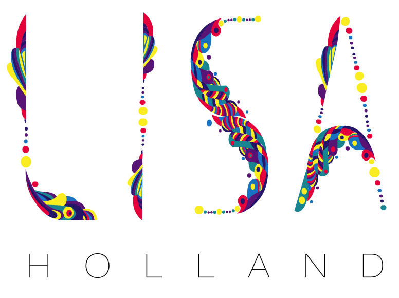
3. Simplicity is great

A simple logo isn’t a wrong one, but still many people (some of them logo designers) are circumspect regarding this concept. Their problem is related to the feeling of unfinished project when someone is seeing a simple logo, however here is another great advantage: a not very complicated structure is more easily to remember for ordinary people. A powerful logo is one that is known by the entire community and under these circumstances what is simple is amazing. 

Studying the logos of the global recognized brands this premise is set solid, nothing more than three colors, one or two fonts, simple shapes. I believe the collection below is pretty enough:


4. Originality makes the difference

An original concept of a logo puts the owner in a special light and usually the advantages are immense. The logo should be considered the graphical representation of the people behind it and in a world full of opportunities and possibilities to stand apart is difficult but profitable. Having a common logo is equivalent of nothing to say or being a decent provider in an ocean of other more colorful solutions.

5. A memorable logo is the base of a successful brand

If someone sees a logo and after a few days remembers it, then the graphical work deserves its money. The purpose of a logo is to make in the mind of the folks the connection between the owner and a quality service/product and a memorable logo is the start in accomplishing this task. The big problem is how to effectively create a wonderful & memorable work? The answer is based only on talent and a lot of work. 

Wednesday 22 June 2011

Artists to design 2012 Olympics posters, but no designers?

traceyeminwithpastgamesposters_0.jpgToday I cam across the news that twelve british artists have been selected to design the posters for the 2012 Olympic Games. The artists include Tracey Emin, Chris Ofili, Fiona Banner, Michael Craig-Martin, Martin Creed, Anthea Hamilton, Howard Hodgkin, Gary Hume, Sarah Morris, Bridget Riley, Bob and Roberta Smith and Rachel Whiteread. Their works will shown in a free exhibition at Tate Britain as part of the London 2012 Festival, and will go on sale this autumn (more here).


This is a great idea but couldnt some designers have been chosen too? What do you think?

Monday 20 June 2011

Watch Me Move at Barbican Art Gallery


The Barbican Art Gallery in London has devoted its summer show to a celebration of animation, from The Lumière Brothers to The Simpsons. Here are some highlights...

The exhibition takes place across the large art gallery space at Barbican, and mixes familar names from the commercial world with pieces by contemporary artists who have been influenced by animation techniques. Its title, Watch Me Move, is inspired by Winsor McCay's short from 1911, Little Nemo Moving Comics (still above).


The exhibition is divided into loose themes, opening with a section that looks at the early emergence of the genre. Included here are experiments with photography and science, as well as early cartoons, such as Walt Disney's bone-chattering short Skeleton's Dance, shown above, which was created in 1929 with Ub Iwerks.


Another delight is Winsor McCay's Gertie the Dinosaur (above, from 1914), which appears within a brief history of dinosaur special effects in the exhibition, spanning from McCay's delicate line drawing to Steven Spielberg's use of emerging CGI technologies in the 1993 blockbuster Jurassic Park.


A large section of the exhibition is devoted to the much-loved characters that have been created via animation, with screenings featuring everyone from Bugs Bunny to Betty Boop, Felix the Cat to Homer Simpson.

The Barbican gets around the problem of such a screen-heavy show by the use of clever exhibition design, by Chezweitz & Roseapple. A multitude of different screen sizes are used; some encourage you to stop and linger in specially created booths with speakers installed, whereas others allow you just to wander through soaking up the multitude of imagery on display. There is also an expansive 'cabinet of curiosities' featuring examples of plates from cartoons as well as the original puppets and figures from a number of films. In addition, there is a display packed with enough vinyl toys to keep any graphic designer (or kiddie) happy.The end result is a family friendly show, with films here for all tastes, child or adult. For the more hardcore animation fan, Watch Me Move offers the chance to rediscover classics of the genre, and also see the influence it has had on art, while for others it simply provides an excellent opportunity to while away a few pleasant hours watching cartoons.

Watch Me Move will be at the Barbican Art Gallery until September 11. There will be a series of talks, screening and events during the run, more info is atbarbican.org.uk/artgallery.


Friday 17 June 2011

David Meldrum's daily food illustrations

Swimming against the tide of the current proliferation of food blogs, illustrator David Meldrum has been documenting every item of food consumed each day for the last year, not online, but on paper in the form of daily illustrations. He began the project on June 15 last year and tomorrow will open an exhibition of all 365 drawings at the ARCH 402 Gallery in Hoxton...

In the drawings the artist lays bare both the delights and horrors of the modern diet as salads, bowls of delicious looking spaghetti, glasses of wine in elegant glasses find themselves rubbing shoulders with burgers from McDonalds, chocolate bars (Cadbury's Freddo is a recurring theme) and packets of crisps. Here are a few, dare I say it, tasters of what to expect from the exhibition:

The Food Illustrator Project runs from tomorrow June 17 - June 26 at the ARCH 402 Gallery, Cremer Street, London E2 8HD.
See more of the work at thefoodillustrator.com


Wimbledon as you have never seen it before


Sony has drawn inspiration from its own advertising archive for its latest spot, which sees the 2006 ad Balls recreated in leafy Wimbledon...

The ad, which promotes Sony's 3D coverage of the Wimbledon tennis championships, was created by digital agency Crayon. The original spot, by Fallon, saw thousands of brightly coloured balls thrown down the hilly streets of San Francisco. In the new ad these are replaced with tennis balls, which are shown bouncing through Wimbledon's quintessentially English streets. It is a carefully done homage, and the eagle-eyed will notice there is even a nod to the frog that appeared in the original commercial. 

Wednesday 8 June 2011

Debbie Reynolds' iconic cinema costume auction in pictures

As Debbie Reynolds prepares to auction her amazing collection of movie costumes and artefacts, I thought I would write about some of the highlights. 


The star of stage and screen has amassed an unparalled collection of iconic cinema costumes and artefacts which will go under the hammer on June 18 in Los Angeles. The auction contains 3,500 costumes, 20,000 photographs and several thousand original posters. Here are our pick of some of the remarkable highlights from a lifetime of collecting.


Who: Marilyn Monroe 
Movie: Seven Year Itch 
Monroe wore this ivory pleated "Subway" dress by Travilla, for her role as 'The Girl' in Seven Year Itch in 1955. After she stood on a subway grate and uttered the famous line "Oooh isn't it delicious?", the scene, and the dress, went down in Hollywood history. 
It was acquired by Debbie Reynolds directly from Twentieth Century-Fox during the 'pre-sale' when she bought all of the Marilyn Monroe wardrobe from the studio prior to the auction in 1971. 
Estimate: $1,000,000 - $2,000,000

Who: Marilyn Monroe 
Movie: Gentlemen Prefer Blondes 
This iconic costume was worn by Marilyn Monroe as 'Lorelei Lee' in the number 'Two Little Girls from Little Rock' with Jane Russell in Gentlemen Prefer Blondes, 1953. The slightly risqué bust area once again fooled the censors by including a shear body-toned fabric from the neck right down to the waist giving the impression of nudity without showing a thing. 
Estimate: $200,000 - $300,000


Who: Judy Garland 
Movie: Wizard of Oz 
The iconic blue dress worn by Garland as 'Dorothy Gale' in the Wizard of Oz, 1939. Made by Adrian, the cotton pinafore with polka dot trim bears a handwritten label "Judy Garland 3955." 
Estimate: $60,000 - $80,000

Who: Judy Garland 
Movie: Wizard of Oz 
Debbie Reynolds told how she nearly lost this pair of ruby slippers when her daughter Carrie Fisher, who played Princess Leia in the Star Wars trilogy wanted to give them to her director George Lucas as a thank you gift. 
Estimate: $120,000-$150,000

Who: Julie Andrews 
Movie: Sound of Music 
Red-brown nubby dress with ivory raw linen blouse was worn by Julie Andrews as Maria when she sang 'Do-Re-Mi' in Sound of Music. 
Estimate: $40,000 - $60,000

Who: Elizabeth Taylor 

Movie: Cleopatra 

The signature royal ceremonial headdress from the 1963 film 'Cleopatra'. Worn by Taylor when she enters Rome with Caesar's son by her side. 

Estimate: $30,000 - $50,000


Who: Rita Hayworth 

Movie: Salomé 

Rita Hayworth's 'Princess Salome' wore this flesh chiffon dress with halter by Jean Louis for the 'Dance of the Seven Veils' sequence in Salomé, 1953. 

Estimate: $12,000 - $15,000


Who: Madonna 

Movie: Evita 

Elegant black evening gown by Penny Rose worn by Madonna's character 'Eva Peron' in Evita, 1996. 

Estimate: $4,000 - $6,000