Sunday 16 October 2011

Tetley Tea Folk Just The Way You Are


Tetley, the British tea brand, has launched a new television commercial featuring Sydney, one of the Tetley Tea Folk, singing Billy Joel’s 1970s song “Just the Way You Are”. The ad is the fourth in the Tea Folk come-back series launched in September 2010. But in true Sydney style he cannot quite hit all of the notes and forgets some of the words. The Tetley Tea Folk have their own website, Youtube channel, Twitter and Facebook accounts. The Tetley Tea Folk will be back with an ad for Tetley Extra Strong on 22nd October and Tetley Green Tea in January 2012.


Sunday 9 October 2011

Muller Rice Cast Yogi Bear, Muttley and Mr Men to star in a £20m campaign

Müller has licensed cartoon characters Yogi Bear, Muttley and Mr Men to star in a £20m campaign that pushes the yoghurt brand as “fun and delicious”.


The television ads, created by TBWA, invite people to “stir a little bit of Wünder” into their lives by eating yogurts and dessert. It introduces the strapline “Wünderful Stuff”.

The cartoon characters are seen transforming a grey city into one with bright colours, rainbows and unicorns.

Lee Rolston, marketing director at Müller Dairy, says: “Over the years we have continued to stir in an imaginative mix of ingredients to turn a product which was seen as plain and ordinary into something which is fun and delicious.

“That’s exactly what the ’Wünderful Stuff’ campaign sets out to do. It captures the essence of the Müller brand which is essentially all about the enjoyment and fun of a great-tasting product.”


Saturday 8 October 2011

Twinings Get Back to You Advert

I recently saw this advert and instantly fell in love with the animation and soft colour palette. Here is what Twinings have to say:  
We've created this really quite extraordinary piece of animated advertising to metaphorically explain the hectic lives that women today lead, and how taking just 10 minutes out each day to reconnect with yourself can have such an impact on the rest of your day. 


We teamed up with animation house Psyop, working through the creative process from simple illustrations, to creating something that we believe is truly spectacular.  To bring the animation to life we have worked with up and coming young artist Charlene Soraia, to bring you the wonderfully emotional recording of "Wherever You Will Go", which is available to download on itunes from Monday 3rd October.

Friday 2 September 2011

Crit: Why Google has oodles of doodles

Today I found this article over at Creative Review and thought I would share:


There used to be a time when trademark lawyers advised against tampering with a logo or adding superfluous elements to it. The concern was that these additions and modifications would, by changing the original design, create further unregistered and therefore unprotected devices and that the exclusive rights to the original trademark could be weakened, or even lost. Consistency was considered to be the safest way. A key objective of corporate design guidelines was to reinforce trademark protection by ensuring a standardised corporate logo and attendant visual identification system. Most large corporations still follow this principle.

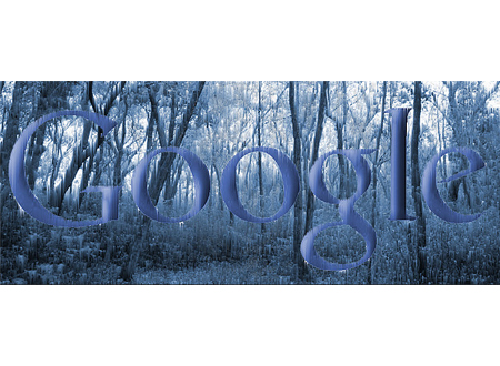
Google, though, is different. It says that "having a little bit of fun with the logo is part of the brand" and the company wilfully and regularly violates its own trademark. Since 1998, Google has used over 1,000 variations of the corporate logo in the form of Google doodles, the remodelled and playful iterations of the wordmark that appear on the Google homepage to highlight various holidays and anniversaries of historic events. (If you want to see all the doodles from 1998 to the present, just search for ‘Google doodles' or go straight to google.com/ logos.)

In March of this year, the US Patent and Trademark office granted Google a patent for its doodles but, surprisingly, that patent does not cover the individual doodle designs, instead, it relates to the invention of the idea and method of periodically changing the logo to entice people to the website. You might wonder how a company could be granted exclusive rights to the concept of frequently varying its logo, but that seems to be what has happened.


I can see that Google might want to prevent search engine competitors such as Bing and Yahoo! from doing similar things, but I remain puzzled as to how the company could have been granted exclusive rights to the notion of flexible branding that's been used by many other organisations for so long. Attitudes to brand building and brand protection are always changing and if, today, Google's lawyers are happy that the doodles do not threaten the protectability of the core Google brand, then I can see no reason why the doodles should not be deployed.

Like most people, I use Google as my main search engine and when a new doodle appears it usually raises a smile as I try to guess what it represents. Some are obvious while others need a bit more deciphering. I particularly enjoy the more abstract designs: the recent Alexander Calder mobile, the Les Paul guitar and the Braille dots, for example. Some of the more entertaining doodles are interactive, whilst others use animation, sound, and occasionally, live streaming.

Google is, of course, both global and local and the doodles reflect this. Some appear worldwide while others mark local events and only appear in the relevant countries. Large corporations like Google strive to create a sense of community among users and customers and the doodles support this aim. The doodles have a keen following and, although most designs are intended to have a life span of only 24 hours or so, some have been brought back by public demand and have been allocated their own individual Google web pages so they can live on in perpetuity - the Les Paul and Pac-Man doodles are two that have been honoured with this treatment. There's even a Doodle Store on the Google website where you can buy T-shirts, stickers and posters featuring various popular doodles.

Some doodles are developed through open competition and it's possible for the public to submit ideas and designs for consideration. In this way we're encouraged to share in the Google fraternity. When local events are ‘doodled', the global corporation perhaps appears a little less monolithic and a bit more approachable. 

As a designer, my main concern with the Google doodles is to do with the quality of the designs. Most of them are created by Chief Doodler Denis Hwang and his in-house team of designers. Some iterations are witty, intriguing, and well put together. Others, and particularly those that are developed through competitions, such as the Doodle 4 Google competition for schoolchildren, are, unsurprisingly, often visually crude, over cute, and amateurish. But the Google brand is probably big enough and strong enough to withstand these variations and a bit of corporate playfulness is to be welcomed.

That said, a global corporation, particularly one operating at the forefront of new information technology and openly committed to leading the way in its field, should demonstrate excellence in all that it does. Google says that its doodles are intended to "reflect Google's personality and love for innovation" and when it describes its values, the company says it has a "minimalist ethic" and is on a quest to create products that are "simple" and "beautiful" as well as "innovative". If those are core values, then it follows that all expressions of its identity, including the design of its doodles, should convey those values and be of the highest creative and artistic quality.

It's been suggested that Google may have grown too big or become too corporate to accommodate quirky and entertaining doodles, but I don't hold that view; the company describes its working atmosphere as "casual", so the informal doodles do fit the relaxed culture. 

I do, however, think that Google, in its quest for ‘beautiful' solutions, is too good a business to embrace inferior doodles. I'm all for a bit of fun, but I think there is also room here for a bit more quality control.


Friday 26 August 2011

Little Fille Amazing Giveaway!!!


I have been in love with Little Fille for a while now and always find myself oogling their gorgeous headbands. To my delight the lovely Mari is doing an amazingly generous giveaway! Up for grabs are 20 bright and beautiful headbands from the summer collection and a selection of the new autumn winter collection. Being a lover of anything colourful, flowery or jeweled I am praying I win this giveaway! It is one of the most generous giveaways I have seen online in a long while and i would never have to buy another headband again! (unless Little Fille release something beautiful which undoubtedly they will :P). 


Up for grabs are :


Here is what some of the Autumn/Winter new items look like on:

Beale fur lined turban (I WANT IT) and plain black suede turban (no rhinestones) 


Your choice of either grey crushed velvet or lace trimmed peter pan collar 

Your choice of either black or aqua stone gold tiara 

Here's how to enter:

  • Like us on Facebook, then enter a comment here with your email address.

That's it!

Extra entries and more prizes: 
  • Follow us on Twitter and tweet about the giveaway saying anything you like - as long as you link to this page (http://bit.ly/ogcuav), and mention that you need to be following @sarimantos to win.
  • Not the creative type? No worries, tweet:

    Can I please have all of these Little Fille headbands?! http://bit.ly/ogcuav Follow @sarimantos and RT to win
  • Blog about the competition/sale and tweet us the link, or post it here.
  • There will be extra prize packs for our favourite/most creative comments, tweets and blog posts - and they will be generous! Contest is open internationally.

3 random winners will also win any summer headband of their choice.


Thursday 25 August 2011

Artist Mocks the Absurd Poses in Fashion Photos by Showing Them in Real Life


Have you ever noticed how ridiculous many of the poses seen in fashion and glamor photographs are? Artist Yolanda Dominguez has a project called Poses highlighting how absurd and artificial the poses are by having a group of women do them in public locations and filming the reactions of passersby. It’s interesting how something so ridiculous when seen in real life can look so “normal” when done by a model in the context of a fashion photograph.

reblogged from http://www.petapixel.com

Friday 19 August 2011

C4's Seven Dwarves: a very small ad campaign

To promote Channel 4's new series Seven Dwarves – an observational documentary "following the lives of seven dwarf actors as they live together and perform in a production of Snow White" (we're not making this up) – 4Creative has subverted the notion of a huge billboard campaign by creating 20 mini poster sites...

Twenty of the miniature billboards,  complete with working lights and a stand-alone frame, have been placed in various locations around London over the last week or two including Cromwell Road and Picadilly circus.


Either the mini billboards are popular with passers by, or London councils don't like them... becasue almost all of them have disappeared.

Credits
Agency 4Creative
Creative director Tom Tagholm
Art director / copywriter Molly Manners
Producer Edward Webster / Nick Reeves
Photographer Gary Salter
Business director Stephen Johnstone
Marketing manager Gagan Rehill

Wednesday 17 August 2011

Music redraws Chester Zoo's identity

Manchester-based Music has just completed the rebranding of Chester Zoo. The new brand identity centres on a bespoke handdrawn typeface and logotype, created in collaboration with illustrator Adam Hayes. Music also worked with copywriter Mike Reed to develop a distinctive and playful tone of voice for the brand...


This is Chester Zoo's new logo, which exists in two forms, seen above and below


The new Chester Zoo type family contains four weights to increase flexibility of usage:

And, to maintain the illusion of brand literature being written by hand, there are a number of contextual alternates built in to the typeface...

There are also a number of alternate characters available in each weight of the Chester Zoo typeface which have suitably animal-themed decorations:

As befitting any rigorous branding programme, Music has created a colour palatte:

And there are also a number of stand alone animal illustrations, all created by Hayes, that can be used as and where necessary - such as the new map of the Zoo:

"The new brand centres on a personality and voice rooted in the work of those who make Chester Zoo what it is, encompassing their passion, integrity and knowledge," says Music's Anthony Smith who worked on the project with Craig Oldham. "Add to this the license for creative expression in how the font works and is applied – and the zoo has the means to make a powerful impact and really stand out in a competitive sector," he continues, "by telling their story in a very natural and genuine way."


Music has created a wide range of the zoo's new marketing materials, as well as its site map and signage - plus the identity for The Act for Wildlife campaign that the zoo has also just launched (the homepage of actforwildlife.org.uk shown below). Music is now working with Chester Zoo on updating its website, incorporating the new look.

Saturday 23 July 2011

Art Revealed by Revell

I recenlty came across this trailer on the Creative Review blog and instantly fell in love with it. i know that dropping pigment in water has been done before but it is still interesting to watch.  


Revell was commissioned by Red Bee Media to create the trail for the BBC's Art Revealed series. Though long famed for his beautiful still life shots, Revell, like many photographers, has recently been exploring moving image work prompted in part by publishers needing content for iPad apps 

Red Bee Media credits
Group creative director: Frazer Jelleyman
Creative head: Tony Pipes
Creative: Elie Zaccour
Producer: Deborah Stewart
Editor: Gerry Lindfield

Sunday 17 July 2011

Typographic Movie Posters by Patrik Svensson

Today I came across these fab posters on a friend's blog (view her post here). the following typographic posters are by illustrator and designer Patrik Svensson. I love the simplicity of these posters and how a few simple elements can convey a message.


Friday 24 June 2011

What should someone appreciate when seeing a logo?

Today I came across this article on design daily.com and thought I would share. 


Building a brand isn’t the easiest task in the world or the most important; a well-established brand requires a great deal of time and money. The tremendous effort of obtaining a serious brand, when this is successfully finished, is rewarded and the profit is huge. The examples are numerous in our global economy, but everyone should know that in this process a small element plays a big role.


 A logo is a small graphic element, which may contain words, letters or/and shapes. Regardless its structure, a logo is the entity, which makes the connection between the clientele and the company/website who own this. In accordance with the previous statement that means a logo is very important; personally I believe it’s true 100%. It is unfair, but usually people don’t have the time or the opportunity to check the quality of all the products in this world and as a result they apply a superficial judgment; a logo can be the construction upon which people base their opinions.


The specialists who are building logos are called logo designers and anyone can find them inside of the freelance job boards. They are numerous, but definitely there are enough people who have no acknowledgement about logo design. This article is written especially for the potential clients who didn’t care about logos until this moment and at the moment need one but it may be a pleasant lecture for any designer in order to refresh some basic principles.


1. A logo must be versatile


Initially a customer wants a logo for his website – nothing unusual and the creator of it doesn’t have any restrictions related to the logo-the happiest case. Although, after some time (years or months, really doesn’t matter) this client considers beneficial for his affair to put the logo on a banner, thus we must have here a print version. 

Unfortunately in many cases this version doesn’t look as good as the online one. Trouble might arise here. To resume and to obtain the conclusion of this situation is pretty simple:a logo must be versatile, it should look the same in the header of a website, on a banner and even on a T-shirt. It’s a sign of professionalism. My advice for any potential buyer of a logo is: think twice before saying that you need a logo only for a website.

2. The king is always in black and white format


This point came as a completion of the previous one, but because it is very important, it needs a special treatment. Always, a quality logo will look appealing in a black and white format. It can be regarded as a prolonged versatility but it hides another impressing fact. In the most cases a black and white format emphasizes mostly the concept of the  logo and not the graphical realization. There are trends, which are coming and leaving and any designer should pay attention to these to keep a logo updated but the concept of a logo remains and it must be eternal. 

On the other hand, a black and white logo will be always on trend and consequently won’t be a mistake to make it using no colorization.

3. Simplicity is great

A simple logo isn’t a wrong one, but still many people (some of them logo designers) are circumspect regarding this concept. Their problem is related to the feeling of unfinished project when someone is seeing a simple logo, however here is another great advantage: a not very complicated structure is more easily to remember for ordinary people. A powerful logo is one that is known by the entire community and under these circumstances what is simple is amazing. 

Studying the logos of the global recognized brands this premise is set solid, nothing more than three colors, one or two fonts, simple shapes. I believe the collection below is pretty enough:


4. Originality makes the difference

An original concept of a logo puts the owner in a special light and usually the advantages are immense. The logo should be considered the graphical representation of the people behind it and in a world full of opportunities and possibilities to stand apart is difficult but profitable. Having a common logo is equivalent of nothing to say or being a decent provider in an ocean of other more colorful solutions.

5. A memorable logo is the base of a successful brand

If someone sees a logo and after a few days remembers it, then the graphical work deserves its money. The purpose of a logo is to make in the mind of the folks the connection between the owner and a quality service/product and a memorable logo is the start in accomplishing this task. The big problem is how to effectively create a wonderful & memorable work? The answer is based only on talent and a lot of work. 

Wednesday 22 June 2011

Artists to design 2012 Olympics posters, but no designers?

traceyeminwithpastgamesposters_0.jpgToday I cam across the news that twelve british artists have been selected to design the posters for the 2012 Olympic Games. The artists include Tracey Emin, Chris Ofili, Fiona Banner, Michael Craig-Martin, Martin Creed, Anthea Hamilton, Howard Hodgkin, Gary Hume, Sarah Morris, Bridget Riley, Bob and Roberta Smith and Rachel Whiteread. Their works will shown in a free exhibition at Tate Britain as part of the London 2012 Festival, and will go on sale this autumn (more here).


This is a great idea but couldnt some designers have been chosen too? What do you think?