
Saturday 26 March 2011
Iconic Women - Marilyn Monroe
I have been on a bit of whirl today and completed two illustrations out of the five Iconic Women illustrations I am currently doing. This is the third installment and it is of Marilyn Monroe a woman that men drooled over. I found this interesting quote by the lady herself and I think it contrasts well with her sensual image.

Iconic Women - Coco Chanel
Here is my second installment for my Iconic Women Project. It is of the wonderful Coco Chanel a very inspirational lady.


Friday 25 March 2011
Iconic Women
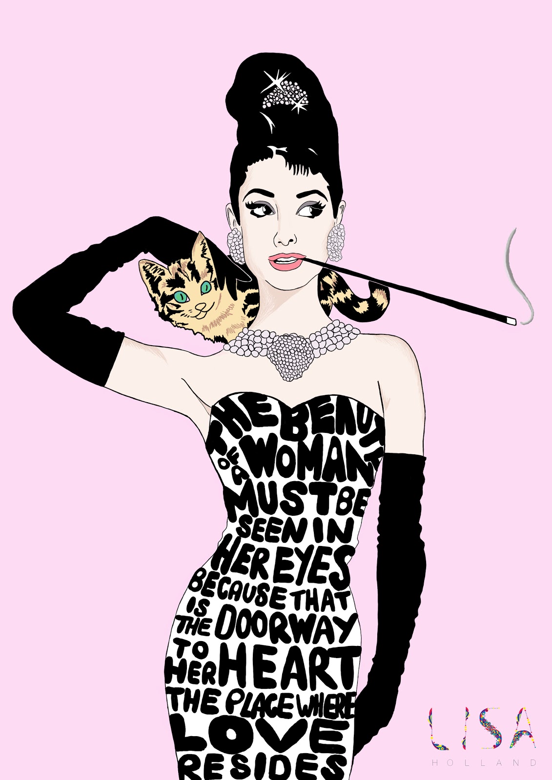
I have recently decided to embark on a new illustration project called iconic women. I completed the first drawing to day of Audrey Hepburn who is absolutely beautiful and a true icon. I plan to do others of Coco Chanel, Marilyn Monroe, Twiggy and Madonna.
I really wanted to experiment with typography within my illustrations because this is something I usually avoid! I decided to incorporate a famous quote by Audrey Hepburn and I am very pleased with the result! Stand by for more updates!
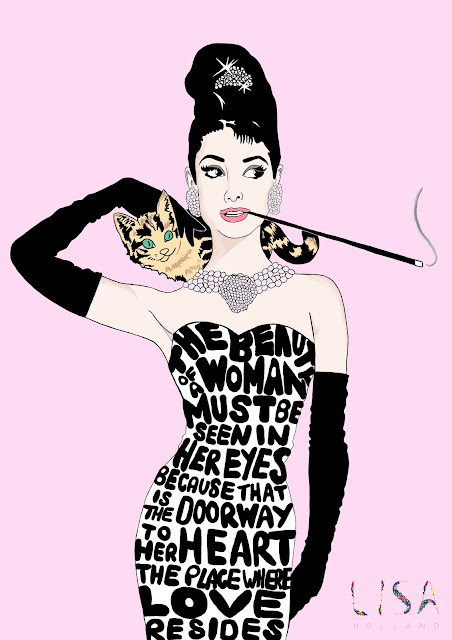
I really wanted to experiment with typography within my illustrations because this is something I usually avoid! I decided to incorporate a famous quote by Audrey Hepburn and I am very pleased with the result! Stand by for more updates!
Sunday 20 March 2011
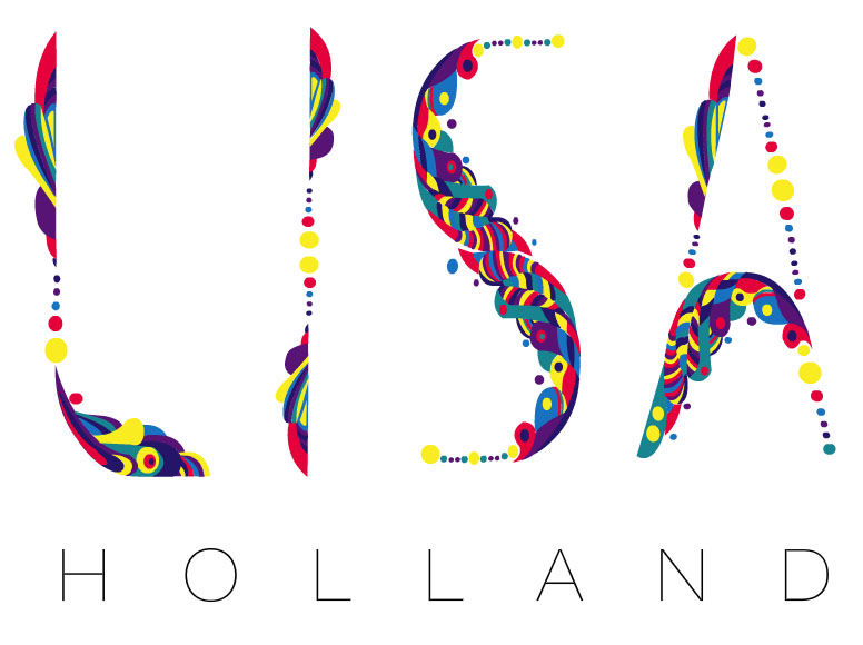
Lisa Holland Design on Behance

Or you can view my projects on the following links. I would really appreciate it if you wonderful readers would scroll down to the bottom of the pages and click the blue appreciate button!
The Fft Timeline EdisonBell Font Wired Font Contortionist Font
Wednesday 16 March 2011
Skins Illustration Competition
Last week I saw that the E4 website was hosting a competition that asked it's entrants to illustrate Grace's Fairytale. Although I am not really impressed with this season I thought I would give it a go. The competition doesn't have a prize but because I have been bogged down with teaching lately, I jumped at the chance to do something creative. Here is my entry:


I chose to illustrate this section of the story:
Once upon a time there was a little girl who had a dreamy pink Barbie princess castle. It had tiny little doors and tiny little windows, from which you could look into even tinier little rooms. In front of the grand entrance stood a darling porcelain doll with her arms held high above her head and one leg outstretched behind her. She wore dainty pink little ballet shoes, fastened with ribbon, that allowed her to dance on the tips of her toes. She was a tiny dancer, a prima ballerina.
Unfortunately after I uploaded my entry it was removed for being "off topic"!! Obviously I was quite frustrated because clearly the image is ON TOPIC!
Sunday 13 March 2011
Jamie's Dream School
Recently I began watching the television series Jamie's Dream School. I personally disagree with some of the comments that Jamie makes such as "if you don't get 5 A-C GCSE's you are on your knees". I found this comment incredibly irresponsible. If a teenager does not get all five there are always other options such as foundation courses and key skills, so to bark this at these young people without checking his facts is terrible.
Another issue I have with the program is that they seem to be blaming the teenagers "failure" entirely on the school. In some cases yes maybe the school did not do the best job, but in my opinion in schools it is roughly a 50/50 mix of teaching quality and the students attitude and motivation learn. The teenagers that are on this show have been called "ferrel" even by Jamie and have no manners or concept of being quiet when someone else is speaking or listening. One student bunked off school for most of his academic career and blamed the school for not learning anything!!!
Finally the main thing that bothers me is that Jamie Oliver actually thinks he can do a better job at teaching than a trained professional and quite frankly I think that is incredibly arrogant. He has set up this dream school with some of the best academic minds in the country spending god knows how much money to do this and claiming this is how teenagers should be taught. Has he even thought how unrealistic this is?
Anyway on a brighter note I absolutely love the illustrations that appear in the opening sequence of the program. They were done by Hanne berkaak
Here is an advert for the programme:
Friday 11 March 2011
Organise your desktop with Ikea

Hungarian ad agency Laboratory Ideas have come up with a nifty desktop app that allows you to organise your computer as if it were a set of Ikea shelves

"Just like Ikea's furniture, the Ikea e-Folder set has to be assembled by you: it consists of a background picture with an Expedit storage unit and an icon set made of Ikea's very own organisers," the agency say. "Once you set it up, you can put order to the chaos on your desktop."


For those wondering exactly how it works, or who would like to have a go, here are the English setup instructions for the Mac version:
1. Select the volume, application, folder, or file whose icon you want to stamp onto another, just click the icon to select it.
2. From the File menu, choose Get Info or press Command-I to open the Info window.
3. Click the icon in the upper-left corner of the Info window to select it.
4. From the Edit menu, choose Copy or press Command-C.
5. Select the volume, application, folder, or file whose icon you want to replace.
6. From the File menu, choose Get Info or press Command-I.
7. Click the icon in the upper-left corner.
8. From the Edit menu, choose Paste or press Command-V to replace the icon.
Thursday 10 March 2011
The Voiceless Campaign for The Zimbabwean
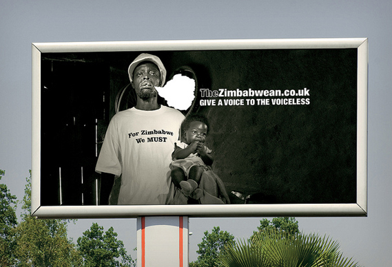
A new advertising campaign for The Zimbabwean highlights the newspaper's role in giving a voice to the people of Zimbabwe. The posters feature images taken by photojournalists who have worked in the country over the last two years, and direct viewers to the newspaper's website, where the photographers describe the circumstances in which the shots were taken.
The campaign is the brainchild of TBWA Hunt Lascaris in Johannesburg, the agency also behind the Trillion Dollar Campaign for The Zimbabwean, which won a D&AD Black Pencil last year, as well as many other awards.


The Zimbabwean newspaper is published in South Africa and the UK by a network of journalists exiled from Zimbabwe for refusing to write propaganda. The newspaper has succeeded in bringing real news from the country to its residents and to over a million Zimbabwean refugees in South Africa and abroad. TBWA Hunt Lascaris devised the latest campaign in response to recent events in the country, where 46 people have been arrested, detained and tortured for gathering to watch footage from Egypt and Tunisia during the recent political uprisings in North Africa.
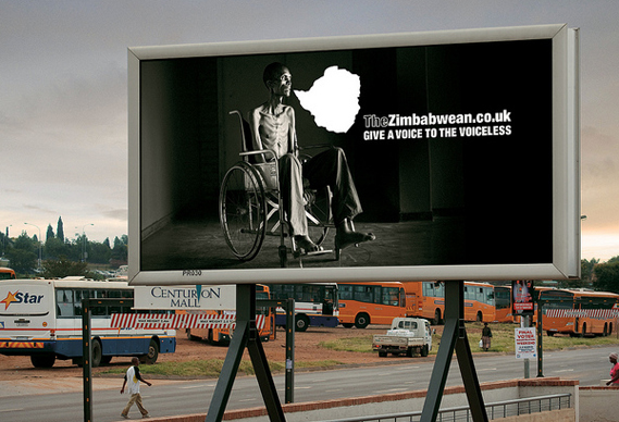
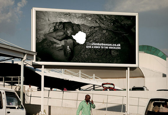
The idea to use the documentary images in the posters sprang from reports from Harare that police had raided an exhibition of similar images as it opened late last year. An empty speech mark, in the shape of the map of Zimbabwe, has been added to the images, to highlight the residents' lack of voice in the world. The billboard campaign has just launched across South Africa: to read more about the photographs, hear the eyewitness accounts, and also locate where the images were taken on a satellite map, visit thezimbabwean.co.uk.
Sunday 6 March 2011
New 7up Logo
7up has had a redesign. Now with more fruit, bubbles and, of course, a big number 7, fI was worried when I heard the news that the redesign would be a repeat of the disastrous Pepsi redesign but it's not half bad...
The new look was created by TracyLocke New York and will be rolled out (as they say) in several countries around the world, but not the US. Confusingly, 7up is owned by Dr Pepper Snapple Group in the US but the global brand is owned by PepsiCo: it is the latter that will carry the new look.
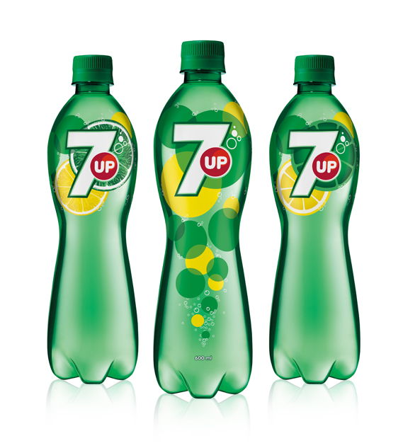
The design, is said to "goes back to the core elements that define 7up: lemons, limes, bubbles and refreshment".
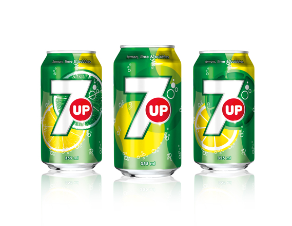
It's all notably cleaner than the previous incarnation, which looked like this (although these things tend to look better on the mock-ups than the actual bottles and cans).

There seems to be, post-Turner Duckworth's work for Coke, a distinct move away from the drop shadows, 3D effects and graduated fills that has cluttered up so much mainstream packaging and towards a far simpler, flatter aesthetic. Which is all to the good as far as I am concerned.
Friday 4 March 2011
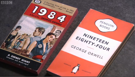
What does Nineteen Eighty-Four look like?
BBC4 screened an interesting film on book cover design last night, featuring contributions from designers John McConnell, David Pearson and David Pelham, who recalled the fascinating story behind his cover for A Clockwork Orange...
As part of the BBC's season of programmes about the written word, Paperback Writer: The Beauty of Books looked at how the role of the cover has changed from functioning primarily as a protective shell, to becoming a complex marketing tool that aims to, as McConnell says, "distill [the book] down into a visual signal." If you're in the UK, you can view the programme on the iPlayer, here.
The film centres on the design of the 15 Penguin covers of George Orwell's Nineteen Eighty-Four, interestingly bringing together two US and British editions from the mid-1950s for comparison (above).
In the US, Orwell's book was initially sold as a tale of "forbidden love... fear... [and] betrayal" and sported a Rock Hudson type figure as Orwell's protagonist, Winston Smith – while the aesthetic of the three-banded Penguin edition remained steeped in the austerity of post-war Britain.
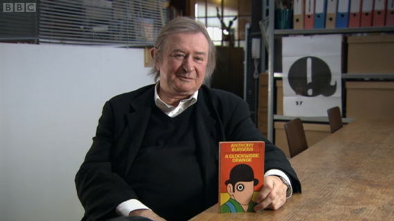
The story of David Pelham's cover for Anthony Burgess' A Clockwork Orange is also explored in detail. With Stanley Kubrick's film version imminent the director refused to grant Penguin the use of any stills for a book cover, so Pelham (having just been let down by a colleague) had to come up with something overnight in his flat.
Having seen the film, he used its visual language (there are no mentions of bowler hats in the book, for example) but focused on the eye of main character Alex.
At once an intoxicated, dilated pupil and a cog in the machine; the stark graphic device also alluded to Alex's punishment at the end of the book. When Kubrick's film was banned, it was Pelham's cover that initially became the visual identifier for Burgess' work.
The author, however, didn't like it and defaced his own copy, penning the rest of Alex's face in himself. But then Pelham, too, remains equally as unimpressed with his own work. "I don't like the image," he reveals. "I really don't but it has become iconographic. I don't like it because it was primarily done overnight, with very little thought, really. It was an emergency: a graphic design emergency because we had to a have a cover, because we'd miss the hit of the movie."
Thursday 3 March 2011
Crown and Glory
Crown and Glory was created in early 2010 by recent Sophie King. A serious addiction to hair accessories inspired the beginnings of Crown and Glory; with a single, hand painted feather butterfly.
The shop now boasts a variety of collections, from the dainty to the downright kitsch, all created with love and care. Each collection is full of frivolities and is sure to add the finest touch to every outfit. The accessories available are really lovely and the lovely Sophie is currently running a competition to win some goodies.
The competition will win a whopping 60 pounds worth of goodies! Which includes:


First Prize:
Worth a whopping £60 in total, one lucky lady will win the following:
- a £30 'gift voucher' to spend across the site
- Umberto Giannini Backcomb in a Bottle
- Umbertto Giannini Overnight Beauty Moisture Balm
- Batiste Dry Shampoo in Blush
- Wallpaper Rose Brand New Rapunzel Necklace


The shop now boasts a variety of collections, from the dainty to the downright kitsch, all created with love and care. Each collection is full of frivolities and is sure to add the finest touch to every outfit. The accessories available are really lovely and the lovely Sophie is currently running a competition to win some goodies.
The competition will win a whopping 60 pounds worth of goodies! Which includes:


Worth a whopping £60 in total, one lucky lady will win the following:
- a £30 'gift voucher' to spend across the site
- Umberto Giannini Backcomb in a Bottle
- Umbertto Giannini Overnight Beauty Moisture Balm
- Batiste Dry Shampoo in Blush
- Wallpaper Rose Brand New Rapunzel Necklace

Runner Up:
One Runner Up will also receive a pair of our Russian Doll Button Bobby Pins.
One Runner Up will also receive a pair of our Russian Doll Button Bobby Pins.
If I won this competition I would choose the following items:
The Giant Poppy Clip
Rock and Rosette Jersey Headband
Woodstock Rocks Necklace/Headband
Vintage Button Bobby Pins (Cage & Nest)
To enter the competition see the Crown and Glory blog here
Subscribe to:
Posts (Atom)