
BBC4 screened an interesting film on book cover design last night, featuring contributions from designers John McConnell, David Pearson and David Pelham, who recalled the fascinating story behind his cover for A Clockwork Orange...
As part of the BBC's season of programmes about the written word, Paperback Writer: The Beauty of Books looked at how the role of the cover has changed from functioning primarily as a protective shell, to becoming a complex marketing tool that aims to, as McConnell says, "distill [the book] down into a visual signal." If you're in the UK, you can view the programme on the iPlayer, here.
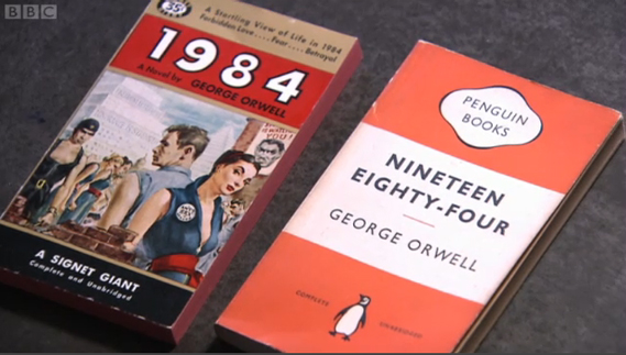
The film centres on the design of the 15 Penguin covers of George Orwell's Nineteen Eighty-Four, interestingly bringing together two US and British editions from the mid-1950s for comparison (above).
In the US, Orwell's book was initially sold as a tale of "forbidden love... fear... [and] betrayal" and sported a Rock Hudson type figure as Orwell's protagonist, Winston Smith – while the aesthetic of the three-banded Penguin edition remained steeped in the austerity of post-war Britain.
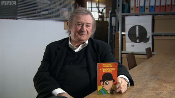
The story of David Pelham's cover for Anthony Burgess' A Clockwork Orange is also explored in detail. With Stanley Kubrick's film version imminent the director refused to grant Penguin the use of any stills for a book cover, so Pelham (having just been let down by a colleague) had to come up with something overnight in his flat.
Having seen the film, he used its visual language (there are no mentions of bowler hats in the book, for example) but focused on the eye of main character Alex.
At once an intoxicated, dilated pupil and a cog in the machine; the stark graphic device also alluded to Alex's punishment at the end of the book. When Kubrick's film was banned, it was Pelham's cover that initially became the visual identifier for Burgess' work.
The author, however, didn't like it and defaced his own copy, penning the rest of Alex's face in himself. But then Pelham, too, remains equally as unimpressed with his own work. "I don't like the image," he reveals. "I really don't but it has become iconographic. I don't like it because it was primarily done overnight, with very little thought, really. It was an emergency: a graphic design emergency because we had to a have a cover, because we'd miss the hit of the movie."
No comments:
Post a Comment