The Olympics are not too far away now and I am personally getting excited as I will be going to see Hockey and Basketball! The medal designs were released a while ago so I am a bit late on jumping on the bandwagon!
Designed by David Watkins, I like the purple ribbons which have been used to fit in with the Queen's Diamond Jubilee. The Greek goddess of victory, Nike has been used on the front which is a nice touch but a tad cliche. I am still strongly opposed to the logo (I am looking at you Wolf Olins). I also like the use of the Thames but I think they should use more iconic London scenery.
The square on the medal they say is to ’reinforce the sense of place, as in a map inset’ and the grid behind is said to ’radiate energy and represents athletes’ achievements and effort,’ but I think it adds clutter to the design and as I said they should have had more of a focus on London and possibly a more simple representation of sport.
What are your thoughts?
Monday 6 February 2012
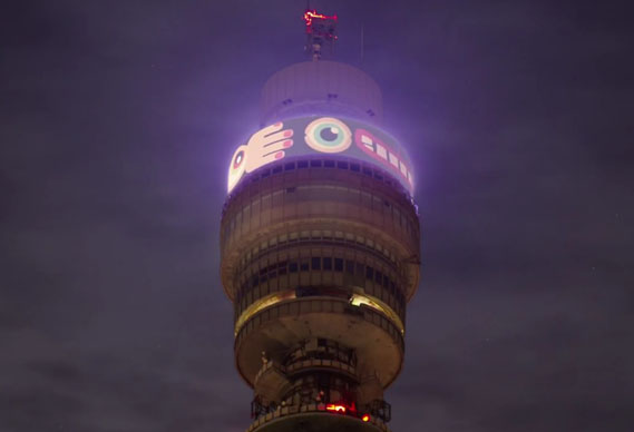
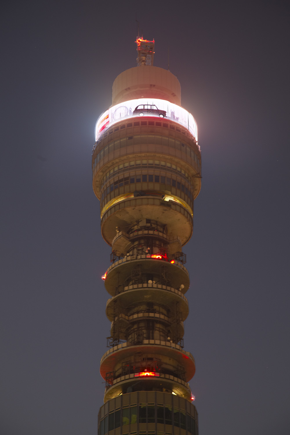
Young animators light up BT Tower
On January 31 five up-and-coming animators were given the chance to have their work run on the digital display at the top of London's BT Tower thanks to somewhereto_ , a nationwide 2012 Olympics legacy project to help young people in sport, culture and the arts
Somewhereto_ funds 'ideas and local talent to inspire creativity across the UK'. Its mission is to help young people realise their ideas by providing them with the resources and spaces to do so. The project, which is run by 'youth engagement agency'Livity in partnership with Channel 4, ran a contest asking for submissions from young animators for work to appear on what is Europe's largest digital display. The five young animators chosen were Dean Wright and Emma Wilson, Joe Collins, Lawrence Simpson and Will Adams (more here).
I have recently asked some of my year 12 and 13 students to set up a blog. I have found one (Alex Carter) which you can view here
Labels:
Animation,
animators light up BT Tower,
livity,
somewhereto
Subscribe to:
Posts (Atom)


