Monday 28 February 2011

Iran threatens 2012 boycott over logo


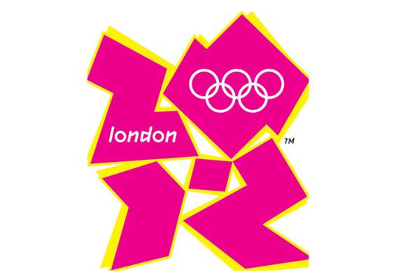
According to an article on the Guardian website, Iran has threatened to boycott the London Olympics because, it claims, the logo spells out the word 'Zion'

There may be a number of reasons to take issue with Wolff Olins' 2012 logo but, up until now, that it represents evidence of an international Zioinist conspiracy has not been one of them.

However, a Guardian story says that the Iranian government has made a formal complaint to the International Olympic Committee calling for the logo to be replaced and its designers "confronted" (whatever that means), warning that Iranian athletes might otherwise be ordered to stay away from the London Games.

An IOC official confirmed to the newspaper that the Iranian letter had been received but said: "The London 2012 logo represents the figure 2012, nothing else."


Friday 25 February 2011

Eco Friendly Design

For those of you who don't know I am currently completing my PGCE (Teacher training). I have the responsibility of taking care of the students that have specialized in design. Anyways a new brief that I have written for them (they will be starting on monday) required them to make a product from recycled materials and to design the packaging and branding to go with it. 


So whilst I lesson planning and all that boring stuff I started researching recycled products and I was really impressed with what I found! Here are some examples:


Yuliya Kyrpo

Gary Harvey


Edson Raup

My Sister's Art


Abigail Mary Rose Clark


Matt Carr


Thursday 24 February 2011

Goodbye Cow, Pirate, Cyclist from Cravendale


Charming advertising characters are thin on the ground these days, so it is with some sadness that I discovered Cravendale has decided to kill off the quirky group of housemates that has graced its ads for the last four years, in order to move its advertising in a new direction. Ad agency Wieden + Kennedy in London has created this amusing film to bid farewell to the cow, pirate and cyclist (and sheep on a skateboard)...

The ads were directed by Belgian directing duo Pic Pic Andre. To view more of their work, including a trailer for their film A Town Called Panic, visit Not To Scale's website here.

Tuesday 22 February 2011

My Paper Cut

Here is a paper cut that I did today and I was quite surprised how quickly I did it! It only took 40mins!

Illustrations for sale

Hello readers I thought I would let everyone know that I am selling my illustrations on on Big Cartel here and through my Facebook group here. These are the illustrations that are available and some that are coming soon.


Coming Soon


Monday 21 February 2011

Fashion Illustrations

Recently I have been inspired many fashion illustrators, so I thought I would have a go. The images below are not completed. I am planning to sew on red sequins to the illustration with the red dress and I am going to make feathers out of paper and glue them on for the blue illustration. I will keep you posted with updated images.


Walter de Maria's all-seeing eye

The barracks where Adolf Hitler began his rise to power have been given a new lease of life – as a gallery boasting just one exhibit
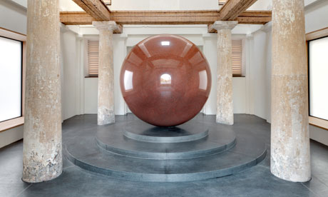
Capturing the surroundings … Walter de Maria’s Large Red Sphere, at the Turkentor in Munich. Photograph: Jan Bitter
There has always been a strongly architectural element to the art of Walter de Maria: it's vast in scale, yet perfectly proportioned. The Californian captured the public imagination in 1977 with Lightning Field: 400 stainless steel rods, arranged in a grid in a New Mexico desert. As well as reflecting and refracting changing patterns of light, Lightning Field blazes magnificently in electrical storms. It has become a place of secular pilgrimage, turning its creator into a cult figure in the process.
In the 1990s, De Maria began making great stone spheres, one of which, a 25-tonne piece of highly polished red granite, has just bumped down at the Turkentor gallery in Munich. A former barracks that once provided a bunk for a young soldier called Adolf Hitler, the Turkentor was bombed in the second world war, then all but demolished in the 1970s. Only a fragment, a grand neoclassical gatehouse, remained. The Turkentor, neatly situated between two major Munich galleries, has now been reconstructed by architects Sauerbruch Hutton – and given a new life as a gallery remarkable for the fact that its purpose is to house one artwork, De Maria's sphere, and nothing else.
"I've been working on the idea of one artwork in one building for 40 years," says De Maria. The title of the polished granite sphere he gave to the Chichu Art Museum, on the Japanese island of Naoshima, does seem to be reaching towards this notion of exclusivity: Time/Timeless/No Time. That gleaming orb resides, along with some water-lilies by Monet, in a beautiful underground museum designed by Japanese architect Tadao Ando, a former truck driver and boxer.
Large Red Sphere, as the Turkentor's sole exhibit is called, measures 260cm in diameter and sits in totemic splendour at the heart of the gallery, lit solely by the sun and the moon, through a glass roof. There is nothing else to see here, although the enveloping architecture, and the way light cascades around its shapes and spaces, are striking. Yet it is hard not to be wholly absorbed by Large Red Sphere, which watches you and the world beyond like some giant unwinking eye. It has a hypnotic quality: your own eye is drawn to both its surface and into its core. You can watch it for hours – and some people do. You can even touch it. "I like people to do that," says De Maria, although most visitors are too intimidated.
De Maria made his first sphere in 1990, for the Assemblée Nationale in Paris. With their highly polished or intricately worked surfaces, his orbs all offer unexpected – and beautifully distorted – reflections of their settings and anything that happens in them. In this way, paradoxically, they seem to contain their surroundings, making them the perfect accompaniment to sensitive architecture.
Large Red Sphere was originally to have been housed in the Pinakothek der Moderne, Munich's gallery of modern art, which flanks the Turkentor. "There were disagreements," says De Maria, "so what had been a site-specific piece was left looking for a home." Having finally found one in the Turkentor, it will now, hopefully, exorcise that building's demons. It was here, when the barracks still paraded along Turkenstrasse, that Hitler stayed after serving in the first world war; it was here that the future Führer gave some of his first political speechesto fellow soldiers; and it was here, in 1919, that he was nearly killed by leftists and liberals.
The barracks was seized that year by the ultra-rightwing Freikorps, German troops spoiling for a fight with those who would turn Bavaria into a Soviet socialist republic. It's stirring to think that this place of hatred and violence has now been reborn as a haven of peace, art and contemplation.
Sauerbruch Hutton cocooned the Turkentor in a sheath of pale brick, and gave it a concealed steel-and-glass roof. The sphere, set on a black plinth designed to raise its centre to eye level, is superbly framed by weathered doric columns and worn oak beams that have been here since 1814. The result is a delicious tension between the organic and the geometric, the straight and the curved – as if the energy of the sphere is contained, or even harnessed, by the notional cube that surrounds it.
"Placing the sphere was quite an operation," says architect Matthias Sauerbruch. "We had to lower it through the roof. As this is 270cm across, you can imagine how precise the installation had to be. But as it came down, it dropped the last inch! The vibration shook the building."
De Maria had been unsure about the Turkentor. "He thought the association was too military," says Sauerbruch. "He came around. His work has a spirituality. You could liken today's Turkentor to a roadside chapel, but without the religious connotations. People drop by to walk around the sphere and are out again in a few moments. Others seem lost in contemplation."
De Maria is now planning his next sphere. "This one will be blue," he says. "I turned 75 before Christmas, so who knows? It'll probably be the last one I do."
Thursday 17 February 2011

Meet the iPhone's newest heroes: Poto and Cabenga

Poto & Cabenga - a man and his horse - are the two heroes of a new iPod app game (just launched today) that features the charming illustration work of Richard Hogg...

The idea and the game play is simple, yet challenging... just by tapping the screen you can make the characters jump, either to hit point-scoring targets or to avoid angry hedgehogs, giant caterpillary things and angry boars. But within a minute of playing, the two characters become separated and you have to control both characters at the same time. Tap the screen, they both jump... but will our two heroes ever be reunited?.


Poto & Cabenga is a collaboration between artist Richard Hogg and game developers Honeyslug. Originally made last year for the Gamma 4 one-button competition, it was one of the 6 winning games and was showcased at Games Developers Conference2010. 

Wednesday 16 February 2011

Neville Brody - Genius or Wanker?

The internationally renowned designer Neville Brody in conversation with designer and writer Adrian Shaughnessy.
Neville Brody is an internationally renowned designer, typographer, art director, brand strategist and consultant. In the early to mid-80s, he was art director at the groundbreaking street magazine The Face before he moved to men’s style and lifestyle bible, Arena, in 1986.

 His monograph, The Graphic Language of Neville Brody, was published in 1988 and became the world’s best selling graphic design book.

Brody founded Research Studios in 1994. It has grown into a network with presence in London, Paris, Barcelona, Berlin and New York. Today, in addition to lecturing and contributing to a variety of cultural and educational initiatives, Brody works both independently on private commissions and alongside Research Studios on commercial projects for a diverse range of clients.

Recent typefaces by Brody include ‘New Deal’ originally used for the 2009 film by Michael Mann, Public Enemies and Peace 2 developed for Wallpaper* magazines August 2009 edition.

In September 2009 Arena Homme launched their 32nd issue with Brody as Creative Director.

You can watch the lecture here is well worth the watch

Tuesday 15 February 2011

Pass the sick bag

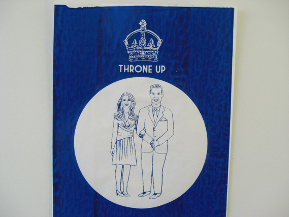
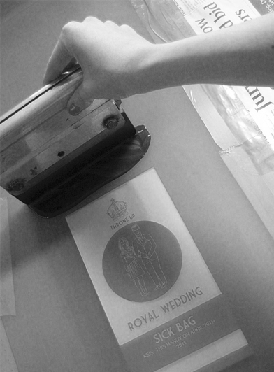
Not everyone in the UK is looking forward to the upcoming nuptials of William and Kate (apart from the days off, of course). Illustrator Lydia Leith has an essential Royal Wedding accessory.

Leith's screenprinted souvenir sick bags (under the punning brand name Throne Up) are available from her website at £3 each. As they say on the front, non-Royalists may want to keep them handy on April 29.


Sunday 13 February 2011

Nice work for Nike, Skittles, Lynx, Virgin Media and more...


The video above is the first of two new Nike ads from Wieden + Kennedy. This one, for the new CTR 360 boot, stars Barcelona midfield maestro Andrés Iniesta and features immersive surround sound, best experienced via headphones. Directed by Scott Lyon, the film was shot using six cameras mounted together to capture a 360 degree image of the players in action.


The second piece from Nike is a trailer for a new film project from Nike Basketball, which is directed by Robert Rodriguez. Titled The Black Mamba, the film stars Bruce Willis and Kanye West and will be released online on February 19. More info is here.


Skittles returned with another surreal little number this week too, starring two men trapped in giant fists. Agency: TBWA Chiat Day, New York. Director: Ulf Johansson.


BBH in London has released a TV spot for the new Lynx fragrance, Excite. While beautifully shot by Rupert Sanders, the ad's narrative takes the usual Lynx schtick of the deodorant rendering men irresistible to women to new, ridiculous heights as angels drop from the sky to seek out the Lynx wearer. Surely it's time for Lynx to look for a new narrative now. Please?


This new ad for Virgin Media (by DDB London) in turn features a curious remix of a familiar tune, with the lyrics from Madness's Our House set to the Dan Black track, Symphonies. The ad is directed by Seb Edwards and aims to show how the brand makes the world 'a more exciting place to live'.

Friday 11 February 2011

Mulberry says it with (digital) flowers


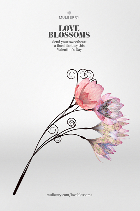
With Valentines day quickly approaching I thought the new Mulberry campaign was fitting to write about.Fans of luxury goods brand Mulberry can send their loved one a unique gift this Valentine's day – generative digital flowers that grow before their eyes. 


Mulberry's digital consultant Ross Phillips commissioned Daniel Brown to create the project, called Love Blossoms. Users register online (here), choose a pattern from Mulberry's Spring Summer 2011 collection and add a personalised message. Come February 14, a digital seed will be sent to the object of their affections via email. Once the link is opened, the seed grows into a unique bunch of flowers, the patterns of which are generated from the Mulberry prints.


Whilst this is an inventive and more eco-friendly Valentines Day gift I would still rather have a traditional present sorry planet!


Thursday 10 February 2011

Barbara Stauffacher Solomon: A Woman's Struggle in Graphic Design

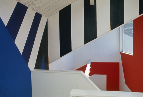
Barbara Stauffacher Solomon pioneered the use of Supergraphics (her work for The Sea Ranch, California, 1966 is shown above). A student of Armin Hoffmann, she later became disillusioned with graphic design. To those worried about the lack of women at the top of the profession, her story may prove illuminating.


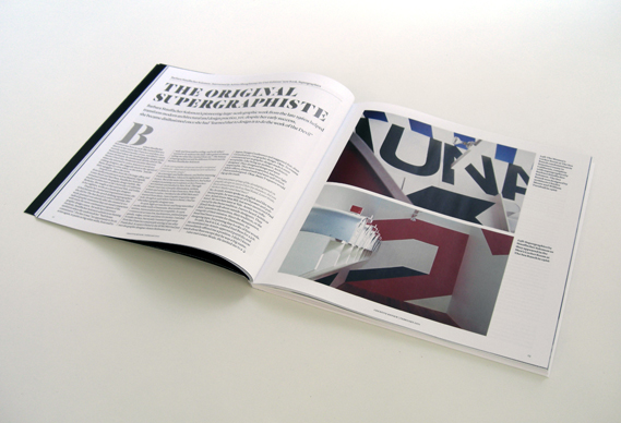
The current (February) print issue of Creative Review (which you can buy here) includes a wonderful interview with Stauffacher Solomon by Adrian Shaughnessy. In it, she highlights some of the issues that came to restrict her professional practice. At one point she describes her attempts to balance her working life in 1960s San Francisco with her home life and the limitations that imposed. While her male peers had the luxury of obsessing long into the night over every last detail and type choice, she had other demands on her time:

"Now that I happily live alone with my dog I have time to think, and I realise that I was always so frantically busy making money to live, taking care of my daughters and worrying about men, that I never had time to think, least of all about my work. At my office I just drew up the first design I visualised so that I could leave to pick up Chloe or Nellie from school, shop for dinner, cook and clean, play wife and do all the stuff that working mothers do."

In the 1970s, tiring of battles over receiving credit for her work and admitting to a distaste for the kind of self-promotion others used to advance their careers, she became disillusioned with graphic design and her role in it:

"Clever verbal architects used my skills to promote their projects; mostly real estate developments. I designed good design covers for many questionable commodities. I worked fast and well and my projects came in at or below the budget. I flattered the men, got paid and then went home to cook dinner."

And then in 1977, having closed her office, she went back to college, this time to the University of California, "to study what I hadn’t learned in Basel; the myths and misinterpretations behind the messages of the Modern Movement. I read mostly French philosophers cleverly discrediting the superficial visual covers I was so skilled at designing; the deceits I’d wrought on the world by camouflaging guileful land developments with good design covers and learned that to design is to do the work of the Devil."

And so one of the most talented designers of her generation was lost to the profession, preferring to pursue a career as an artist instead.


Tuesday 8 February 2011

J R Hartley Reimagined


Dabbling in nostalgia can be a risky advertising strategy, as this new spot for Yell from Rapier proves...The ad aims to update the Yellow Pages J R Hartley ad, which first aired in 1983, for the modern era. For those of a certain age, this classic ad (shown below) will be fondly remembered: it starred an elderly gentleman (actor Norman Lumsden) seeking out a book on fly fishing from a number of second-hand bookshops. After he returns home empty-handed, his daughter suggests searching via the Yellow Pages. He finds the book, and the final scene then reveals that it is in fact written by him. The spot struck a chord with popular culture and was spoofed in a number of sketches in the 80s by comedians including Harry Enfield and Fry & Laurie.


Saturday 5 February 2011

What are your Favourite Logos - Creative Review Results


A while back I did a blog post about Creative Review asking its readers what their favourite logos of all time are. Well the results are in!


No. 1 NIKE


No. 2 APPLE


No. 3 COCA-COLA


No. 4 FEDEX


No. 5 TARGET


No. 6 VW


No. 7 IBM


No. 8 CBS


No. 9 I LOVE NY


No. 10 GE


No. 11 MCDONALDS


No. 12 UPS


No. 13 PLAYBOY


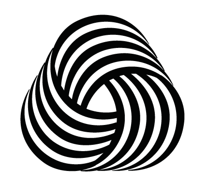
No. 14 WOOLMARK


No. 15 OBAMA '08


Thursday 3 February 2011

Marcelacamargo's Etsy Shop

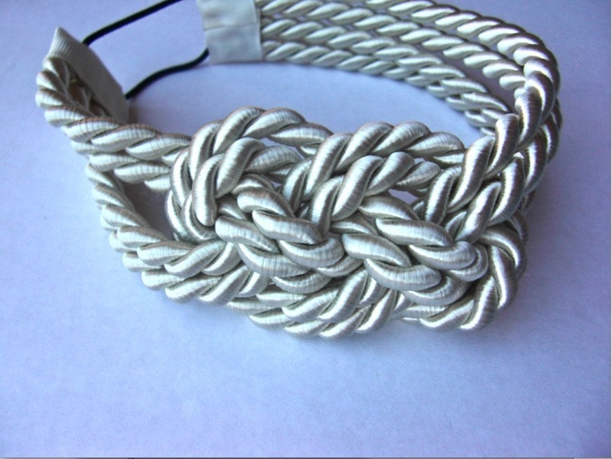
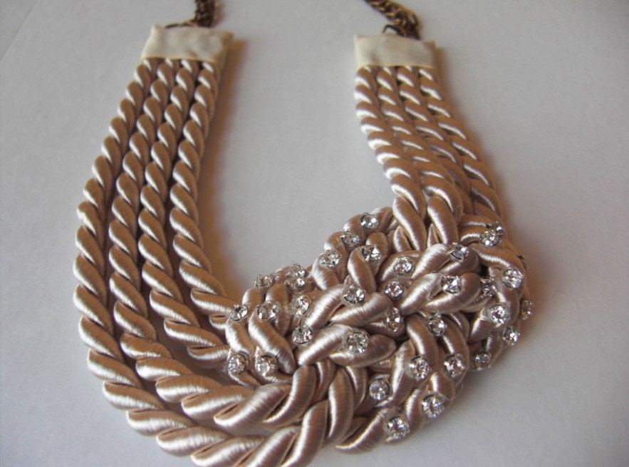
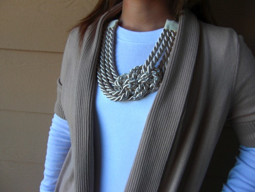
Recently I have been looking for a new hair accessory and I really wanted something different. So imagine my delight when I came across Marcelacamargo's Etsy Shop. The shop consists of beautiful handmade  jewelry, head pieces, and scarfs. All at a very reasonable price!


I chose to buy the Ivory Sailor Knot Headband. It was extremely cheap considering the quality of the item. It cost a mere £13 including delivery!! Here it is:

Other pieces that I am taken with are: