Sunday 31 October 2010

Advertising that will catch your attention: Awesome billboards

Most of the time, billboard ads are an annoyance, filling the side of the roads with cheap design and poor concepts. However, the billboards in this post are not your ordinary billboard. These are funny, creative and/or well-thought ads that really stand-out.

IKEA billboard


Guinness


 Lego giant billboard


Saturday 30 October 2010

Pumpkin Carving

Seeing as it will be Halloween soon my boyfriend and I decided to have a go at pumpkin carving. It is very fun and I would recommend that you have a go at it. Here are our efforts:

John's Pumpkin

My Pumpkin

I thought it would be fitting to mention a for more skilled artist called Ray Villafane whose pumpkin carvings are jaw dropping. Here is some of his work:


Thursday 28 October 2010

Graphic: Inside the Sketchbooks of the World's Great Graphic Designers


Stefan Sagmeister's sketch book


If you peek inside a sketchbook of a designer, you can see the birth of their ideas: everything from corporate communications to hand-screened posters, beginning life as wandering doodles. But sketchbooks are usually private affairs; you only see inside them at the personal invitation for the designer himself. That's why Graphic: Inside the Sketchbooks of the World's Great Graphic Designers (The Monacelli Press) is such an exciting new book: It's like a exclusive journey inside the brains of the greatest design minds working today.
Authors Steven Heller and Lita Talarico take us inside the sketchbooks of top designers like Milton Glaser, Michael Bierut, and Stefan Sagmeister, showing the intriguing evolution of familiar logos, typefaces, and book covers. Some designers use their sketchbooks as creative outlets for their over-computerized lives, making room for the painting and drawing their design work doesn't require. And many of these sketchbooks also serve as journals for the designers' daily life, so we get to see activities like meals and vacations documented as beautifully as future design projects.
It's also a treat to see how and where designers like to sketch. Some use fancy hard-bound Moleskines, some swear by cheap drugstore spiral-bound notebook. Some designers create collages made from found objects, others have a ritualistic dedication to using the same type of pen. But no matter how designers choose to use their sketchbooks, each page tells a fascinating story about the creative process. Graphic proves that a fresh sheet of notebook paper is destined to become a work of art when placed in the right designer's hands.
Milton Glaser Sketchbook


Wednesday 27 October 2010

Barbara Kruger at the Stedelijk

American artist Barbara Kruger's installation -- designed especially for the building’s largest gallery, known as the hall of honor -- wraps the floor and walls with printed texts that speak directly and loudly to the spectator.


her provocative, emotionally charged statements about how people regard and treat each other disrupt the decorum of a traditional museum space. bringing the world into her work and her work into the world, she confronts stereotypes and clichés, shattering them with a rigorous critique, a generous empathy and a sharp wit.


Tuesday 26 October 2010

Nike Extreme

When you are Nike, you just do it. There’s absolutely no point being timid or ordinary. You blaze trails, create trends, draw attention.

Access the brains behind the idea say this:

"Here at Access, we are creating Nike Extreme experiences around the globe. Here are a few of our concepts in which we use the Nike singular swoosh power to create serious buzz. The kind of buzz that goes viral because people love it. Because they are having fun doing it."


Canon Pixma: bringing Colour To Life

The project is a collaboration with biochemist/photographer, Linden Gledhill for Canon’s PIXMA colour printer range and Dentsu London.  The project features surreal ‘sound sculptures’ made of dancing droplets of paint captured in extreme detail as they react to sound waves.
 Linden has a mesmerising Water Figure series on Flickr, a fantastic example of “bringing colour to life”.  He agreed to collaborate with Dentsu London and travelled from Philadelphia to shoot the campaign stills on a Canon 5D Mark II, with a Canon EF 100mm Macro IS USM lens.
The ‘colour sculptures’ were created by stretching a balloon over a speaker to form a membrane.  A few drops of paint were then placed in the centre of the balloon and a single sharp note was played through the speaker, causing the paint to erupt for just a fraction of a second.


Sunday 24 October 2010

Hitler Hates Comic Sans!

Today I found this amusing parody. Hitler disaproves the use of Comic Sans MS for his propaganda campaign. Nice historical references (Nazis shutting down the Bauhaus, Stalin’s poster designs, Hitler’s art school past).


Swiss Graphic Design

Also known as International Style, the Swiss Style does not simply describe a style of graphic design made in Switzerland. It became famous through the art of very talented Swiss graphic designers, but it emerged in Russia, Germany and Netherlands in the 1920’s. This style in art, architecture and culture became an ‘international’ style after 1950’s and it was produced by artists all around the globe. Despite that, people still refer to it as the Swiss Style or the Swiss Legacy.
This progressive, radical movement in graphic design is not concerned with the graphic design in Switzerland, but rather with the new style that had been proposed, attacked and defended in the 1920s in Switzerland. Keen attention to detail, precision, craft skills, system of education and technical training, a high standard of printing as well as a clear refined and inventive lettering and typography laid out a foundation for a new movement that has been exported worldwide in 1960s to become an international style.

Grid Systems
A grid system is a rigid framework that is supposed to help graphic designers in the meaningful, logical and consistent organization of information on a page. Rudimentary versions of grid systems existed since the medieval times, but a group of graphic designers, mostly inspired in ideas from typographical literature started building a more rigid and coherent system for page layout. The core of these ideas were first presented in the book Grid Systems in Graphic Design by Josef Müller-Brockmann which helped to spread the knowledge about the grids thorough the world.


Nowadays grid systems are an established tool that is often used by print and web designers to create well-structured, balanced designs. There are many resources on the subject, one of them is an article by your own Smashing Magazine: Designing With Grid-Based Approach. You may want to take a closer look at it if you want to learn and find out more about grid-systems.


Typography:

One of the strongest characteristics of the Swiss style typography is the use of sans-serif typefaces such as Akzidenz Grotesk and Neue Haas Grotesk (a.k.a Helvetica). In fact, when Jan Tschichold wrote Die neue Typographie, he ignored any use of non sans-serif typefaces. With this philosophy, graphic designers were aiming at clarity, simplicity and universality. Helvetica, for instance, is a typeface that is famous for its pervasiveness: it is used in corporate identity, street signs, magazines and pretty much everywhere else. The Swiss Style advocates that the typeface does not have to be expressive in itself, it must be an unobtrusive instrument of expression.
This is by no means a rigid rule. When Swiss Style graphic designers advocate the use of sans-serif typefaces, they weren’t paying attention to the historical legacy and experimented with something new. Even Jan Tschichold himself admitted that his book was too rigid. If there’s one single lesson from the Swiss Style it is tolove and respect typefaces.


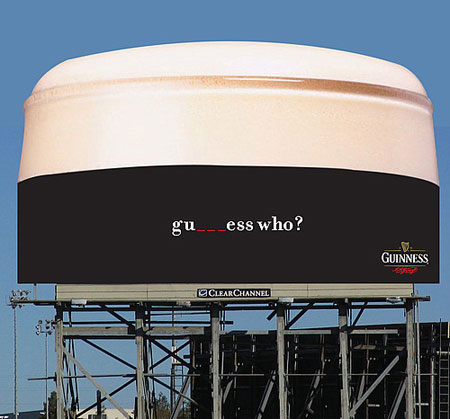
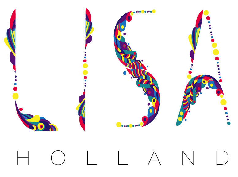
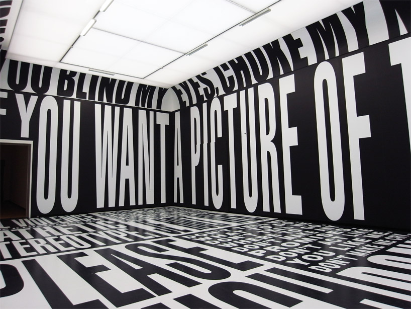
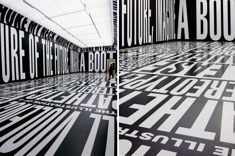
Examples of Swiss Design:


Saturday 23 October 2010

Logo Re-deign - iTunes, Gap, Myspace

Recently there has been a lot of re-designing or rebranding of famous logos including iTunes, Gap and Myspace. There has also been a great deal written about the new logos and whether they are for better or worse. So I thought I would share my opinions on them.


iTunes


The iTunes icon has been redesigned recently. The good part of this redesign is that Apple is getting rid of the disc, which makes perfect sense (considering the digital world we are now in). The bad part is that the gradients in the new icon are awful. I also wonder if staying with the musical note is a bit old-fashioned and literal – after all, we use iTunes for a great deal more than music although music seems to be its core competence. Overall I can understand the need for an updated logo but I do not think the new logo has been executed to its full potential.  anyway you can still change it for an alternative icon which you can see below:
Gap


The Gap logo redesign made a lot of buzz on the blogosphere during the past week, and there is a good reason for that: it looks awful. After all, Gap has built a solid brand since its humble beginnings in 1969. So why trade that for Helvetica (and an awkwardly placed square)?
Among the outcry (including a Twitter parody), Many other designers offered their own suggestions via Dribbble as well.Here are some of my favourites:


As it turns out, that’s exactly what Gap is asking for. Gap responded to the criticism via Facebook with this statement:
"Thanks for everyone’s input on the new logo! We’ve had the same logo for 20+ years, and this is just one of the things we’re changing. We know this logo created a lot of buzz and we’re thrilled to see passionate debates unfolding! So much so we’re asking you to share your designs. We love our version, but we’d like to see other ideas. Stay tuned for details in the next few days on this crowd sourcing project."

At the time of writing, Gap’s Facebook post had nearly 250 comments. It makes me wonder, is this is all a publicity stunt or is the company seriously this out of touch?

Myspace

I am unsure whether the logo is good. The concept behind it is clever, but I wonder what it’s worth in terms of branding. It just doesn’t feel right not to see part of the name. A new user to Myspace may not understand the name of the company/organization. On the other hand, it opens a whole world of adaptations for the logo 

Thursday 21 October 2010

Information Graphics

Yesterday I came across a wonderful piece of information graphics about the evolution of the Geek. The piece is designed by Dan Martell. It is a wonderfully illustrated and humourous piece! View the full size here


I thought it would be fitting to put a piece of my own Information Graphics. It is a project called 
"The Colours of Me". This Information Graphics piece focuses on the colours in my wardrobe. One version is jacket shaped which hangs on its own hanger and features a cardboard cut out of myself with clothes that fit onto it. 


Wednesday 20 October 2010

MTV SHOW: 16 and Pregnant on BEHANCE

The MTV reality show 16 and Pregnant has popped up on the Behance site. The designers behind all logos and promotional materials have uploaded their working process for the world to see. 


The designers themselves say:
"We were asked to make a new id, print and video for the rest of the World TV show launch campaign. However, we had to do this regardless base of the current identity from the USA TV show.We create a fresh identity that identifies with the youth MTV target, a brand illustration and brand gradients.


The primary challenge for us was working with a huge MTV Project that would be develop around the world, so we produced a comprehensive set of guidelines and brought the brand to life on a large series of graphics.
We also participated in the photography campaign and the TV commercials. We developed the graphics for the TV commercials and get in charge of the motions for it."