
Yesterday I did a post about my top 10 design magazines, todays is my favourite Typefaces. I have split the category into San Serif (no tails) and Serif (with tails).
SAN SERIF:
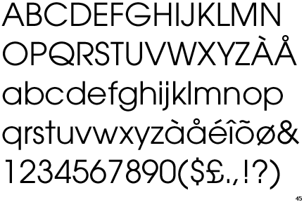
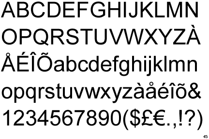
Gill Sans:
 Gill Sans is a sans-serif typeface designed by Eric Gill.The uppercase of Gill Sans is modelled on the monumental Roman capitals like those found on the Column of Trajan, and the Caslon and Baskerville typefaces.
The capital M from Gill Sans is based on the proportions of a square with the middle strokes meeting at the centre of that square. The Gill Sans typeface family contains fourteen styles and has less of a mechanical feel than geometric sans-serifs like Futura, because its proportions stemmed from Roman tradition. Unlike realist sans-serif typefaces including Akzidenz Grotesk and Univers the lower case is modelled on the lowercase Carolingian script.
Helvetica:
Helvetica was developed in 1957 by Max Miedinger with Eduard Hoffmann at the Haas'sche Schriftgiesserei (Haas type foundry) of Münchenstein, Switzerland. Haas set out to design a new sans-serif typeface that could compete with the successful Akzidenz-Grotesk in the Swiss market. Originally called Neue Haas Grotesk, its design was based on Schelter-Grotesk and Haas’ Normal Grotesk. The aim of the new design was to create a neutral typeface that had great clarity, no intrinsic meaning in its form, and could be used on a wide variety of signage.
In 1960, the typeface's name was changed by Haas' German parent company Stempel to Helvetica (derived from Confoederatio Helvetica, the Latin name for Switzerland) in order to make it more marketable internationally. It was initially suggested that the type be called 'Helvetia' which is the original Latin name for Switzerland. This was ignored by Eduard Hoffmann as he decided it wouldn't be appropriate to name a type after a country. He then decided on 'Helvetica' as this meant 'Swiss' as opposed to 'Switzerland'.
Frutiger:

Frutiger is a typeface by the Swiss type designer Adrian Frutiger. It was commissioned in 1968 by the newly built Charles De Gaulle International Airport at Roissy which needed a new directional sign system. Instead of using one of his previously designed typefaces like Univers, Frutiger chose to design a new one. The new typeface, originally called Roissy, was completed in 1975 and installed at the airport the same year.
Frutiger's goal was to create a sans serif typeface with the rationality and cleanliness of Univers, but with the organic and proportional aspects of Gill Sans. The result is that Frutiger is a distinctive and legible typeface. The letter properties were suited to the needs of Charles De Gaulle – modern appearance and legibility at various angles, sizes, and distances. Ascenders and descenders are very prominent, and apertures are wide to easily distinguish letters from each other.
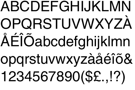
DIN:
DIN, an acronym for the German Deutsches Institut für Normung (German Institute for Standardization), and the name of an increasingly large realist sans-serif typeface family. In 1936 the German Standard Committee selected DIN 1451 as the standard typeface for use in the areas of engineering, technology, traffic, administration and business. Among the other recommendations adopted by this committee was an early precursor to the typographic grid.
The earliest version of a DIN typeface was released by the D Stempel AG foundry in 1923. Stempel's design was based on a 1905 typeface for the Königlich Preußische Eisenbahn-Verwaltung (Royal Prussian Railway Administration) and was applied mostly to schematics and blueprints. This version later became the basis for DIN-Engschrift (Condensed). In 1929, the Berthold foundry released a version, and it, too, was used mostly for technical drawings. Both of the early DIN typefaces were made available as lettering templates cut from an acetate material for drafting use. Both of the earliest DIN typefaces were used primarily in oblique form.
Popularity grew rapidly, once the DIN typeface was adopted. The most widely-used of the DIN-1451 group was DIN-Mittelschrift (Medium). It was released as a metal type, as acetate stencils for smaller applications, as larger metal stencils for application to vehicles and in train yards, and as cast metal lettering for street and building signage. Polish and Cyrillic variants of the face were developed in the 1940s.
Akzidenz Grotesk:
Akzidenz-Grotesk is a grotesque (early sans-serif) typeface originally released by the H. Berthold AG type foundry in 1898 under the name Accidenz-Grotesk. It was the first sans serif typeface to be widely used and influenced many later neo-grotesque typefaces. Max Miedinger at the Haas Foundry used it as a model for the typeface Neue Haas Grotesk, released in 1957 and renamed Helvetica in 1960. Miedinger sought to refine the typeface making it more even and unified.
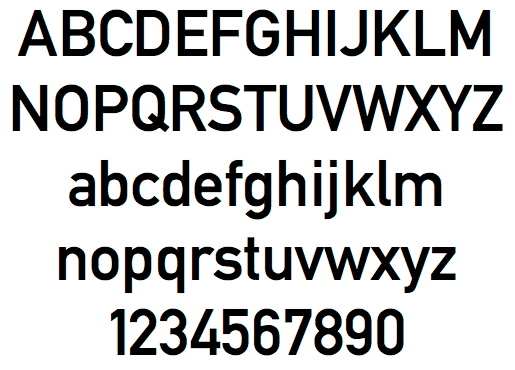
Avant Garde:
Avant Garde had a modest circulation but was extremely popular in certain circles, including New York’s advertising and editorial art directors. Herbert F. Lubalin, a post-modern design guru, was Ginzburg's collaborator on his four best-known magazines, including Avant Garde which gave birth to a well-known typeface of the same name. It was originally intended primarily for use in logos: the first version consisted solely of 26 capital letters. It was inspired by Ginzburg and his wife, designed by Lubalin, and realized by Lubalin's assistants and Tom Carnese, one of Lubalin's partners. It is characterized by geometrically perfect round strokes; short, straight lines; and an extremely large number of ligatures and negative kerning. The International Typefont Corporation(ITC) (of which Lubalin was a founder) released a full version in 1970.
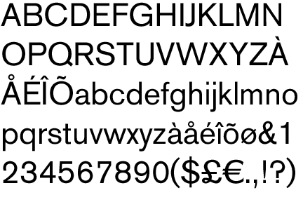
Arial:
The typeface was designed in 1982 by Robin Nicholas and Patricia Saunders for Monotype Typography. Monotype is the current owner of the copyrights for the Arial font software programs.
Contemporary sans serif design, Arial contains more humanist characteristics than many of its predecessors and as such is more in tune with the mood of the last decades of the twentieth century. The overall treatment of curves is softer and fuller than in most industrial style sans serif faces. Terminal strokes are cut on the diagonal which helps to give the face a less mechanical appearance. Arial is an extremely versatile family of typefaces which can be used with equal success for text setting in reports, presentations, magazines etc, and for display use in newspapers, advertising and promotions.
SERIF:
Garamond:
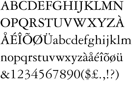
Garamond is the name given to a group of old-style serif typefaces named for the punch-cutter Claude Garamond. Most of the Garamond faces are more closely related to the work of a later punch-cutter, Jean Jannon. A direct relationship between Garamond’s letterforms and contemporary type can be found in the Roman versions of the typefaces Adobe Garamond, Granjon, Sabon, and Stempel Garamond.
Garamond’s letterforms convey a sense of fluidity and consistency. Some unique characteristics in his letters are the small bowl of the a and the small eye of thee. Long extenders and top serifs have a downward slope.
Garamond is considered to be among the most legible and readable serif typefaces for use in print (offline) applications. It has also been noted to be one of the most eco-friendly major fonts when it comes to ink usage.
Baskerville:
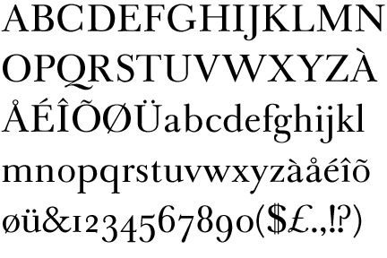
Baskerville is a transitional serif typeface designed in 1757 by John Baskerville in Birmingham, England. Baskerville is classified as a transitional typeface, positioned between the old style typefaces of William Caslon, and the modern styles of Giambattista Bodoni and Firmin Didot.
The Baskerville typeface is the result of John Baskerville's intent to improve upon the types of William Caslon. He increased the contrast between thick and thin strokes, making the serifs sharper and more tapered, and shifted the axis of rounded letters to a more vertical position. The curved strokes are more circular in shape, and the characters became more regular. These changes created a greater consistency in size and form.
Baskerville's typeface was the culmination of a larger series of experiments to improve legibility which also included paper making and ink manufacturing. The result was a typeface that reflected Baskerville's ideals of perfection, where he chose simplicity and quiet refinement. His background as a writing master is evident in the distinctive swash tail on the uppercase Q and in the cursive serifs in the Baskerville Italic. The refined feeling of the typeface makes it an excellent choice to convey dignity and tradition.
Bodoni:
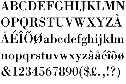
Bodoni is a series of serif typefaces first designed by Giambattista Bodoni in 1798. The typeface is classified as didone modern. Bodoni followed the ideas of John Baskerville, as found in the printing type Baskerville, that of increased stroke contrast and a more vertical, slightly condensed, upper case, but taking them to a more extreme conclusion. Bodoni had a long career and his designs evolved and differed, ending with a typeface of narrower underlying structure with flat, unbracketed serifs, extreme contrast between thick and thin strokes, and an overall geometric construction. Though these later designs are rightfully called "modern", the earlier designs are "transitional". Among digital versions, there are two good examples of the earlier, transitional period: Sumner Stone's ITC Bodoni, and Günther Lange's "Bodoni Old Face" for Berthold. Virtually all other versions are based on Bodoni's most extreme late manner.
Some digital versions of Bodoni are said to suffer from a particular kind of legibility degradation known as "dazzle" caused by the alternating thick and thin strokes, particularly from the thin strokes being very thin at small point sizes. This only occurs when display versions are used at text sizes, and it is also true of much display type that is used at text sizes. Non-dazzling versions of Bodoni that are intended to be used at text size are "Bodoni Old Face", optimized for 9 points, and ITC Bodoni 12 (for 12 points) and ITC Bodoni 7 (for 7 points).
No comments:
Post a Comment