
iTunes
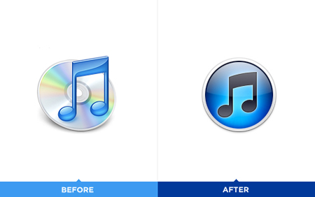
The iTunes icon has been redesigned recently. The good part of this redesign is that Apple is getting rid of the disc, which makes perfect sense (considering the digital world we are now in). The bad part is that the gradients in the new icon are awful. I also wonder if staying with the musical note is a bit old-fashioned and literal – after all, we use iTunes for a great deal more than music although music seems to be its core competence. Overall I can understand the need for an updated logo but I do not think the new logo has been executed to its full potential. anyway you can still change it for an alternative icon which you can see below:
The Gap logo redesign made a lot of buzz on the blogosphere during the past week, and there is a good reason for that: it looks awful. After all, Gap has built a solid brand since its humble beginnings in 1969. So why trade that for Helvetica (and an awkwardly placed square)?
Among the outcry (including a Twitter parody), Many other designers offered their own suggestions via Dribbble as well.Here are some of my favourites:


As it turns out, that’s exactly what Gap is asking for. Gap responded to the criticism via Facebook with this statement:
"Thanks for everyone’s input on the new logo! We’ve had the same logo for 20+ years, and this is just one of the things we’re changing. We know this logo created a lot of buzz and we’re thrilled to see passionate debates unfolding! So much so we’re asking you to share your designs. We love our version, but we’d like to see other ideas. Stay tuned for details in the next few days on this crowd sourcing project."
At the time of writing, Gap’s Facebook post had nearly 250 comments. It makes me wonder, is this is all a publicity stunt or is the company seriously this out of touch?
Myspace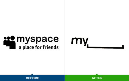
I am unsure whether the logo is good. The concept behind it is clever, but I wonder what it’s worth in terms of branding. It just doesn’t feel right not to see part of the name. A new user to Myspace may not understand the name of the company/organization. On the other hand, it opens a whole world of adaptations for the logo
No comments:
Post a Comment