
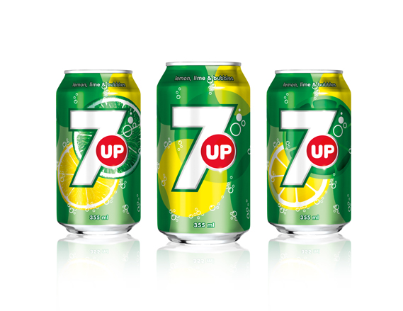
7up has had a redesign. Now with more fruit, bubbles and, of course, a big number 7, fI was worried when I heard the news that the redesign would be a repeat of the disastrous Pepsi redesign but it's not half bad...
The new look was created by TracyLocke New York and will be rolled out (as they say) in several countries around the world, but not the US. Confusingly, 7up is owned by Dr Pepper Snapple Group in the US but the global brand is owned by PepsiCo: it is the latter that will carry the new look.
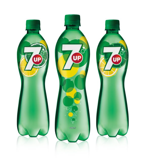
The design, is said to "goes back to the core elements that define 7up: lemons, limes, bubbles and refreshment".
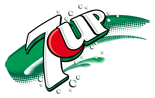
It's all notably cleaner than the previous incarnation, which looked like this (although these things tend to look better on the mock-ups than the actual bottles and cans).
There seems to be, post-Turner Duckworth's work for Coke, a distinct move away from the drop shadows, 3D effects and graduated fills that has cluttered up so much mainstream packaging and towards a far simpler, flatter aesthetic. Which is all to the good as far as I am concerned.
I didn't note that the 7up logo changed (maybe because i don't like it) but it's very interesting that the company looks for to seem more "natural" according the new trends in the food industry.
ReplyDeletePersonally I am into coke :). When I look at the previous 7UP logo it has an old taste (literally)...
DeleteI like 7 UP but prefer sprite or coke. I know the old logo looks very old fashioned!
ReplyDelete