
I always feel jealous when I see a copy of New York magazine, jealous that my own country's capital city, London, doesn't have such an intelligent, funny and well-designed equivalent title to document its life and times.
There are lots of things that New York does well, but the thing it does best is its infographics. After Information is Beautiful's David McCandless had his infamous set-to with Neville Brody on Newsnight, the role of infographics has been increasingly questioned: many are beautiful but are they also meaningless? The infographics in New York are sometimes the former, but never the latter.
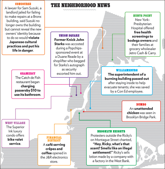
What sets New York's infographics apart (created by the design department under design director Chris Dixon) is that they combine journalistic rigour with design excellence in almost equal measure. A particular favourite is regular feature The Neighbourhood News. A map of New York is annotated with short news stories from different boroughs across the city, neatly encapsulating its diverse nature: an Upper West Side lady reports the theft of $1 million worth of jewellery from her apartment while, in outlying Soundview, police remove a three-foot-long snake from a man's bathroom.
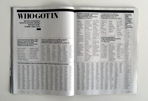
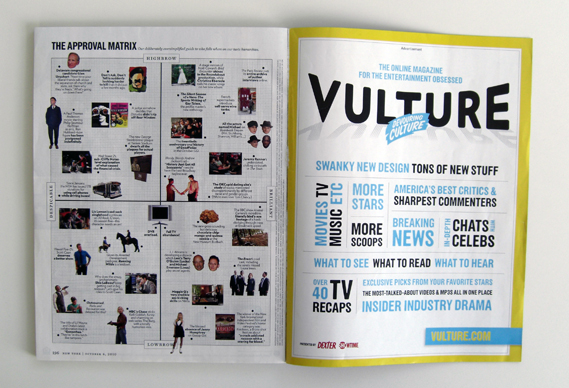
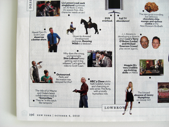
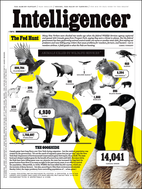
Elsewhere, infographics are used to illustrate and explain features and news stories, adding rather than merely decorating. Sometimes a whole spread will be devoted to data, such as Who Got In (above from the 4/10/10 issue), a recent piece on the Manhattan social scene that simply listed the guests at all the biggest parties in one week. And they are frequently funny, especially The Approval Matrix "our deliberately oversimplified guide to who falls where on our taste hierarchies".
No comments:
Post a Comment