
 A while ago I did a post about Creative Review asking its readers to nominate their favourite logos. The Creative Review team have said they received a lot of votes for the classics of the genre. But the exercise also threw up some less celebrated but still worthy contenders.
 For a special issue in April, Creative Review will be putting together a list of the 25 greatest logos. Last week,they asked readers to nominate their top five. Among the Apples, FedExs and V&As, readers also drew attention to some forgotten classics and little known favourites.
One reader put forward the 1974 New Zealand Commonwealth Games logo by Colin Simon (shown top). The mark cleverly combines the 7 and 4 of the year, the NZ of New Zealand, the Union Jack and even an X for the tenth games. Read more about it here


There was quite a bit of support for Raymond Loewy's New Man ambigram from 1969
Alan Fletcher's Lucas Industries mark was also noted

and don't forget David Gentleman's 1968 British Steel logo

Alan Clarke nominated, among others, the Leica mark
the 1968 Nederlandse Spoorwegen (Dutch railways) logo by Gert Dumbar and Gert-Jan Leuvelink for Tel Design had a lot of fans

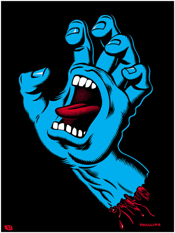
On a very different plane, 'Fidalgo' suggested Santa Cruz skateboards' Screaming Hand by Jim Phillips
Over three hundred people have voted so far but the Creative review team are still asking for more so head to their site and vote!
No comments:
Post a Comment