
In an interview with Motionographer the designers behind the new logo said that the Comedy Central logo was not the result of a logo redesign assignment, but an invitation to solve some of Comedy Central’s core business challenges. A part of the brief said, “They had a solid reputation with great shows, but the shows were not being attributed to the network and they were not getting as many young viewers as they wanted.”
You can watch an interesting video about the logo design here
The most interesting part of this project is how they got to the solution. They explained, “Comedy itself is super social . . . they were not behaving socially, they were a tv station that just talked to you, one person at a time. The old paradigms of viewing times, etc, are not how consumers interact today.” In a way they were able to look back in a media neutral way and make the decision. “We should start with digital, start with the digital presence and build around that.”

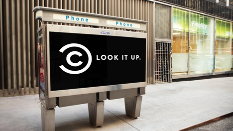
So the team at the Lab invented a branding device that they felt could live in any medium. Alicia explained “the idea of this packet” which would shorten the distance between the viewer and the channel by delivering a packet to the audience through digital media, leveraging social functionality to connect the right comedy to the right audience. The goal, Alicia said, is for the packet to “behave as an object that you could share, and the object would retain branding while being screen agnostic”. This lead to a discussion on how Comedy Central could become more visible outside of the television screen: on the street, in advertising, online, on mobile platforms, tablets and smart phones. Hal cited one of the biggest challenges, “How do we get our identity to travel along with these clips that end up on YouTube?”
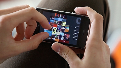
The solution kept restating itself. “Being screen agnostic was something that just we kept going back to them on.” thelab’s solution included pages of web, tablet and mobile design comps with new navigation models demonstrating how a viewer might find the packets of content they’re looking for and what was trending, tagged or even popular amongst friends. As this structure became clear, they needed a way for viewers to identify them.
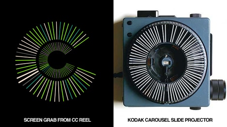
In their pitch, thelab created the comedy mark as a branding device. The C is derived from a slide carousel of “packets” viewed from above, not unlike the Kodak Carousel Projector. This C becomes the playful center of a 3d explosion of screen caps and colors in a muted palette with elegant typography. When the action rests, the flat gothic round c, is met with a second C at the same line weight to form an incomplete circle, resulting in a c surrounded by a larger backward C. In its final representation, the mark looks not unlike the © symbol with a chunk cut out of the left side. The new symbol works in a similar spirit, effectively attributing and tagging every content packet as Comedy Central’s wherever it appears.
From the creative:
“We Should Explain, Our logo has changed. No longer do you see the big buildings and globe, that quite literally said, COMEDY CENTRAL on top of it. Please welcome the new mark. We affectionately call it the COMEDY MARK. It works WAY F*CKING better than that other one we had. Big building-y globe, you served us well, but we moved on.
Thanks, Comedy Central”.
No comments:
Post a Comment