
Ever thought which is the hardest job for graphic designers? Let me…It is to effectively visualize a concept into a single image. This is the exact requirement in creating a powerful print ad for newspaper, magazine or billboards. A print ad copy consists of two elements: visual imagery and typography. Although a picture is worth a thousand words, but the power of words cannot be underestimated. And the best way to illustrate words is through effective use of typography.
Challenges for Graphic Designers in Print Ads:
Creating print ads is quiet a challenging job for the graphic designers. There are a few reasons that cause the making of print ads a little tricky, e.g:- • Say more in Less Space: For starters, a print medium has less space than any other advertising medium. You need to communicate efficiently and effectively.
- • Lack of Emotions: Print ads lack the emotions that TV ads carry. You need to manipulate the words and pictures to create an attractive copy.
- • No Sound or Visual effects: In creating a print ad there are no visual aids or sound effects, you use an immovable media to create a moving ad.
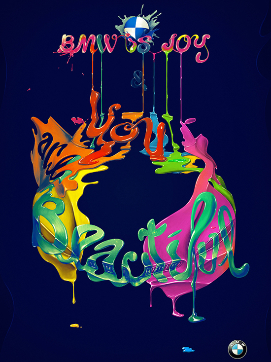
BMW is joy
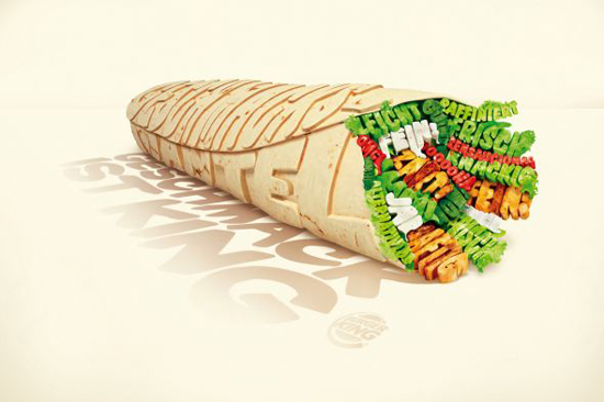
Burger King: Wrap
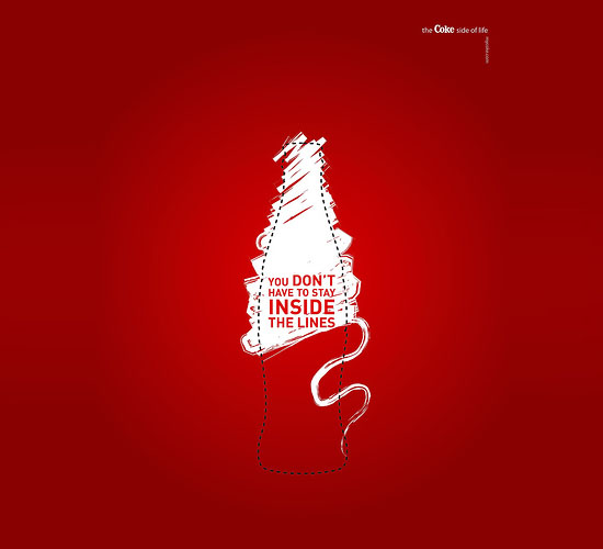
You Don’t have to stay inside the lines
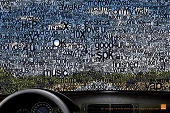
Orange – SMS
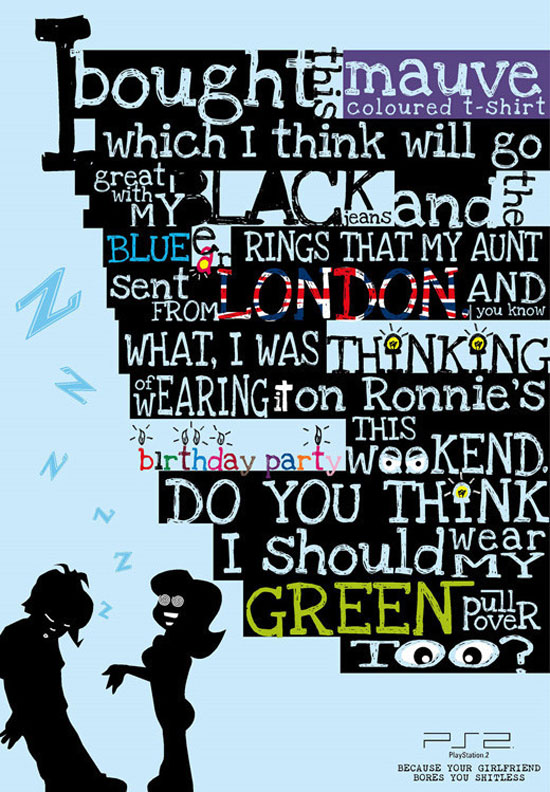
PlayStation 2: Girlfriend
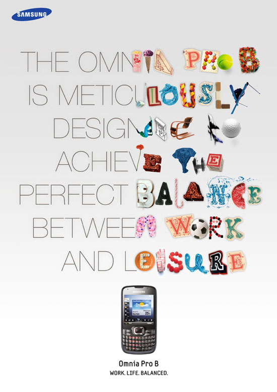
Samsung Omnia
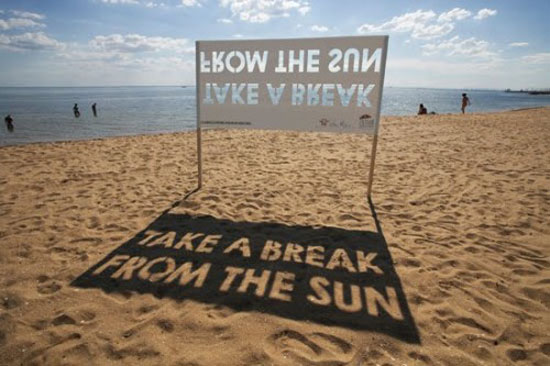
Take a break from the Sun
No comments:
Post a Comment