Showing posts with label Graphic Design. Show all posts

Tuesday, 24 April 2012

Diamond Jubilee Marmite

 
Marmite is a spread that you either love or hate. I personally really like it. In the past Marmite have released various re-designs of their classic jar for special events. So I was very happy to see the Diamond Jubilee special edition Marmite jar.

The limited edition Marmite packaging has replaced the brand's usual yellow white and red label in favour of the red white and blue colours of the Union Jack. The illustration of a marmite and spoon on the front of the label has been replaced by a crown and brand name itself has been changed to Ma'amite. The jar also features a red, rather than the usual yellow, lid.

“We wanted to pay a fitting tribute to the Queen – from one British institution to another," explains Unilever's marketing manager Nicola Waymark of the limited edition packaging.

Ma'amite is on sale at all good high street retailers including Morrison's, Sainsbury's, Tesco and Waitrose. It will also be available from marmiteshop.co.uk from next Monday (April 30).

Friday, 13 May 2011

The new Little Chef

Venturethree has completed an overhaul of Little Chef that sees the brand adopt what the consultancy claims is a 'Wonderfully British' approach. And 'Charlie the Chef' has a new outfit too 


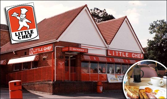
Little Chef has been trying hard to update its dowdy image ever since it was taken over by new owners in 2007. Heston Blumenthal was brought in to update its menu, the process of which was featured in a TV documentary. 


Blumenthal introduced new dishes and new cooking methods in a trial modernised branch of Little Chef in Popham, Hampshire. The exercise apparently proved successful – the chain has opened nine new branches in the past year and plans 20 more. 

Venturethree has, it says, tried to reposition the chain as a 'modern British brand' with new menus, interiors and the introduction of a take away service. 


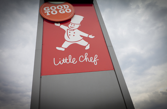
First of all, there's the logo. Venturethree has given the Little Chef himself, known as Charlie, a new outfit and relieved him of that strange bowl of white stuff he previously bore aloft in his right hand. He no longer seems to be wearing a romper suit and instead sports an on-trend double-breasted affair (new Charlie shown top, old Charlie below).


Apparently he is also "friendlier and more refined, with new energy and purpose," according to venturethree's CEO and strategic director Philip Orwell. Erm, OK. Well, he certainly looks more modern (perhaps based on Heston himself?) 

The logotype has also changed, the upper case having been replaced by that old design consultancy standby for 'friendliness', the script face.

There will also be a new range of Good To Go take away food

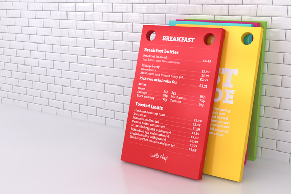
A new colour scheme is designed to tie in with the British theme, featuring (as seen on the trays above) 'mushy pea green, raspberry ripple pink, English mustard yellow and baked bean orange'.

Most striking are a series of Pop Art style giant sculptures of a ketchup bottle, tea mug and lollipop (a normal size version of which kids get for finishing their meal) that will appear at various Little Chefs around the country.

Venturethree worked with Ab Rogers Design and Cake on the project which also includes new interiors

Having spent some dismal times in various Little Chefs  the overhaul (and the promise of better food) is very welcome. With half-term we will soon have the chance to see if the reality lives up to the promise of the new image.


Saturday, 9 April 2011

Canal+ shows how to get ahead in the movies

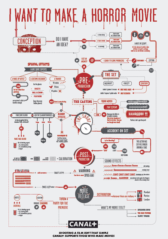
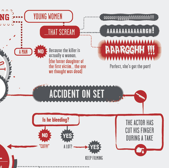
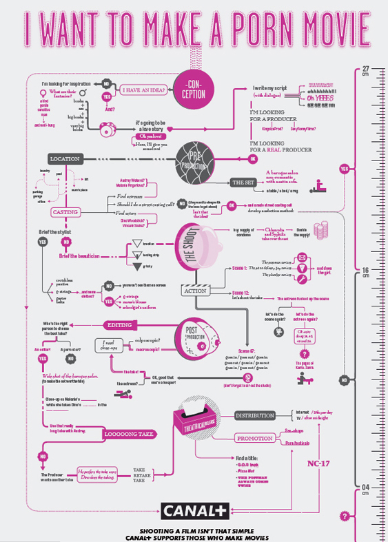
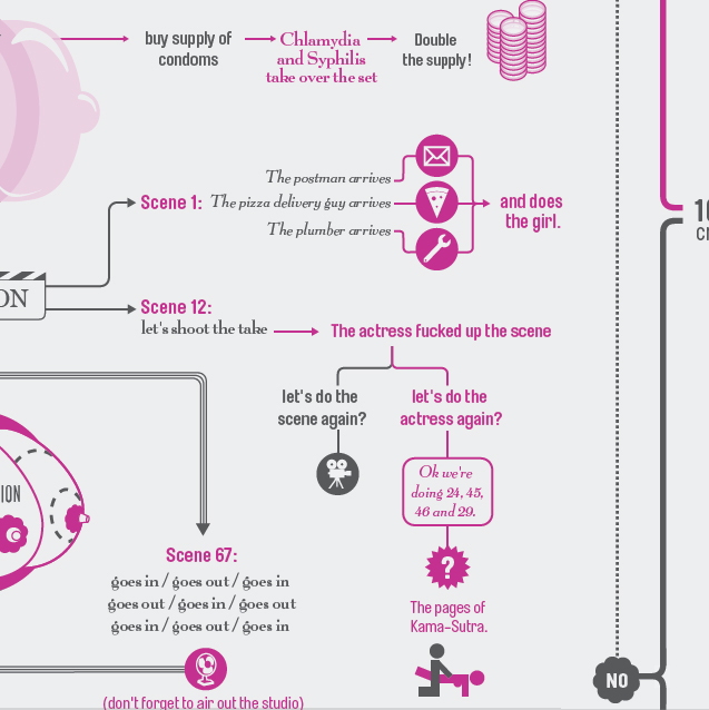
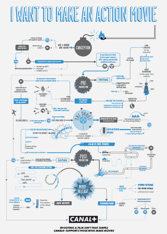
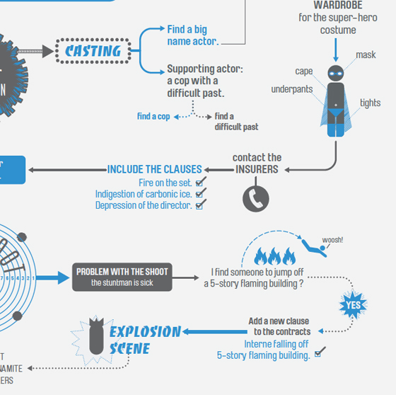
French TV channel Canal+ has a released a witty series of ads, devised by BETC Euro RSCG in Paris, that emphasise its commitment to helping filmmakers...The ads use beautifully designed flowcharts (inspired by New York magazine, perhaps?) to highlight the many twists and turns that can occur when making a movie, and some of the solutions. Each one tackles a different genre, including action, horror and porn, and feature many amusing outcomes. Shown below are three of the full ads, alongside details of each.


Credits:
Agency: BETC Euro RSCG
Global creative director: Stéphane Xiberras
Creative director: Olivier Apers
Creatives: Gregory Ferembach, David Troquier
Illustrator: Les Graphiquants


Thursday, 10 March 2011

The Voiceless Campaign for The Zimbabwean

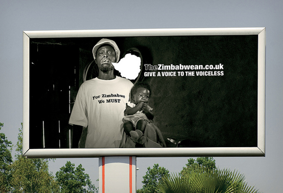
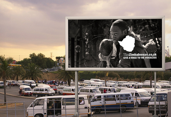
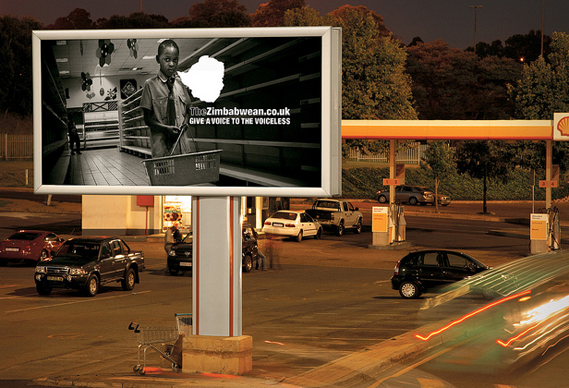
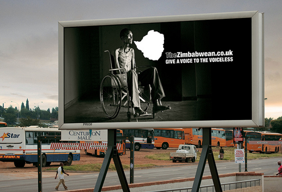
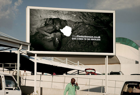
A new advertising campaign for The Zimbabwean highlights the newspaper's role in giving a voice to the people of Zimbabwe. The posters feature images taken by photojournalists who have worked in the country over the last two years, and direct viewers to the newspaper's website, where the photographers describe the circumstances in which the shots were taken.

The campaign is the brainchild of TBWA Hunt Lascaris in Johannesburg, the agency also behind the Trillion Dollar Campaign for The Zimbabwean, which won a D&AD Black Pencil last year, as well as many other awards.

The Zimbabwean newspaper is published in South Africa and the UK by a network of journalists exiled from Zimbabwe for refusing to write propaganda. The newspaper has succeeded in bringing real news from the country to its residents and to over a million Zimbabwean refugees in South Africa and abroad. TBWA Hunt Lascaris devised the latest campaign in response to recent events in the country, where 46 people have been arrested, detained and tortured for gathering to watch footage from Egypt and Tunisia during the recent political uprisings in North Africa.

The idea to use the documentary images in the posters sprang from reports from Harare that police had raided an exhibition of similar images as it opened late last year. An empty speech mark, in the shape of the map of Zimbabwe, has been added to the images, to highlight the residents' lack of voice in the world. The billboard campaign has just launched across South Africa: to read more about the photographs, hear the eyewitness accounts, and also locate where the images were taken on a satellite map, visit thezimbabwean.co.uk.


Sunday, 6 March 2011

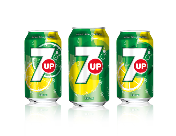
New 7up Logo

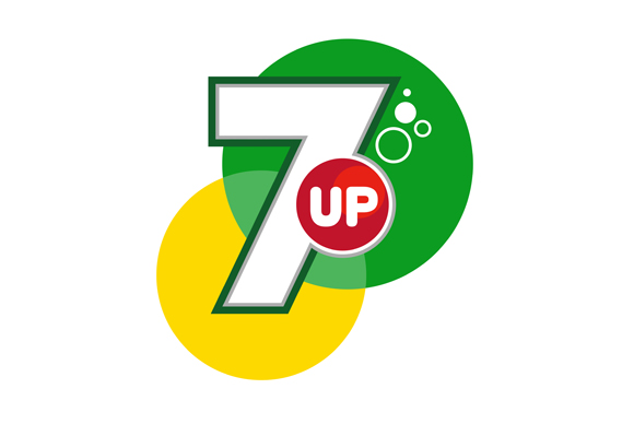
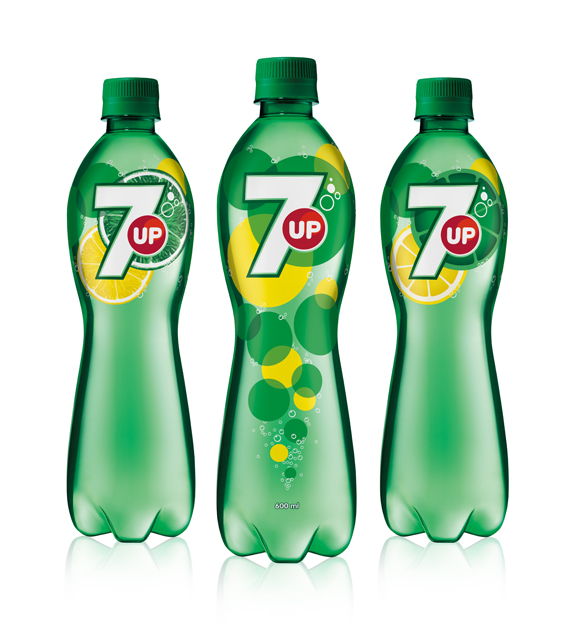
7up has had a redesign. Now with more fruit, bubbles and, of course, a big number 7, fI was worried when I heard the news that the redesign would be a repeat of the disastrous Pepsi redesign but it's not half bad...

The new look was created by TracyLocke New York and will be rolled out (as they say) in several countries around the world, but not the US. Confusingly, 7up is owned by Dr Pepper Snapple Group in the US but the global brand is owned by PepsiCo: it is the latter that will carry the new look.

The design, is said to  "goes back to the core elements that define 7up: lemons, limes, bubbles and refreshment".

It's all notably cleaner than the previous incarnation, which looked like this (although these things tend to look better on the mock-ups than the actual bottles and cans).
There seems to be, post-Turner Duckworth's work for Coke, a distinct move away from the drop shadows, 3D effects and graduated fills that has cluttered up so much mainstream packaging and towards a far simpler, flatter aesthetic. Which is all to the good as far as I am concerned.


Thursday, 10 February 2011

Barbara Stauffacher Solomon: A Woman's Struggle in Graphic Design

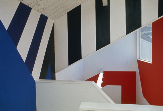
Barbara Stauffacher Solomon pioneered the use of Supergraphics (her work for The Sea Ranch, California, 1966 is shown above). A student of Armin Hoffmann, she later became disillusioned with graphic design. To those worried about the lack of women at the top of the profession, her story may prove illuminating.


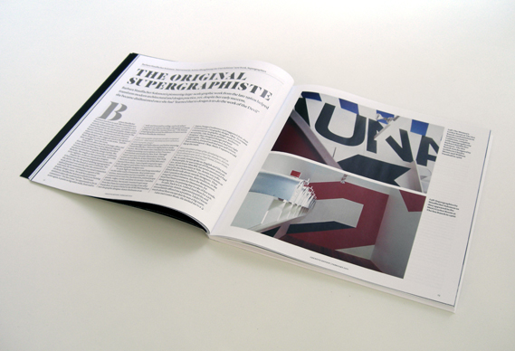
The current (February) print issue of Creative Review (which you can buy here) includes a wonderful interview with Stauffacher Solomon by Adrian Shaughnessy. In it, she highlights some of the issues that came to restrict her professional practice. At one point she describes her attempts to balance her working life in 1960s San Francisco with her home life and the limitations that imposed. While her male peers had the luxury of obsessing long into the night over every last detail and type choice, she had other demands on her time:

"Now that I happily live alone with my dog I have time to think, and I realise that I was always so frantically busy making money to live, taking care of my daughters and worrying about men, that I never had time to think, least of all about my work. At my office I just drew up the first design I visualised so that I could leave to pick up Chloe or Nellie from school, shop for dinner, cook and clean, play wife and do all the stuff that working mothers do."

In the 1970s, tiring of battles over receiving credit for her work and admitting to a distaste for the kind of self-promotion others used to advance their careers, she became disillusioned with graphic design and her role in it:

"Clever verbal architects used my skills to promote their projects; mostly real estate developments. I designed good design covers for many questionable commodities. I worked fast and well and my projects came in at or below the budget. I flattered the men, got paid and then went home to cook dinner."

And then in 1977, having closed her office, she went back to college, this time to the University of California, "to study what I hadn’t learned in Basel; the myths and misinterpretations behind the messages of the Modern Movement. I read mostly French philosophers cleverly discrediting the superficial visual covers I was so skilled at designing; the deceits I’d wrought on the world by camouflaging guileful land developments with good design covers and learned that to design is to do the work of the Devil."

And so one of the most talented designers of her generation was lost to the profession, preferring to pursue a career as an artist instead.


Saturday, 29 January 2011

Graphic USA – an alternative guide book

Graphic USA: An Alternative Guide To 25 US Cities (£19.95, Cicada Books) is a guide book with a difference. Rather than being put together by journalists and specialist researchers, the suggestions of where to go and what to see.  Each of the 25 cities covered in the book are provided by an image maker who lives there, who also illustrates his or her city's chapter....
The book has been designed by Joana Niemeyer at design studio April and edited by Ziggy Hanaor at Cicada. 

"The concept behind the book is that people who work in the graphic arts, and who have an offbeat aesthetic to their work will often seek out the unexpected and inspirational elements in their environments that one wouldn't find in most travel guides," explains Hanaor in her introduction. "The recommendations in this book are the personal favourites of the individual contributors... For the most part they do not include the bucket list recommendations that most tourists feel they have to tick off. They tend to reflect the alternative, independent culture that is bubbling underneath the city, feeding into its public persona, but not immediately apparent to the visiting outsider. Not all the suggestions may be your cup of tea, but hopefully for those who are part of an alternative scene themselves, they will tap into a common urban approach and will open up a different view of the city that you can dip in and out of as you desire. It's kind of like a friend writing down their hot tips for each place."
The Chapter on Denver, Colorado is by illustrator and designer Gwenda Kaczor


Alex Harrison (also known as Alex Warble) provides the illustration and the insight to Memphis, Tennessee (above and below)

Saturday, 15 January 2011

Five tiny illustrated comics from B.ü.L.b Comix

B.ü.L.b Comix in Switzerland newest creation is a set of five tiny concertina comics (each measuring just 35x45mm) - by Andy Rementer, Lloyd Dangle, Rutu Modan, Chihoi and Alexandre Joly – housed in a suitably tiny box...

B.ü.L.b Comix has actually been producing tiny format (as well as larger format) comix since 1996 - with each set being printed in just two spot colours with 22 pages or panels. Each of its  Box Set releases is stamped with a letter of the alphabet. This new one is W – box set A was published back in 1997. "Only 3 letters to go, a countdown to the end of our publishing adventure," says B.ü.L.b's Mathieu. "Yes, we've been running B.ü.L.b comix since 1996, without any grants and supporting the local printers. B.ü.L.b comix is non-profit making, we don't get paid, we give books to authors and all money is reused to release new books. DIY freedom!"

Here's a look at the comics in the new W box set:


Thursday, 6 January 2011

Starbucks Unveils New Logo

US coffee giant Starbucks has unveiled a new identity created by its in-house design team and studio Lippincott. It centres on the Siren logo and does away with the words "Starbucks" and "coffee" altogether...

The 'Siren' figure has been part of the Starbucks identity since the company launched in 1971 and this latest redesign ties in with their 40th anniversary. The new logo essentially takes the Siren out of her ringed frame (see previous iterations of the identity, below), changes the background colour to Starbucks green and removes all text – perhaps a nod to the fact that the company now sells a range of other products in addition to coffee. 

The next step was to bring in a "more sophisticated stroke width and spacing and a smoother line flow." The Siren's hair and facial features were apparently also refined.

The question is, in light of last year's most infamous logo debacle could the new Starbucks ever 'do a Gap'? I very much doubt it. Despite the dissent already emerging on the company's website from largely negative commenters – not to mention the need to monitor their 1.1m followers on Twitter – one thing that stands out is that Starbucks has ensured the big reveal is shown in context; on a paper cup.

It sounds obvious, but when the Gap identity announced itself to the world online, it was the same old decontextualised jpg that people were posting, emailing and generally taking apart. Starbucks has already countered the 'you have to see it in the flesh' argument by simply showing it in the way most people will engage with it. And doesn't it seem all the better for that?