Showing posts with label Logos. Show all posts

Saturday, 5 February 2011

What are your Favourite Logos - Creative Review Results


A while back I did a blog post about Creative Review asking its readers what their favourite logos of all time are. Well the results are in!


No. 1 NIKE


No. 2 APPLE


No. 3 COCA-COLA


No. 4 FEDEX


No. 5 TARGET


No. 6 VW


No. 7 IBM


No. 8 CBS


No. 9 I LOVE NY


No. 10 GE


No. 11 MCDONALDS


No. 12 UPS


No. 13 PLAYBOY


No. 14 WOOLMARK


No. 15 OBAMA '08


Sunday, 23 January 2011

Favourite logos: looking past the obvious

A while ago I did a post about Creative Review asking its readers to nominate their favourite logos. The Creative Review team have said they received a lot of votes for the classics of the genre. But the exercise also threw up some less celebrated but still worthy contenders. 

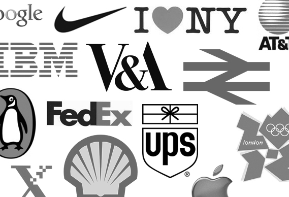
For a special issue in April, Creative Review will be putting together a list of the 25 greatest logos. Last week,they asked readers to nominate their top five. Among the Apples, FedExs and V&As, readers also drew attention to some forgotten classics and little known favourites.

One reader put forward the 1974 New Zealand Commonwealth Games logo by Colin Simon (shown top). The mark cleverly combines the 7 and 4 of the year, the NZ of New Zealand, the Union Jack and even an X for the tenth games. Read more about it here


There was quite a bit of support for Raymond Loewy's New Man ambigram from 1969
Alan Fletcher's Lucas Industries mark was also noted
and don't forget David Gentleman's 1968 British Steel logo


Alan Clarke nominated, among others, the Leica mark


the 1968 Nederlandse Spoorwegen (Dutch railways) logo by Gert Dumbar and Gert-Jan Leuvelink for Tel Design had a lot of fans

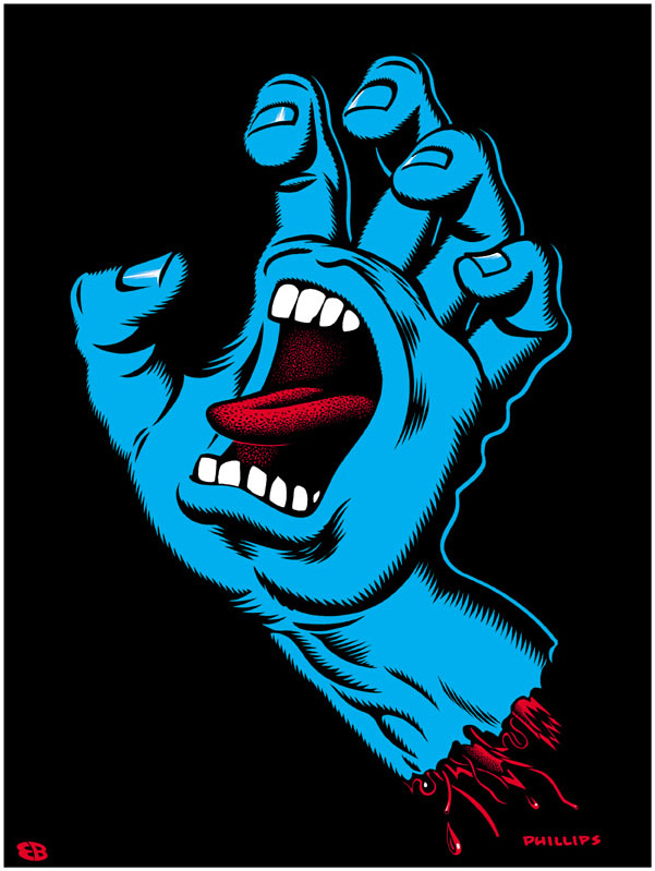
On a very different plane, 'Fidalgo' suggested Santa Cruz skateboards' Screaming Hand by Jim Phillips


Over three hundred people have voted so far but the Creative review team are still asking for more so head to their site and vote!


Wednesday, 12 January 2011

What are your favourite logos? - Creative Review Issue

Creative Review's forthcoming April issue is going to be a bit special. Dedicated to the art of logo design, it is going to include a definitive list of the 20 greatest marks ever created. And the Creative Review team are looking for it's readers nominations.

In order to compile the list they are going to canvas the expert opinion of designers, academics and critics who will ultimately help to come up with 20 of the world's greatest logo designs.

For the first stage Creative Review would like to throw it open to their readers to gather opinions. So go to the Creative Review Blog article named "What are your favourite logos?" and simply nominate your five favourite logo designs of all time and tell them why.

The Creative Review team will use all the information gathered on the CR blog as a starting point for further discussions with their expert panel.

CR April will include the list of the 20 logos, plus a detailed study of the top five marks; including the story of how they were made, who designed them and exactly what it is that makes them stand out.


Thursday, 6 January 2011

Starbucks Unveils New Logo

US coffee giant Starbucks has unveiled a new identity created by its in-house design team and studio Lippincott. It centres on the Siren logo and does away with the words "Starbucks" and "coffee" altogether...

The 'Siren' figure has been part of the Starbucks identity since the company launched in 1971 and this latest redesign ties in with their 40th anniversary. The new logo essentially takes the Siren out of her ringed frame (see previous iterations of the identity, below), changes the background colour to Starbucks green and removes all text – perhaps a nod to the fact that the company now sells a range of other products in addition to coffee. 

The next step was to bring in a "more sophisticated stroke width and spacing and a smoother line flow." The Siren's hair and facial features were apparently also refined.

The question is, in light of last year's most infamous logo debacle could the new Starbucks ever 'do a Gap'? I very much doubt it. Despite the dissent already emerging on the company's website from largely negative commenters – not to mention the need to monitor their 1.1m followers on Twitter – one thing that stands out is that Starbucks has ensured the big reveal is shown in context; on a paper cup.

It sounds obvious, but when the Gap identity announced itself to the world online, it was the same old decontextualised jpg that people were posting, emailing and generally taking apart. Starbucks has already countered the 'you have to see it in the flesh' argument by simply showing it in the way most people will engage with it. And doesn't it seem all the better for that?


Saturday, 23 October 2010

Logo Re-deign - iTunes, Gap, Myspace

Recently there has been a lot of re-designing or rebranding of famous logos including iTunes, Gap and Myspace. There has also been a great deal written about the new logos and whether they are for better or worse. So I thought I would share my opinions on them.


iTunes


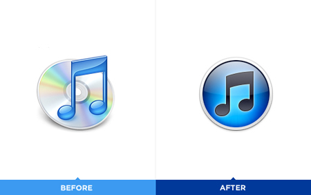
The iTunes icon has been redesigned recently. The good part of this redesign is that Apple is getting rid of the disc, which makes perfect sense (considering the digital world we are now in). The bad part is that the gradients in the new icon are awful. I also wonder if staying with the musical note is a bit old-fashioned and literal – after all, we use iTunes for a great deal more than music although music seems to be its core competence. Overall I can understand the need for an updated logo but I do not think the new logo has been executed to its full potential.  anyway you can still change it for an alternative icon which you can see below:
Gap


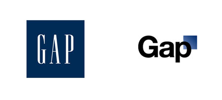
The Gap logo redesign made a lot of buzz on the blogosphere during the past week, and there is a good reason for that: it looks awful. After all, Gap has built a solid brand since its humble beginnings in 1969. So why trade that for Helvetica (and an awkwardly placed square)?
Among the outcry (including a Twitter parody), Many other designers offered their own suggestions via Dribbble as well.Here are some of my favourites:


As it turns out, that’s exactly what Gap is asking for. Gap responded to the criticism via Facebook with this statement:
"Thanks for everyone’s input on the new logo! We’ve had the same logo for 20+ years, and this is just one of the things we’re changing. We know this logo created a lot of buzz and we’re thrilled to see passionate debates unfolding! So much so we’re asking you to share your designs. We love our version, but we’d like to see other ideas. Stay tuned for details in the next few days on this crowd sourcing project."

At the time of writing, Gap’s Facebook post had nearly 250 comments. It makes me wonder, is this is all a publicity stunt or is the company seriously this out of touch?

Myspace

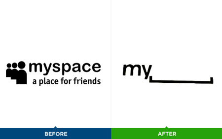
I am unsure whether the logo is good. The concept behind it is clever, but I wonder what it’s worth in terms of branding. It just doesn’t feel right not to see part of the name. A new user to Myspace may not understand the name of the company/organization. On the other hand, it opens a whole world of adaptations for the logo