Showing posts with label Logo Design. Show all posts

Friday, 24 June 2011

What should someone appreciate when seeing a logo?

Today I came across this article on design daily.com and thought I would share. 


Building a brand isn’t the easiest task in the world or the most important; a well-established brand requires a great deal of time and money. The tremendous effort of obtaining a serious brand, when this is successfully finished, is rewarded and the profit is huge. The examples are numerous in our global economy, but everyone should know that in this process a small element plays a big role.


 A logo is a small graphic element, which may contain words, letters or/and shapes. Regardless its structure, a logo is the entity, which makes the connection between the clientele and the company/website who own this. In accordance with the previous statement that means a logo is very important; personally I believe it’s true 100%. It is unfair, but usually people don’t have the time or the opportunity to check the quality of all the products in this world and as a result they apply a superficial judgment; a logo can be the construction upon which people base their opinions.


The specialists who are building logos are called logo designers and anyone can find them inside of the freelance job boards. They are numerous, but definitely there are enough people who have no acknowledgement about logo design. This article is written especially for the potential clients who didn’t care about logos until this moment and at the moment need one but it may be a pleasant lecture for any designer in order to refresh some basic principles.


1. A logo must be versatile
 

Initially a customer wants a logo for his website – nothing unusual and the creator of it doesn’t have any restrictions related to the logo-the happiest case. Although, after some time (years or months, really doesn’t matter) this client considers beneficial for his affair to put the logo on a banner, thus we must have here a print version. 

Unfortunately in many cases this version doesn’t look as good as the online one. Trouble might arise here. To resume and to obtain the conclusion of this situation is pretty simple:a logo must be versatile, it should look the same in the header of a website, on a banner and even on a T-shirt. It’s a sign of professionalism. My advice for any potential buyer of a logo is: think twice before saying that you need a logo only for a website.

2. The king is always in black and white format

This point came as a completion of the previous one, but because it is very important, it needs a special treatment. Always, a quality logo will look appealing in a black and white format. It can be regarded as a prolonged versatility but it hides another impressing fact. In the most cases a black and white format emphasizes mostly the concept of the  logo and not the graphical realization. There are trends, which are coming and leaving and any designer should pay attention to these to keep a logo updated but the concept of a logo remains and it must be eternal. 

On the other hand, a black and white logo will be always on trend and consequently won’t be a mistake to make it using no colorization.

3. Simplicity is great

A simple logo isn’t a wrong one, but still many people (some of them logo designers) are circumspect regarding this concept. Their problem is related to the feeling of unfinished project when someone is seeing a simple logo, however here is another great advantage: a not very complicated structure is more easily to remember for ordinary people. A powerful logo is one that is known by the entire community and under these circumstances what is simple is amazing. 

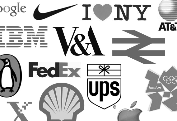
Studying the logos of the global recognized brands this premise is set solid, nothing more than three colors, one or two fonts, simple shapes. I believe the collection below is pretty enough:
4. Originality makes the difference
An original concept of a logo puts the owner in a special light and usually the advantages are immense. The logo should be considered the graphical representation of the people behind it and in a world full of opportunities and possibilities to stand apart is difficult but profitable. Having a common logo is equivalent of nothing to say or being a decent provider in an ocean of other more colorful solutions.

5. A memorable logo is the base of a successful brand
If someone sees a logo and after a few days remembers it, then the graphical work deserves its money. The purpose of a logo is to make in the mind of the folks the connection between the owner and a quality service/product and a memorable logo is the start in accomplishing this task. The big problem is how to effectively create a wonderful & memorable work? The answer is based only on talent and a lot of work. 

Friday, 13 May 2011

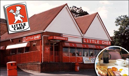
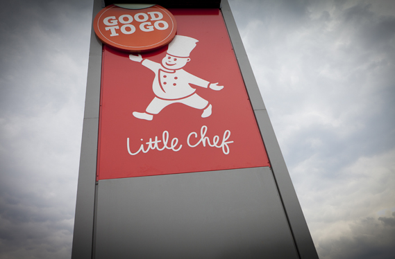
The new Little Chef

Venturethree has completed an overhaul of Little Chef that sees the brand adopt what the consultancy claims is a 'Wonderfully British' approach. And 'Charlie the Chef' has a new outfit too 


Little Chef has been trying hard to update its dowdy image ever since it was taken over by new owners in 2007. Heston Blumenthal was brought in to update its menu, the process of which was featured in a TV documentary. 


Blumenthal introduced new dishes and new cooking methods in a trial modernised branch of Little Chef in Popham, Hampshire. The exercise apparently proved successful – the chain has opened nine new branches in the past year and plans 20 more. 

Venturethree has, it says, tried to reposition the chain as a 'modern British brand' with new menus, interiors and the introduction of a take away service. 


First of all, there's the logo. Venturethree has given the Little Chef himself, known as Charlie, a new outfit and relieved him of that strange bowl of white stuff he previously bore aloft in his right hand. He no longer seems to be wearing a romper suit and instead sports an on-trend double-breasted affair (new Charlie shown top, old Charlie below).


Apparently he is also "friendlier and more refined, with new energy and purpose," according to venturethree's CEO and strategic director Philip Orwell. Erm, OK. Well, he certainly looks more modern (perhaps based on Heston himself?) 

The logotype has also changed, the upper case having been replaced by that old design consultancy standby for 'friendliness', the script face.

There will also be a new range of Good To Go take away food

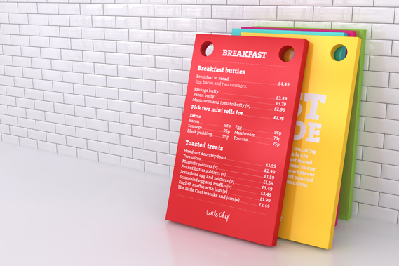
A new colour scheme is designed to tie in with the British theme, featuring (as seen on the trays above) 'mushy pea green, raspberry ripple pink, English mustard yellow and baked bean orange'.

Most striking are a series of Pop Art style giant sculptures of a ketchup bottle, tea mug and lollipop (a normal size version of which kids get for finishing their meal) that will appear at various Little Chefs around the country.

Venturethree worked with Ab Rogers Design and Cake on the project which also includes new interiors

Having spent some dismal times in various Little Chefs  the overhaul (and the promise of better food) is very welcome. With half-term we will soon have the chance to see if the reality lives up to the promise of the new image.


Sunday, 6 March 2011

New 7up Logo

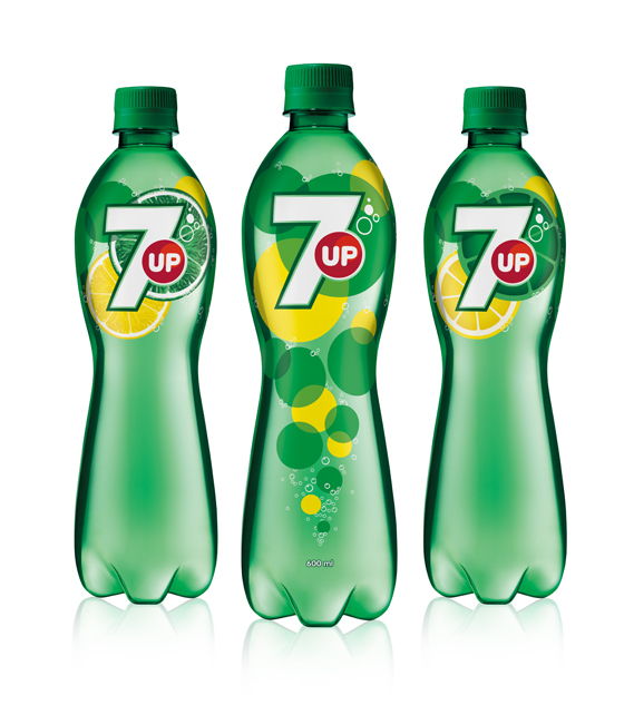
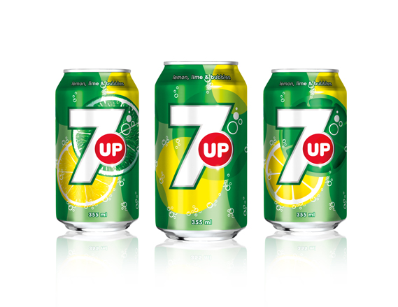
7up has had a redesign. Now with more fruit, bubbles and, of course, a big number 7, fI was worried when I heard the news that the redesign would be a repeat of the disastrous Pepsi redesign but it's not half bad...

The new look was created by TracyLocke New York and will be rolled out (as they say) in several countries around the world, but not the US. Confusingly, 7up is owned by Dr Pepper Snapple Group in the US but the global brand is owned by PepsiCo: it is the latter that will carry the new look.

The design, is said to  "goes back to the core elements that define 7up: lemons, limes, bubbles and refreshment".

It's all notably cleaner than the previous incarnation, which looked like this (although these things tend to look better on the mock-ups than the actual bottles and cans).
There seems to be, post-Turner Duckworth's work for Coke, a distinct move away from the drop shadows, 3D effects and graduated fills that has cluttered up so much mainstream packaging and towards a far simpler, flatter aesthetic. Which is all to the good as far as I am concerned.


Saturday, 5 February 2011

What are your Favourite Logos - Creative Review Results


A while back I did a blog post about Creative Review asking its readers what their favourite logos of all time are. Well the results are in!


No. 1 NIKE


No. 2 APPLE


No. 3 COCA-COLA


No. 4 FEDEX


No. 5 TARGET


No. 6 VW


No. 7 IBM


No. 8 CBS


No. 9 I LOVE NY


No. 10 GE


No. 11 MCDONALDS


No. 12 UPS


No. 13 PLAYBOY


No. 14 WOOLMARK


No. 15 OBAMA '08


Sunday, 23 January 2011

Favourite logos: looking past the obvious

A while ago I did a post about Creative Review asking its readers to nominate their favourite logos. The Creative Review team have said they received a lot of votes for the classics of the genre. But the exercise also threw up some less celebrated but still worthy contenders. 

For a special issue in April, Creative Review will be putting together a list of the 25 greatest logos. Last week,they asked readers to nominate their top five. Among the Apples, FedExs and V&As, readers also drew attention to some forgotten classics and little known favourites.

One reader put forward the 1974 New Zealand Commonwealth Games logo by Colin Simon (shown top). The mark cleverly combines the 7 and 4 of the year, the NZ of New Zealand, the Union Jack and even an X for the tenth games. Read more about it here


There was quite a bit of support for Raymond Loewy's New Man ambigram from 1969
Alan Fletcher's Lucas Industries mark was also noted
and don't forget David Gentleman's 1968 British Steel logo


Alan Clarke nominated, among others, the Leica mark


the 1968 Nederlandse Spoorwegen (Dutch railways) logo by Gert Dumbar and Gert-Jan Leuvelink for Tel Design had a lot of fans

On a very different plane, 'Fidalgo' suggested Santa Cruz skateboards' Screaming Hand by Jim Phillips


Over three hundred people have voted so far but the Creative review team are still asking for more so head to their site and vote!