Showing posts with label Interior Design. Show all posts

Sunday, 5 June 2011

Michael Faraday School

Cartlidge Levene is behind a new wayfinding system for a regenerated school in Southwark in London. The work includes a series of visual 'shopfronts' to each of the classrooms and a range of playful signage...

The Michael Faraday Community School in Southwark (the chemist and physicist was born in what is now part of the London borough in 1791) was developed by architectural firm, Archial.

The primary school is one of the first to be transformed as part of the Southwark Schools for the Future programme. It accommodates a primary school, nursery, adult education and community facilities, and an after-school play group.
The structure of the build is based on a 'circular footprint' with a flexible learning space, called the Living Room, in the centre. Classrooms for year groups one to six are arranged around the perimeter and are connected by the central communal space. The Living Room features a bright yellow, double height wall which encloses both the Studio and Roof Garden teaching spaces.

Cartlidge Levene was briefed to develop a wayfinding system that would engage the children, engendering a feeling of pride in their school, and that integrated with the architecture. Ultimately, say the studio, the visual language aims to provide a new graphic identity for the school and work alongside the Faraday logotype that is mounted above the main entrance.


Also of note are the year group classrooms that form a continuous row of ‘shopfronts' around the circular space over two levels. Differently coloured flag-signs fold out from these shopfronts to identify each year group. The studio also devised methods of displaying the children's work to provide an ordered but flexible system that could be easily operated by the teachers. The signage takes advantage of the intuitive building arrangement with, according to the studio, good sight-lines across the central, circular space. Furthermore, playful, 3D arrows are used to sign the 'Studio' and 'Roof Garden' teaching spaces and supporting facilities.

The use of terminology such as Roof Garden and Living Room (for the teaching spaces) and even 'Ballroom' (for the external pavilion that houses sports and dining facilities) was developed, say the studio, to create "a fun nomenclature that the children can relate to". The Ballroom sign is integrated into the building's cladding, along with a layer of decorative pattern and, in the toilet blocks a ‘paper chain' of male and female toilet icons has been applied to the doors.



Friday, 13 May 2011

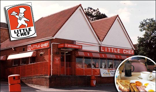
The new Little Chef

Venturethree has completed an overhaul of Little Chef that sees the brand adopt what the consultancy claims is a 'Wonderfully British' approach. And 'Charlie the Chef' has a new outfit too 


Little Chef has been trying hard to update its dowdy image ever since it was taken over by new owners in 2007. Heston Blumenthal was brought in to update its menu, the process of which was featured in a TV documentary. 


Blumenthal introduced new dishes and new cooking methods in a trial modernised branch of Little Chef in Popham, Hampshire. The exercise apparently proved successful – the chain has opened nine new branches in the past year and plans 20 more. 

Venturethree has, it says, tried to reposition the chain as a 'modern British brand' with new menus, interiors and the introduction of a take away service. 


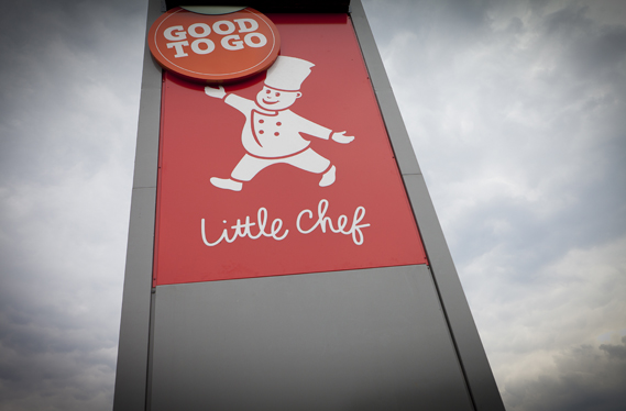
First of all, there's the logo. Venturethree has given the Little Chef himself, known as Charlie, a new outfit and relieved him of that strange bowl of white stuff he previously bore aloft in his right hand. He no longer seems to be wearing a romper suit and instead sports an on-trend double-breasted affair (new Charlie shown top, old Charlie below).


Apparently he is also "friendlier and more refined, with new energy and purpose," according to venturethree's CEO and strategic director Philip Orwell. Erm, OK. Well, he certainly looks more modern (perhaps based on Heston himself?) 

The logotype has also changed, the upper case having been replaced by that old design consultancy standby for 'friendliness', the script face.

There will also be a new range of Good To Go take away food

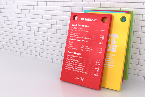
A new colour scheme is designed to tie in with the British theme, featuring (as seen on the trays above) 'mushy pea green, raspberry ripple pink, English mustard yellow and baked bean orange'.

Most striking are a series of Pop Art style giant sculptures of a ketchup bottle, tea mug and lollipop (a normal size version of which kids get for finishing their meal) that will appear at various Little Chefs around the country.

Venturethree worked with Ab Rogers Design and Cake on the project which also includes new interiors

Having spent some dismal times in various Little Chefs  the overhaul (and the promise of better food) is very welcome. With half-term we will soon have the chance to see if the reality lives up to the promise of the new image.


Thursday, 23 December 2010

Christmas fun for everyone!

majowski_1.jpg
The Christmassy treats keep on flooding into CR Towers. Here are some more of the inventive ways that designers and ad agencies are promoting themselves this festive season... First up is illustrator James Majowski's take on Santa, which he calls 'On the origin of Christmas'.


180a_0.jpg
180b_0.jpg
We've all seen Elf Yourself, but now there's Delft Yourself, a uniquely Dutch take on the whole interactive Christmas card-film-website thing from 180 Amsterdam. Visitors to the site are encouraged to use their webcams to create their own personalised messages that will appear on the site in a Holland style.


lmfm_0.jpg
Lean Mean Fighting Machine has tackled one of the great questions of the Christmas season with its website Snowman or Fatman? The site invites visitors to pick one option and then watch a small boy approach a snow-covered figure and kick it to reveal which is correct.


New Future Graphic has created this cute film featuring a wrapping paper-machine. The paper patterns shown can then be downloaded for use on your very own gifts online here
, and there are fun iPhone and iPad treats too.

squintopera1_0.jpg
squintopera2_0.jpg
Digital production house squint/opera has shown its dedication to the Christmas season by painting a giant Christmas tree across its office space.


Saturday, 20 November 2010

Le French Dresser

I recently came across this piece by Wary Meyers, a husband and wife design team, on Apartment Therapy.  "Le French Dresser" was created by adding scroll-saw cut wooden letters to a salvaged dresser, drawing upon inspiration from Lou Dorfsman's Gastrotypographicalassemblage.  This awesome DIY project is currently featured in Wary Meyers' book, "Tossed and Found ," along with several other simple masterpieces created from items that others might disregard as trash.

Tuesday, 2 November 2010

Turn Ikea into Mykea


To walk through an IKEA store means browsing the mass quantities of furniture, rugs, lamps and every other household item imaginable with one hand holding their $1 frozen yogurt cone and the other, a plate of Swedish meatballs. Since it gets a good and bad rap for being both affordable and yet incredibly plain, a small creative company that goes by the name Mykea has come up with an Ikea-inspired idea.
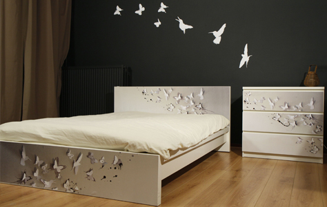
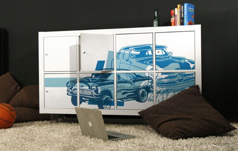
The way it works is this: First, you choose your favorite piece of Ikea furniture. Some of the most popular items are listed on their website (but other requests can be fulfilled) and they include: Malm bed, Billy bookcase, Expedit bookcase, Expedit coffee table, Malm dresser, Lack coffee table, and Pax wardrobe.
Next, choose your favorite design from dozens and dozens that people just like you, who appreciate spicing their home up with more than a scented candle, have created for Mykea. When I checked out the page last, you have your choice of up to 53 different patterns and illustrations, as well as solid colors. So in other words, you tell them which standard piece you’ve chosen from the IKEA furniture superstore, and they’ll equip you with the custom-cut design that will make it stand out from the pack.
To apply the designs, all you need are household items. It will be shipped to you in a cylindrical container. All you have to do is apply soapy water to the surface of your bookshelf backing, wardrobe doors, coffee table surface, dresser drawers or bed frame and carefully stick on the appropriate design. Smoothing with a spatula of any kind, it’s a no-frills way to achieving beautiful furniture. The cost of a Mykea design depends on the design itself. 
Celebrate to the tune of the Mykea motto and just say NO to NAKED furniture!