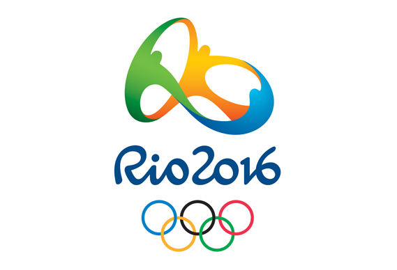
Before getting in to the logo, perhaps a bit of context would be useful. It's no use designers pining for another Otl Aicher, a master designer handed almost complete control over the visual identity of a major international sporting event: those days are gone. To create an identity for such an event today, particularly the Olympics or World Cup, is to enter into a process that is torturous, endlessly frustrating and enough to test the patience of a saint.It is a process, moreover, that flies in the face of accepted wisdom regarding what is neeeded to produce strong, distinctive, memorable design. There will be no single, clear, consistent decision-maker. There will be a multitude of competing interests to satisfy. And the very nature of the mechanism for even competing for the job in the first place will be so Byzantine and time-consuming that it will put many of the most talented and most suitable design studios off even getting involved.
But get involved they do and so any design studio that can make it out the other side with even a half-decent end result deserves praise for endurance, bottle and endless patience if nothing else.
And so to Rio. On New Year's Eve, in front of nearly two million people the world got its first look at the emblem designed for the 2016 Games. It was created by Rio-basedTátil, whose other clients include Walmart and Fiat.
Tátil's online case study (interesting that they are allowed to discuss the project given the restrictions imposed by the London organisers) talks through its strategy for the Olympics logo. The challenge, it says, was "to represent the Passion and Transformation of a city and an entire country, and project these values to the rest of the world.
A brand that must express unity. Inspire achievement and optimism. Avoid clichés and present Rio de Janeiro as the site of the largest sporting event in the world - to its very own Cariocas, and to athletes and people around the world."
It began its research by mapping out "several Rio 2016 planets ... each one with multiple references, concepts, trends and articles."
The idea was to root the identity in the essence of Rio's Cariocas – its citizens. "We were born from a mixture of ethnicities. We warmly embrace all ethnicities, faiths and generations. We share our sky, our ocean and our happiness with the world. This human warmth, which is part of the Carioca nature and the Olympic spirit, is shaped by the exuberant nature of a city that inspires us to live passionately and carefree, and loves to share and engage with others."
This led Tália to a graphic device that would (literally) depict people joining together in an exuberant, joyful way.
Colour choices were led by the Brazilian environment: "Yellow symbolises the sun and our warm, vivacious and happy nature. Blue expresses the fluidity of the water that surrounds us, and our easygoing way of life. Green represents our forests and hope, a positive vision that inspires us to go even further."
To all this is added a rather neat, abstract reference to a Rio landmark, Pão de Açúcar or Sugarloaf Mountain, the shape of which is mapped by the logo.
Although presented initially in 2D form, the logo device was, apparently conceived as a three-dimensional form as this model illustrates.
Beneath the graphic device, Rio 2016 is picked out in a bespoke brushscript typeface - the default option for international sporting events de nos jours. Some commenters on our original story claim to see the word 'RIO' in the graphical device as well, though it's not immediately obvious.
The Rio logo comes in the wake of London 2012 and so comparisons are inevitable.London tore up the Great Sporting Event Logo Handbook. It almost willfully disregards the accepted way of these things: no overt geographical reference to the home city, no 'welcoming, joyful' attitude, no rounded, friendly organic shapes. It almost dares us to like it. And for many it remains an unmitigated design disaster.
Rio, on the other hand, seems to have gone too far in the other direction. If London is all bared teeth, Rio rolls over and wants us to tickle its tummy. Each organising committee requirement is present and correct: happy amorphous dancing people of the type seen in so many logos before (and, yes, as also seen in Matisse), soft edges where London is jagged and city landmark front and centre (though, I admit, I wouldn't have recognised the Sugarloaf unprompted). But the Games don't just belong to the organising committee, they belong to the citizens of the host city and, by extension, to the world.
I have no nationalistic agenda here - for all its daring the London logo remains damn ugly and I have yet to see it used happily by a third party nor brought to life in any dazzling manner. It's not a question of whether one beats the other. And I can't comment on whether it says 'Rio' - I've never been there - but it certainly says 'Logo for major international sporting event'. Yes the Sugar loaf reference is clever, but the overall effect is disappointingly familiar. Perhaps it will fare better when animated or turned into public art, but in 2D form it's just a little banal and forgettable.