Monday, 6 December 2010

Claire Hartley

Claire Hartley is a wonderfully talented graphic designer and illustrator. She graduated from the University of Northampton in 2008. She is now working for Substrakt as a graphic designer. Her work has been featured in FormFiftyFive NotinCR Computer Arts Creative Review Form Fifty Five Design Week

You can see more of her work here


Sunday, 5 December 2010

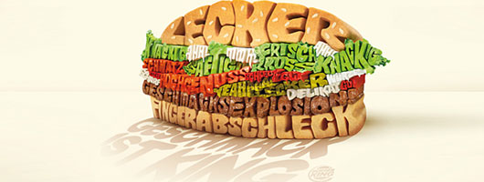
Cool Typography Print Ads – Pictures that speak out!

Ever thought which is the hardest job for graphic designers? Let me…It is to effectively visualize a concept into a single image. This is the exact requirement in creating a powerful print ad for newspaper, magazine or billboards. A print ad copy consists of two elements: visual imagery and typography. Although a picture is worth a thousand words, but the power of words cannot be underestimated. And the best way to illustrate words is through effective use of typography.

Challenges for Graphic Designers in Print Ads:

Creating print ads is quiet a challenging job for the graphic designers. There are a few reasons that cause the making of print ads a little tricky, e.g:
  • • Say more in Less Space: For starters, a print medium has less space than any other advertising medium. You need to communicate efficiently and effectively.
  • • Lack of Emotions: Print ads lack the emotions that TV ads carry. You need to manipulate the words and pictures to create an attractive copy.
  • • No Sound or Visual effects: In creating a print ad there are no visual aids or sound effects, you use an immovable media to create a moving ad.
In order to get a better understanding of how typography serves the effectiveness to print ads, let us take a look at some of the brilliant ads.


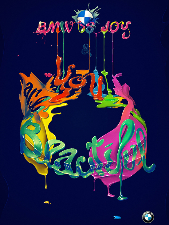
BMW is joy


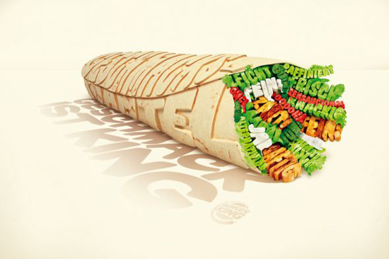
Burger King: Wrap


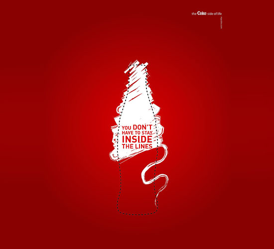
You Don’t have to stay inside the lines


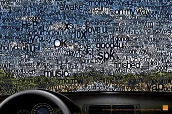
Orange – SMS


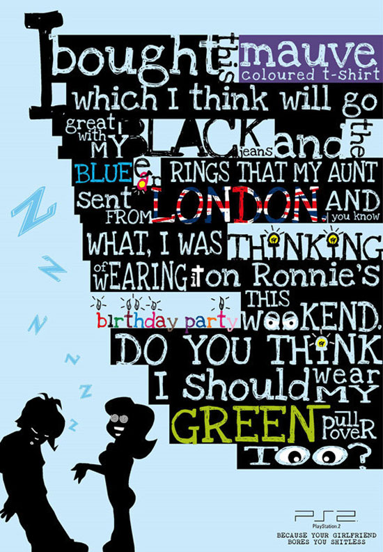
PlayStation 2: Girlfriend


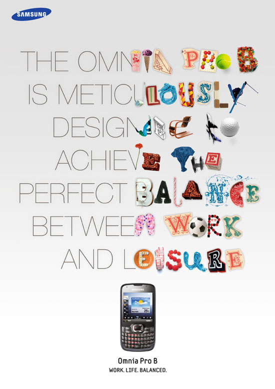
Samsung Omnia


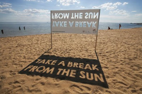
Take a break from the Sun


The noodle van is coming... The noodle van is coming...


AKQA's has made a charmingly animated spot for Pot Noeldle, a special Christmassy version of the dried food snack. The ad mocks the smaltz of most of the seasonal ads out there, offering a more down-to-earth, and particularly UK-based Xmas experience instead. As the Pot Noodle van travels through town, the locals can't help but drop what they're doing and follow it, until a firmly 2010-style Christmas scene is unveiled.


Saturday, 4 December 2010

Wim Crouwel at the Design Museum


In news sure to send a frisson through the design community, London's Design Museum announced today that it is to stage a major retrospective of the work of Wim Crouwel, opening in March. 
Wim Crouwel – A Graphic Odyssey will be Crouwel's first major UK retrospective. It is to be curated by Tony Brook, creative director of design studio Spin, who has an extensive collection of the Gridnik's work.
"Original sketches, posters, catalogues and archive photography will be on display alongside films and audio commentary, we are promised in a statemnt from the Museum issued today. "In addition to celebrating Crouwel's career this exhibition will also explore his legacy and influence on contemporary graphic design with commentary from leading industry figures including Peter Saville and Stefan Sagmeister. In addition six designers will take inspiration from Crouwel's career to produce a series of limited edition prints, a unique Wim Crouwel inspired wallpaper will also be sold exclusively in the Design Museum Shop."


Wim Crouwel – A Graphic Odyssey will run from March 30 to July 3 2011. More here

Thursday, 2 December 2010

Stanley Kubrick Tape Measure


In a limited addition of 100 the 25' Stanley tape measure is an absolute necessity in any shop. Each tape measure is individually hand engraved by the artist. On the front is a trompe l'oeil sticker that duplicates Tom's personal tape measure, so that you can build (or measure) great things too.
3" x 3" x 1 1/2"
Yellow vinyl sticker, Stanley chrome tape measure  25'