Showing posts with label Animated Typography. Show all posts

Wednesday, 10 November 2010

Changing Education Paradigms

This animation was adapted from a talk given at the RSA by Sir Ken Robinson, about how schools kill creativity. Sir Ken Robinson is a  world-renowned education and creativity expert and recipient of the RSA’s Benjamin Franklin award. It is so great to see an already excellent talk brought to life visually. 


Other RSA Animations:

Smile or Die Talk


The Surprising Truth About What Motivates Us Talk


The Secret Powers of Our Time Talk


Tuesday, 9 November 2010

Bembo's Zoo - Typography Animations


Bembo’s  Zoo is a flash website with beautiful, innovative alphabet animations. The animations are a kind of typographic game – at first you see the name of an animal, then the letters start swirling around and finally form the shape of the animal itself. Fun for both kids and typography geeks!
Bembo’s  Zoo is also available as a picture book, Bembo’s Zoo: An Animal ABC Book.


Saturday, 6 November 2010

Need To Want Less


Erin Hanson's outlet is the Recovering Lazyholic, and she has some great ways of pinpointing the unfortunate condition of so many of us folks, who give in to our slovenly side a little too often. One of her projects is "Need to Want Less," a series of graphics that smartly and succinctly sums up the choices we're given about consumerism.
Her work isn't necessarily green on purpose, but in being very practical about our wants versus our needs, she makes some very eco-sensible points. For instance, about food:


Hanson's wry work separating out wants from needs and elbowing our habits of groping for things that ultimately aren't in our best interests anyway is refreshing and fun to sift through. Check out more of the Need to Want Less images on her website. And like all good artists these days, she also has an Etsy shop 


Wednesday, 27 October 2010

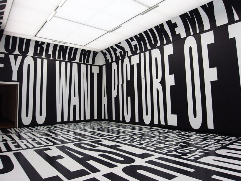
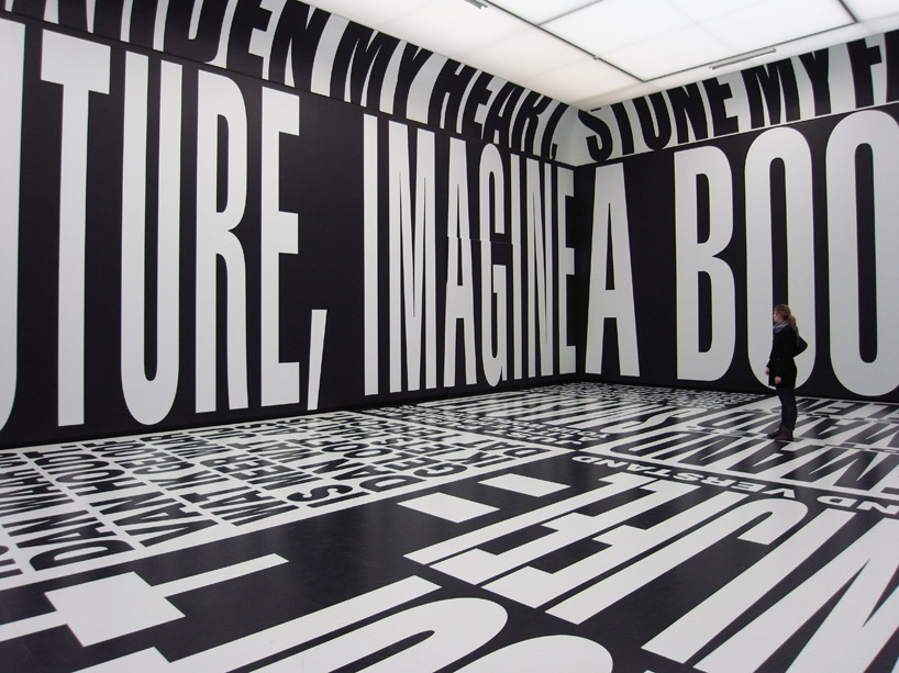
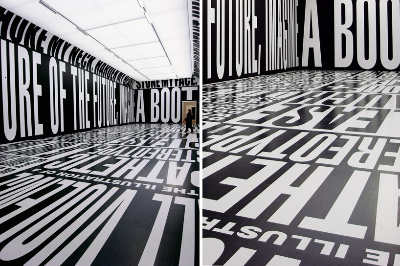
Barbara Kruger at the Stedelijk

American artist Barbara Kruger's installation -- designed especially for the building’s largest gallery, known as the hall of honor -- wraps the floor and walls with printed texts that speak directly and loudly to the spectator.


her provocative, emotionally charged statements about how people regard and treat each other disrupt the decorum of a traditional museum space. bringing the world into her work and her work into the world, she confronts stereotypes and clichés, shattering them with a rigorous critique, a generous empathy and a sharp wit.


Sunday, 24 October 2010

Hitler Hates Comic Sans!

Today I found this amusing parody. Hitler disaproves the use of Comic Sans MS for his propaganda campaign. Nice historical references (Nazis shutting down the Bauhaus, Stalin’s poster designs, Hitler’s art school past).


Swiss Graphic Design

Also known as International Style, the Swiss Style does not simply describe a style of graphic design made in Switzerland. It became famous through the art of very talented Swiss graphic designers, but it emerged in Russia, Germany and Netherlands in the 1920’s. This style in art, architecture and culture became an ‘international’ style after 1950’s and it was produced by artists all around the globe. Despite that, people still refer to it as the Swiss Style or the Swiss Legacy.
This progressive, radical movement in graphic design is not concerned with the graphic design in Switzerland, but rather with the new style that had been proposed, attacked and defended in the 1920s in Switzerland. Keen attention to detail, precision, craft skills, system of education and technical training, a high standard of printing as well as a clear refined and inventive lettering and typography laid out a foundation for a new movement that has been exported worldwide in 1960s to become an international style.

Grid Systems
A grid system is a rigid framework that is supposed to help graphic designers in the meaningful, logical and consistent organization of information on a page. Rudimentary versions of grid systems existed since the medieval times, but a group of graphic designers, mostly inspired in ideas from typographical literature started building a more rigid and coherent system for page layout. The core of these ideas were first presented in the book Grid Systems in Graphic Design by Josef Müller-Brockmann which helped to spread the knowledge about the grids thorough the world.


Nowadays grid systems are an established tool that is often used by print and web designers to create well-structured, balanced designs. There are many resources on the subject, one of them is an article by your own Smashing Magazine: Designing With Grid-Based Approach. You may want to take a closer look at it if you want to learn and find out more about grid-systems.


Typography:

One of the strongest characteristics of the Swiss style typography is the use of sans-serif typefaces such as Akzidenz Grotesk and Neue Haas Grotesk (a.k.a Helvetica). In fact, when Jan Tschichold wrote Die neue Typographie, he ignored any use of non sans-serif typefaces. With this philosophy, graphic designers were aiming at clarity, simplicity and universality. Helvetica, for instance, is a typeface that is famous for its pervasiveness: it is used in corporate identity, street signs, magazines and pretty much everywhere else. The Swiss Style advocates that the typeface does not have to be expressive in itself, it must be an unobtrusive instrument of expression.
This is by no means a rigid rule. When Swiss Style graphic designers advocate the use of sans-serif typefaces, they weren’t paying attention to the historical legacy and experimented with something new. Even Jan Tschichold himself admitted that his book was too rigid. If there’s one single lesson from the Swiss Style it is tolove and respect typefaces.


Examples of Swiss Design:


Tuesday, 19 October 2010

Graphic Design Jewelry


Plastique* is a los angeles based jewelry company owned by graphic designer, Jen Murse. Her range of laser cut accessories would suit anyone who loves good design and all that goes with it.

From her notoriously blogged 'CMD+Z' (that's the shortcut for undo for anyone who doesnt have a Mac!) to her 'AvantGarde' (thats a font) necklace; each one is a beautiful and delicate statement.  Another edition to the designer jewelry set it the "Tweet" necklace.

These statement pieces are available to buy from an online store called Every Day We Summer. 
Tweet Necklace £9.00

Avant Garde Necklace £8.00

CMD-Z Undo Necklace £8.00

Other Pieces:


Handmade Typography

Recently I came across a blog named Lucky So and So.  The blog is written by Jess Arrington and is inspired by her love of colour. I love this piece of typography that has been made out of sweets. It was featured on  Jason Santa Maria‘s blog. 


I thought it would also be fitting to show some of my handmade typography. The first typeface is called EdisonBell and is made from a telephone cable. The second is made from outdoor lights and is wrapped around the human body. The third is made from coloured wire. 


You can view more typeface designs and other work on my Website, Facebook Group, or Store.  


Sunday, 17 October 2010

Jonny Wan


This Morning I came across Jonny Wan's work on Flickr. His work is incredibly playful and eye catching. His letters have a sort of vintage fun fair appeal to them. I wouldn,t mind having a print or two of his around my house! His work is worth a look!

Mercedes Pink Ribbon Calligraffiti


Mercedes-Benz in The Netherlands promoted their support for the Pink Ribbon breast cancer campaign by sponsoring a special car for the Pink Ribbon team. The white Mercedes B Class car, to be used for visiting sponsors, partners, in TV programs and galas, has been customized by calligraffiti artist Niels Shoe Meulman. Hundreds of women’s names have been added to the name of Mercedes, symbolising all the women for whom the Pink Ribbon foundation works tirelessly. The artwork was turned into an advertisement in Pink Ribbon magazine and is featured in an online making-of film.


Friday, 15 October 2010

Making Future Magic - Light Painting

Yesterday I came across this wonderful video clip. Typography is made by using an iPad to do light painting with. The result is amazing! Take a look below:

Thursday, 14 October 2010

Positive Posters


Mike Witcomb and Micah Scott's entries

Positive Posters is a Melbourne-based project which popped up just last year. It’s the brainchild of local graphic designer Nick Hallam.
Positive Posters is a non-profit international poster competition, run by a group of Melbourne-based volunteers.   Their simple goal is to give graphic designers worldwide an outlet to create freely, using their skills to inspire and make a positive difference, in an entirely non-commercial way.
This year’s 30 finalists have just been announced and it is such a lovely line-up, with so many brilliant Australian designers represented.  Do pop over and check out all the entries!  The top 30 posters will be exhibited next month at No Vacancy Gallery.

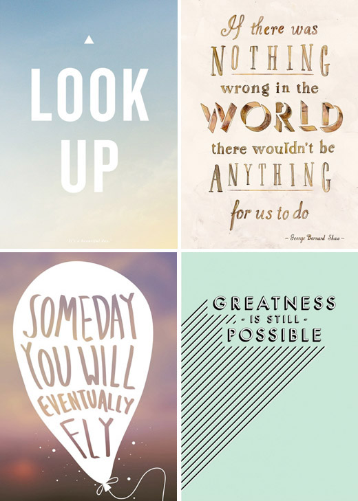
Some of this year’s Positive Posters Australian entries – Clockwise from top left, entries by Carlo Mussett,Hilary Sloane, Ron Whitfield and Mike Nguyen.

Saturday, 2 October 2010

Kinetic Typography

I have seen kinetic Typography many times before and have always been amazed the effect. Kinetic Typography is normally inspired from famous quotes from films. These animations remove the fancy sets, stage props and actors and make you look and understand the dialogue so much more. With any animation timing is key and the animations below are timed impeccably.

Pulp Fiction


Fight Club


Lock Stock and Two Smoking Barrels


Ocean's Eleven


Wedding Crashers